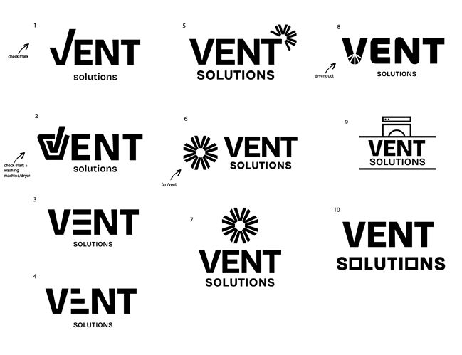
Hi, I need feedback on these logos and help to narrow them down.
It’s a dryer vent cleaning company. (In case that wasn’t obvious  )
)
All comments welcome! TIA!
2,4,8 & 10 are my favorite ones, such creative options!
I like 8 the best
I also vote for 8!
OK, 8 seems to win! I’m actually still playing around with fonts for that one, so it’s not done yet.
I like to send my clients 2 logos in a presentation, so they can see 2 diff directions but it’s not too overwhelming.
Any more votes for which other one I should develop more, together with #8?
Thanks!
i like the concept of #2 but isnt vent only for dryer? wanna point out something about the shape:…
this is the logo on a tag for dryer

this is the logo on a tag for washing machine

True, I know…  But where would you incorporate the square icon?
  I tried it with the #10 option but it didn’t look too good… Also ,you see no one voted for that one…
Also, this person specifically, he also does appliance repair… I know the name doesn’t match precisely but what can I do?
oh! was trying to figure out why you made it boxy!!!

