Hi,
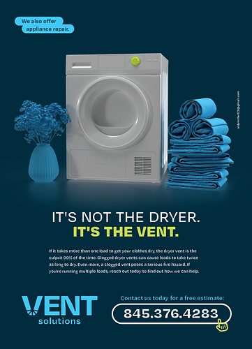
I designed this ad now for Vent Solutions, any comments or feedback please?
Beautiful!
it’s really nice! Maybe put the text on top in a darker bubble, its catching my eye before everything else.
Nice! Or I would try putting the appliance repair text in a semi circle around the right corner of the dryer? It was also catching my eye first. One more thing- maybe make the body text either justified or centered instead of left aligned?
Thanks! I see about the top callout being too showy, will fix.
looks great!
Also think you should make the text centered and not aligned
OK, will fix that too! 
wow love it!
Looks amazing!! Neat and very professional 

really nice!
its really really nice!
Beautiful ad! Eye-catching and professional!
love this ad
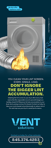
My client changed his mind… He wants a half page ad and wants the ad to bring out the idea of fire prevention.
What do you guys think of this? Copy still needs some work…
I’ll take critique on that as well…
I love the layout
I feel like the dryer does not match the vent. Vent is more 3D/real and the dryer is more flat color.
Also maybe change the fire because I’m not sure if it would cause the machine to explode or fire to come out of the vent. But overall the ad looks amazing
looks nice! i like the hierarchy and love the logo!
I would make the picture smaller, the dryer it looks like its being squished onto the page, maybe can use some breathing room


