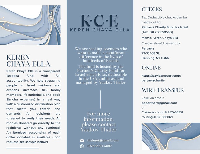
Hi, would love feedback on this tzedaka email flyer. THey don’t have a logo, so i made something quickly but i don’t like it that much so any advice on that too would be really appreciated!
I love the lay out, It’s very neat and easy to read. Just think that the design is a bit too elegant… but maybe that’s the look that they want
Very neat!
I would remove the shadow underneath KCE and give it some more space between that and the words underneath.
Also you can align the KCE at the top with the other 2 sides.
