Which option looks better: the one with raffle pictures on the bottles (though not all pictures are included) or the list of raffles at the bottom? Any additional comments?
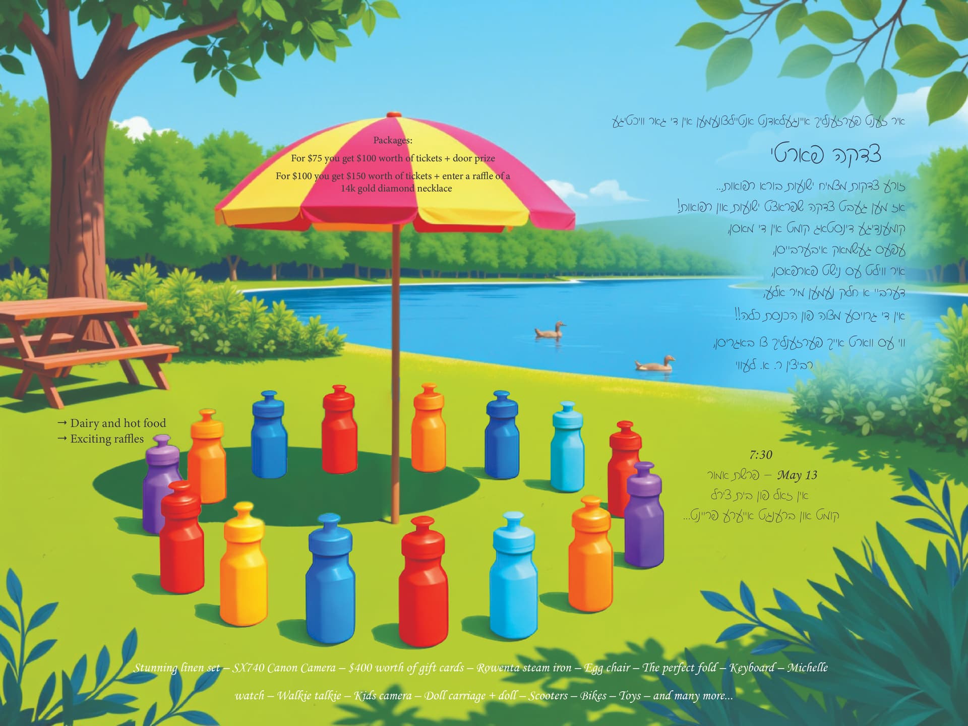

I like the first one better, it’s cleaner.
Maybe make the words on the umbrella more visible and
the words on the bottom a bit larger?
Raffles on the bottom, but the text is not very legible, the white on the green is not showing…
It’s such a cute bright ad!! I do think the prizes need to be a lot more prominent. I’m not a yiddish speaker, so it could be I’m missing the significance of the water bottles in a circle etc. but generally speaking for a raffle ad, I would probably expect to see a lot more emphasis on the prizes which are not so noticeable right now. Think, what will make people want to enter? Most auctions have the prize pics in big, and the food and exciting raffles line should be the focal point - more so than the umbrella. I would say have a look at some raffle ads, study the hierarchy and compostion, where and how they display the prizes etc and then decide how to move forward. Hatzlocha!!!