Hi,
I am working on a trifold brochure. I created two designs to show the client.
Would appreciate in receiving critique…
Thanks a mil!
Hi,
I am working on a trifold brochure. I created two designs to show the client.
Would appreciate in receiving critique…
Thanks a mil!
It didn’t upload properly! Try again
Thanks for letting me know. It keeps on saying processing. Not sure why it’s not working.
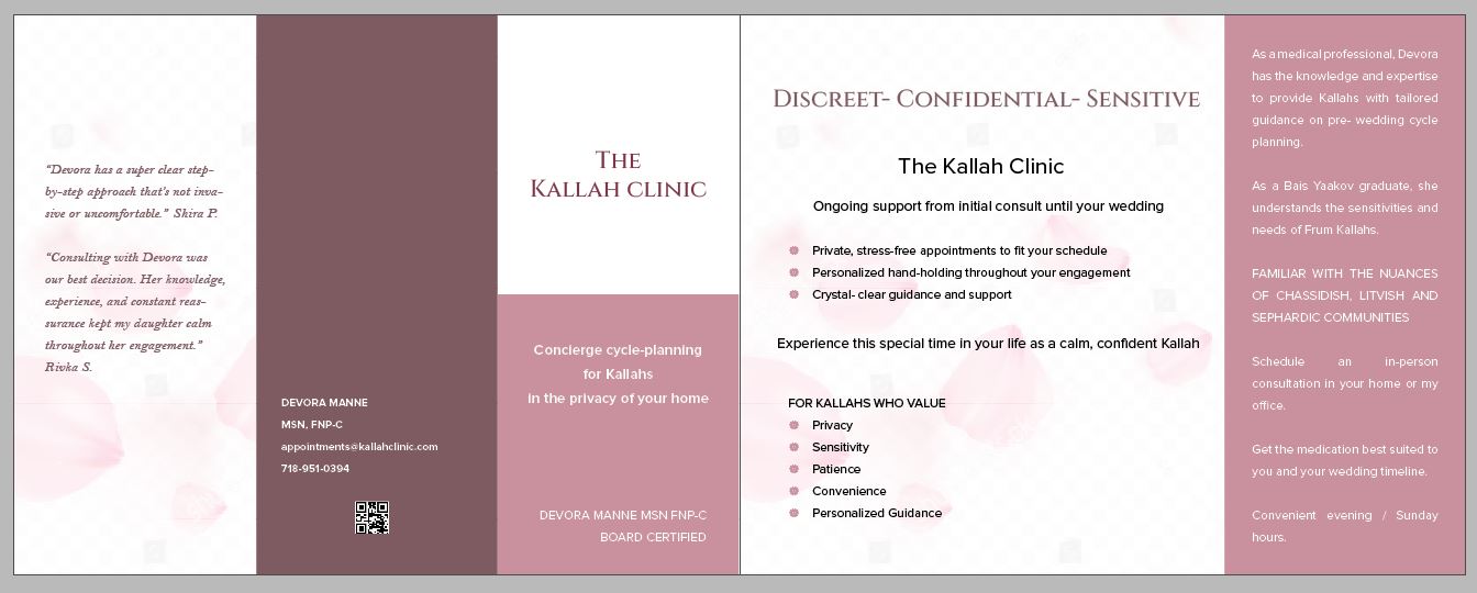
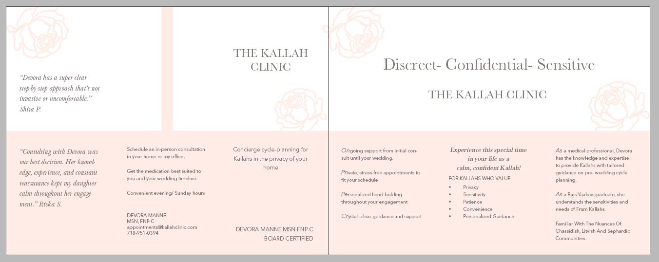
I personally think the way the text is broken up in the first option is easier to read esp bc there are no images to break it up. The spacing in the right column 4th paragraph first line is rather big.
Thank you. Any suggestion on how I can break up the text better on the light pink version?
Is there a way to use the coloring on the light one but bring in some accents of the darker brownish pink? I like the soft, happier feel of the lighter pink one but needs a bit of contrast and pop…
The text is more organized in the first one, but flows nicely as a unified whole in the lighter one. If you want to stick with the layout of the lighter one, you would need stronger hierarchy, so important headings, subheads, and tidbits of info clearly stand out, and for everything else there is a clear order of how things should be read…subheads should be more noticeable, as should units of info such as bulleted lists etc. Emphasized text, such as headings, pull quote on right, contact info, should be more dramatically different than the rest of the text in terms of size, boldness, color etc, in order to give the viewer cues as to where to find info and places for the eye to “rest”. Use alignment to connect things that are meant to go together (right now text units seem randomly positioned rather than aligned with other text units), as well as repetition (i.e if two text units are meant to relate, use the same color for those units or for something in those text units to tie them together. Use proximity to create fewer visual groups. Right now there are so many visual “stops”, each phrase or sentence reads like a separate unit, even in the title area on the top left. Group things closer together that belong together to work as one visual unit, and within that unit you can make subheads or other info stand out by bolding or coloring or enlarging within a unit.
Hope that helps.
Wow! Thank you so much. Your detailed critique is a huge help. Is this better now?!
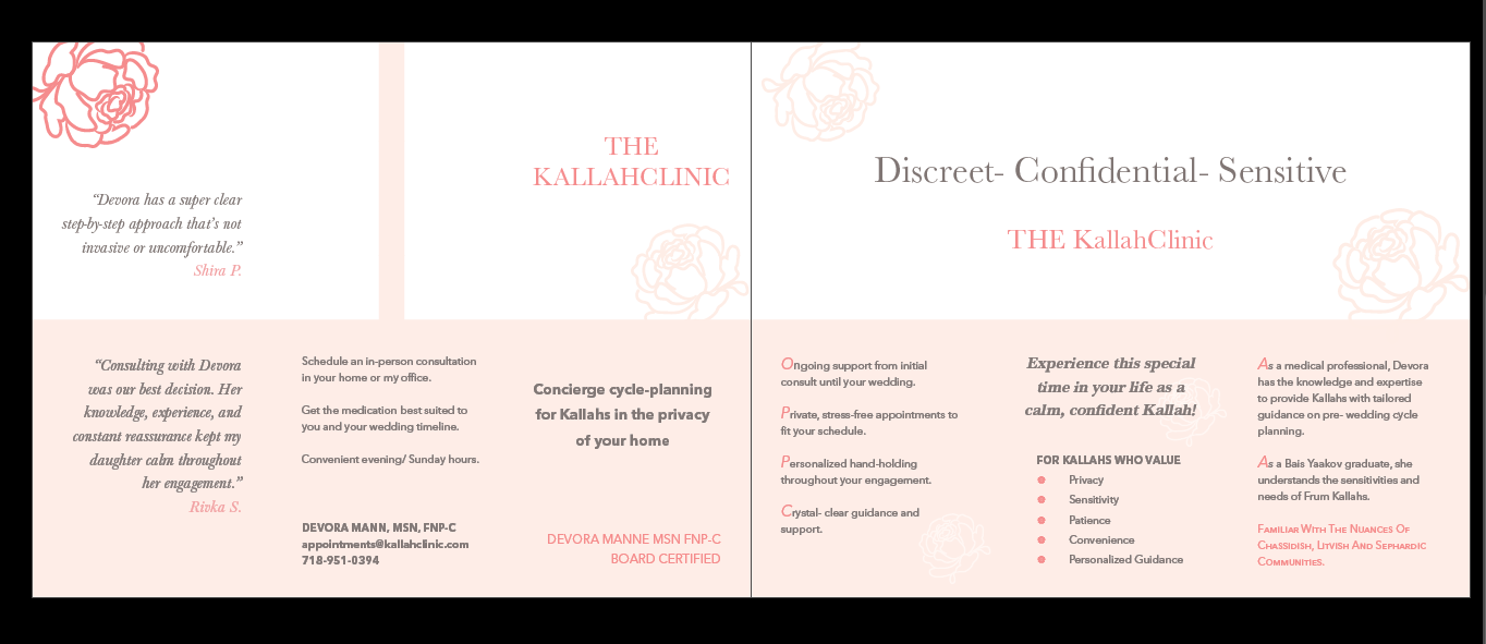
Also, what can i improve on the first design? I will be sending the client both.
Can anyone look at this again before I send it to the client?
Looks nice! I wouldn’t capitalize “THE” in The Kallah Clinic, maybe you can also add a bit more swirl into those words, something flowery like a mini logo.
Great job!
I agree I wouldnt capitalize THE.
Second,if you feel like it needs more, I would add more artwork. How about instead of bullets as circles, you switch to icons or even mini flowers,or check boxes.
I see that you capitalized and changed the color of the first letter of the sentences,but at first glance I feel like it’s trying to spell out something like “OPPC”,which I dont think was your goal. Maybe back the paragraph in a different color.
All in all it loks really pretty!Great job
Good luck!