Hi, I went back and forth with a client with different flyer options and here is the final one they chose. Any advice on how to make it look nicer?
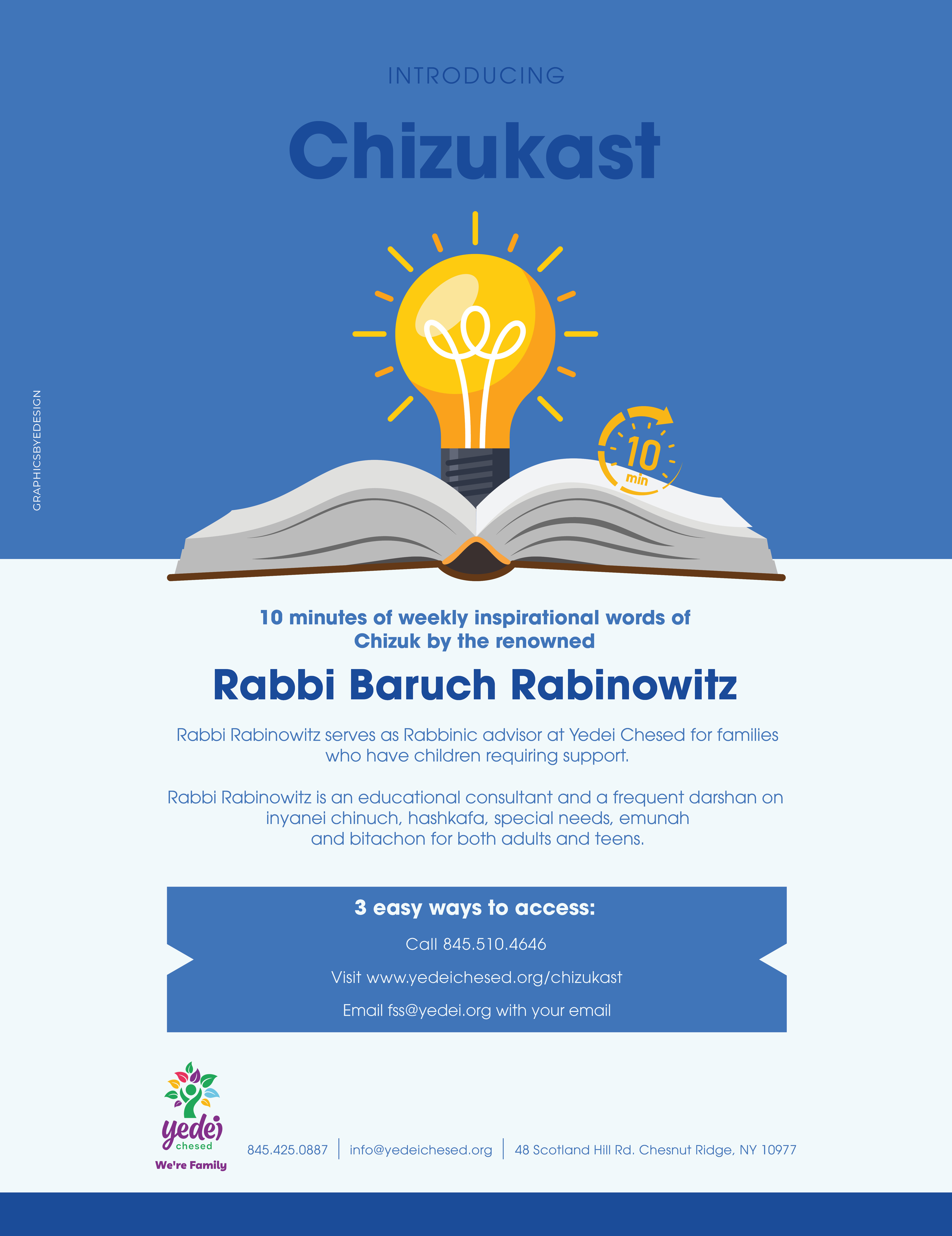
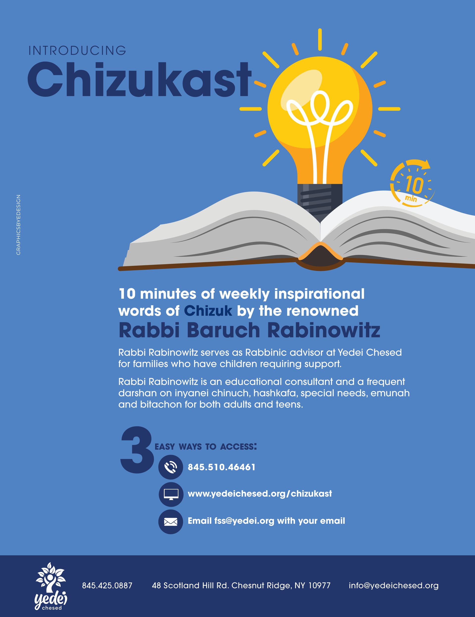
They chose this one (with the book on the side and the full blue backround) but I’ll attach another option I gave them
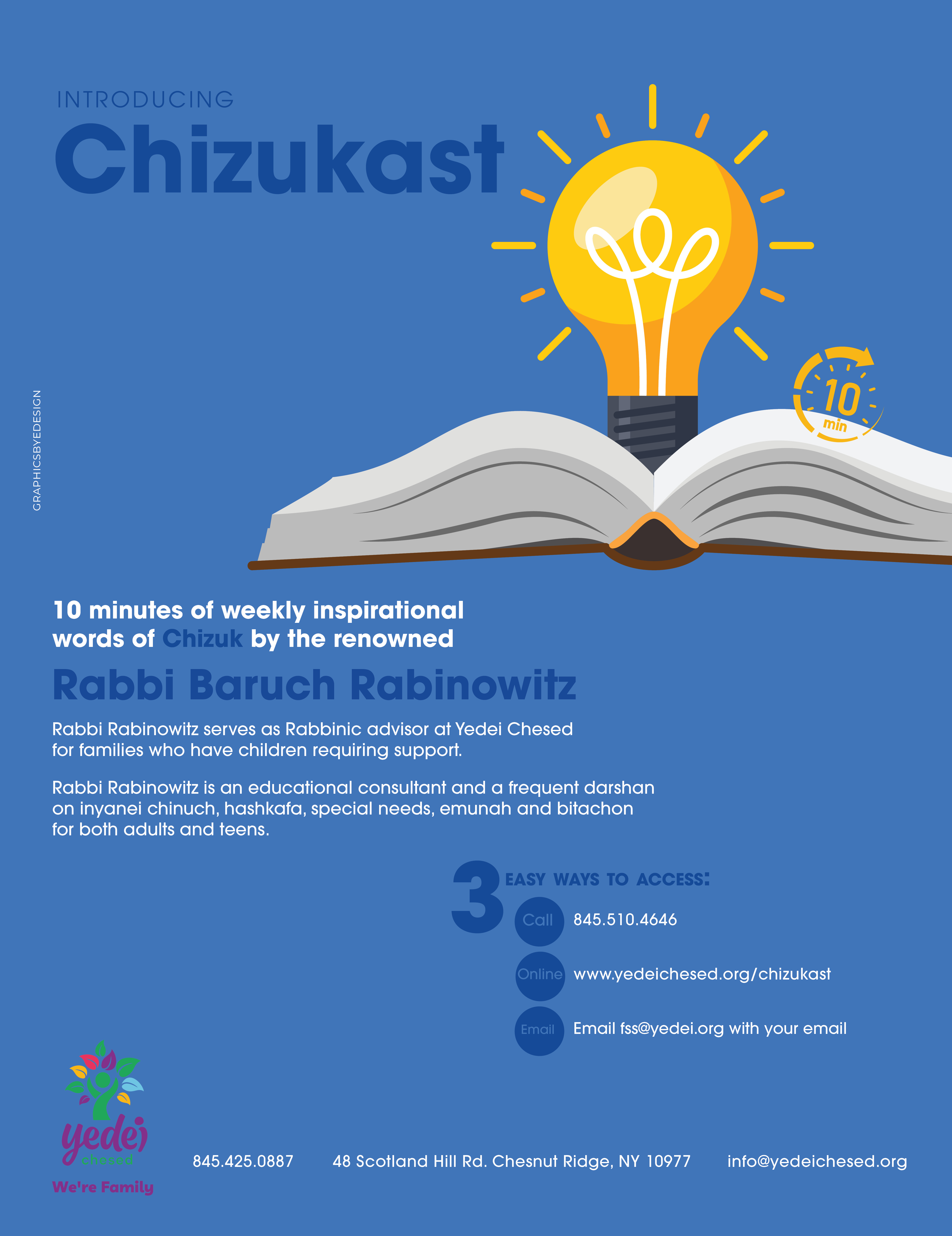
1-Align the paragraphs underneath to each other
2- it’s hard to read the dark blue text
3- maybe you can put the header overlapping the light bulb somehow?
Good luck! Always hard when the client wants changes you don’t think are good ideas…
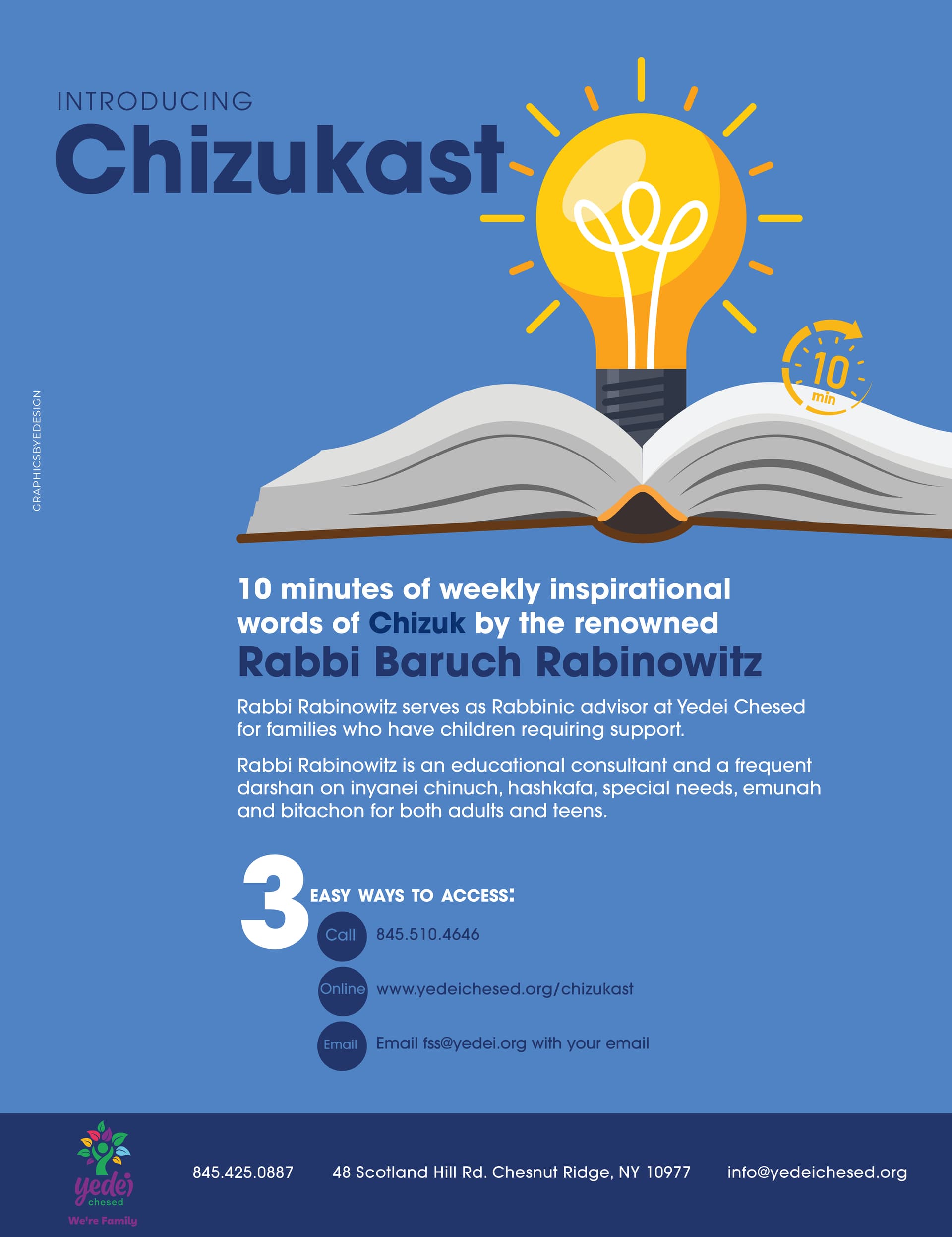
I agree that call/online/email are hard to read. Try to make those words a lighter color. And make the details next to them a bigger font size.
And the word Chizuk (above the speaker’s name) doesn’t look like it’s aligned on the same text line as the rest of the words in that line.
Thanks for the help! Made some adjustments…
wonder what I can do about the logo. Dont want it so close to the bottom but cant make it any smaller.
It’s such a pity that they dont like the second option. It’s so nice.
I feel like the logo is hard to see on the dark blue.
What do you think about putting icons in place of call, online and email?
Maybe put a white bar on top of the blue one (shrink the blue so it is just a line) and place that bottom info in there.
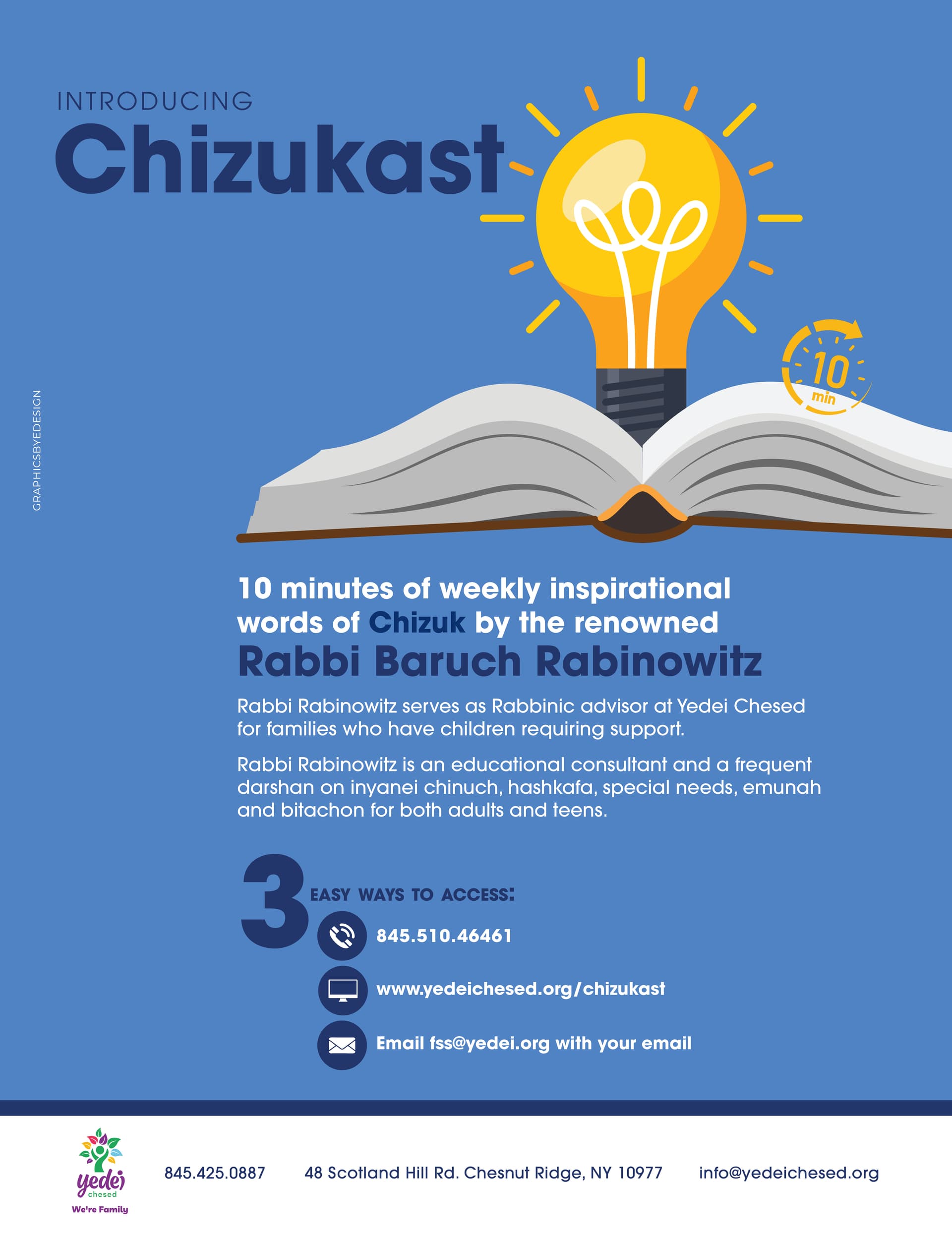
#2 is better
i would move the introducing chizukast a bit lower to align with the middle of the bulb