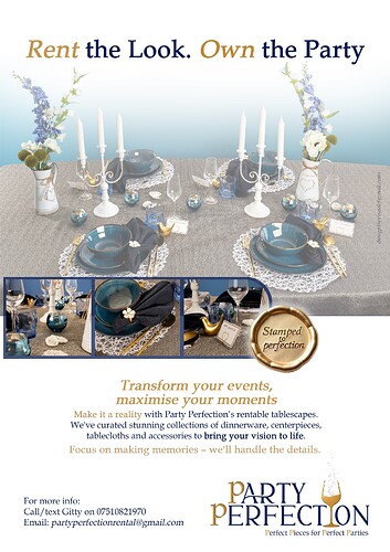
Really nice, should you put a period after the word party?
yes thank you for that, will correct
Beautiful ad!
Are you the party rental? I wish I can rent from them but it seems to be based out of the USA. I’m having an event in June in Passaic, NJ.
Beautiful! I wonder what it would look like without the glow around the stamp. I think it’s standing out a bit too much against the ad.
Also, did you create the logo? I’d keep the whole tagline one colour rather than the gold 'P’s at the start of each word - personally it looks like a bit too much. Otherwise, lovely design and copy!
If it’s you who’s doing it, hatzlacha and looking forward to seeing the ad!
Thank you for the tips… really appreciate!
@ShoshanaElisheva there is someone in monsey and BP who does it if that helps you at all
@RivkyH thanks so much! will post it with the small changes… and thanks for your warm wishes!
Gorgeous!
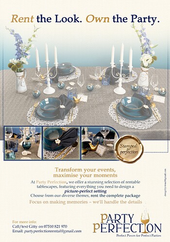
I happen to think it looked classier without the new border. But obviously do whatever you like.
Also, the correct way to write a tagline is with a capital only at the beginning of the sentence. So I would change the rest of the Ps to lowercase. Unless you had a specific reason you wanted it that way - because it’s a lot easier on the eye when lowercase.
Hi! someone told me the following about the above ad…
“I Don’t really like your ad layout. I think they look boring… But I don’t want to make trouble.
I just know I probably wouldn’t notice the ad, and wouldn’t bother reading it all. Not captivating enough”
i am just wondering how much truth there is to it and if anyone has any ideas that i could change that would help…
thanks a lot, really appreciate
In my head I categorize ads into 2 categories:
- Ads that are nice but nothing particularly screaming loud about them
- Ads that really shout.
(Obviously, there’s the 3rd category of ads that are poorly designed!)
For an ad to really shout, it has to have either a very eye-catching or unusual image, or a very punchy and sharp headline to catch your attention.
I feel that when we are working as individual designers, as opposed to being part of a big marketing team, it’s OK if not every ad is from those that really grab attention. Sometimes it’s enough if it’s laid out clearly and neatly and looks good.
I think this ad falls into that category - so even though not all ppl will pay attention to it, I think that someone looking for this service would take note.
If you do still want to improve it, you can try playing with some other layouts rather than having everything center aligned. Maybe the text on the right and the image to the left… I also don’t think the main image should be washed-out looking. Or maybe you can try making the background and tablecloth of the image washed-out but not the placesettings and candles…
Or you can try to come up with a different headline… But that’s not really your job!
Hatzlacha, and don’t feel bad! You did a great job with it.
I totally agree with @AMiller !!
It happens to be a nice ad!
regarding the copy… its just in place as something is there… client is giving me a better copy to use so i guess that will be more catchy!
client really want it to be more “WOW” and to shout…
i’ll try these suggestions and see how i get on.
thanks to all for suggestions
I think it’s very neat and classy
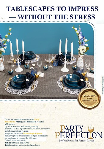
i’ve done a bit of changes… ive laid it out a bit messy just for the idea…
would love to hear any thoughts if possible
Personally I like the first one more, I think the text here on the bottom is too heavy, it’s too much text it doesn’t give you a good overview…
Same here, also prefer the first
im not sure what to do, i dont want the text to overtake the whole ad like in first one and also dont want it to be so heavy in the bottom…
Any option to cut down on the text?
i did that a lot, less text on second ad rather than first… just in a tighter spot!
What if you would make the photo full width, and extend the blue all the way to the top. Then, have the header directly on the blue in a white font…?
For the bottom, see if you can rephrase certain parts to be bulleted / with icons.


