This is the front and back of business card. Client wanted logo that is an R looking like a person reaching out, she is happy with this look but prefers if the word Reach is incorporated in the logo as well. Any idea how I should do that, did not look good with the combinations I tried. I would also love some advice on fonts, I really want to use a serif font but it looks old, any way to get a more modern look with a serif?
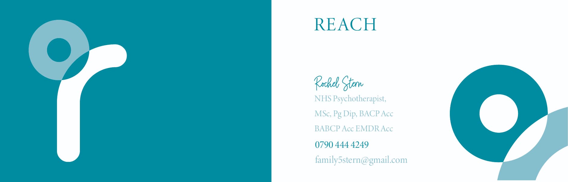
nice clean logo - i would keep the same rounded sans-serif font for the word ‘reach’ - wouldnt it look better in the same type of simple rounded font rather than serif? then maybe you can have that in small as the logo on the white side of the card (where it says REACH now) and keep the r image only on the blue side of card.
you could still use serif for the other details in the card - i found if you space out the letters a lot more it makes a serif font look more modern. if you change font of REACH then i would probably not put her name in that signature font for the business card as then you’ll have 3 fonts on that side.
Thank you, I will try that.
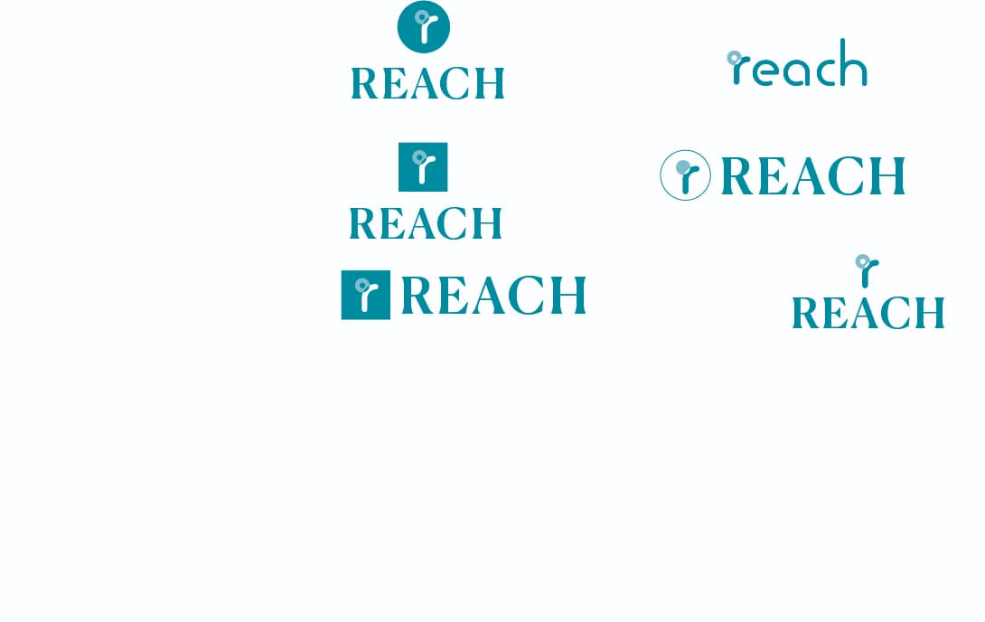
@rivkah is this what you meant by using the same font for the word reach? Client was not sure she loved the font as looked a little young to her. What do you think of the other versions, and any ideas on how to work on any of them. (I want to perfect her logo first, will then work on the card)

Thank you @Breindy-S . Do you think the circle should be filled in or left as is.
i personally really like the top right one that uses same font as the ‘r’ it’s really warm and friendly and more inviting than the others in my opinion… and surely it’s not always so easy to reach out to a psychotherapist… especially if you’re english (which i am too!) so the more inviting the better!
On the other hand if it doesn’t fit her character and she is a more formal type of person and not so warm and friendly then maybe she should stick to the other options!!
If the client is open to the rounder one (even though it’s not her favourite) i would suggest her emailing the 2 font versions to a few people she trusts and include people who would use a psychotherapist (not only other psychotherapists) especially the type of people she wants to help e.g. if it’s younger/older, singles/marrieds etc and hear their opinions.
Also see what logos/her competition have coz she may not want to be too different to them. Or maybe she davka wants to stand out!
To me, all the other versions are a variation on the same idea… first i think it’s important for you to get clear on whether you’ll have the more formal or more informal font.
Hatzlacha! Looking good!
Thank you for your advice, will speak to my client about this and see what she thinks.