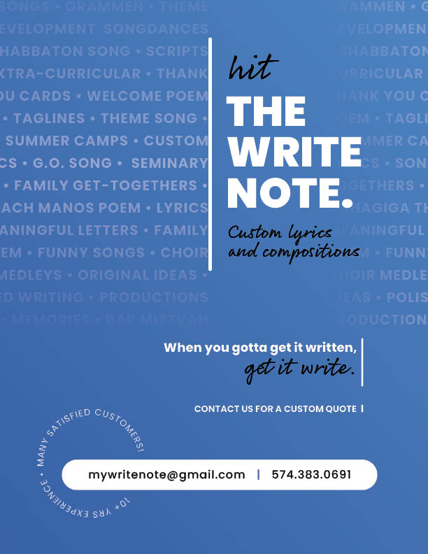
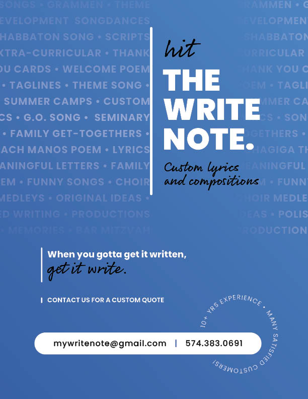
I’m having trouble finding balance with this ad. Which one would you say leads the eye more naturally through the ad? Any other feedback? Thanks!
1 Like
Hi!! I like this one better. Love the color - pantone color of the year!
Im also a fan of the script you chose, legible and attractive.
1 tiny thing:
Maybe remove the extra line after the word “quote”, and just extend the line on top till the “contact us” line.
Tip- If your using this in print, print it out at lower opacity -70% to see if the background text comes thru visibly.
But awesome job! I love it!
Aw thanks Malky! I appreciate the feedback!
Hi 
I like the second one better. It looks really nice overall!
I think the contact us for a custom quote line would actually look really good in a circle. Then maybe you can put the 10+ years experience somewhere else. Just an idea…
Hi! Thank you! I will try it out.
I prefer the second one, but they’re both really attractive. Love the colour!
i think either are great. only thing is i couldnt read the word ‘hit’ at first - to me it looked like ‘wit’ for ages… maybe u can do capital H instead?
Stretching the h to make it taller might help
i love the watermark! its such a smart way of including all the things she can write, without actually making a list…
Thank you!
I love it, Dena! I find the second one has better flow. Love the name, and how the typography creates the ad - it matches your message. Hatzlacha!
Thank you Shiffy!
Good idea, thanks