Hi. See attached.
Any comments or suggestions?
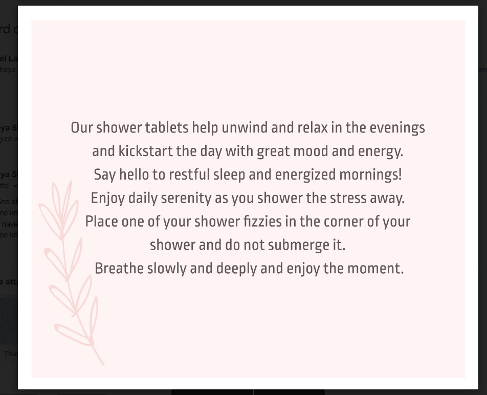
Really nice!
1- The text may be able to be consolidated a little bit, but I’m not sure if you have control over that.
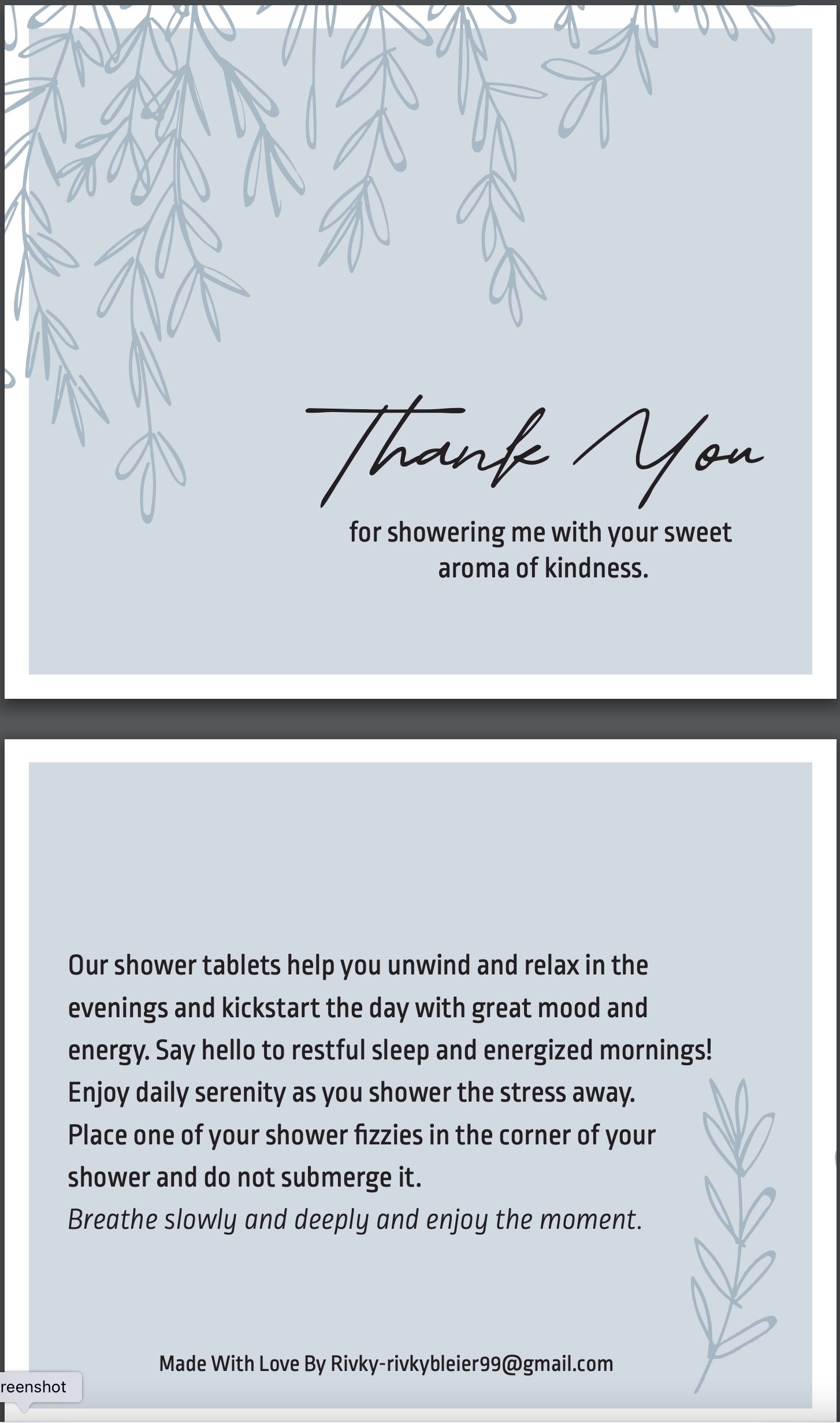
2- Can you use a lighter version of this text? It’s a little bold and doesn’t seem to mesh with the soft pink.
3- Can you use a softer color, maybe a pink toned grey, instead of black?
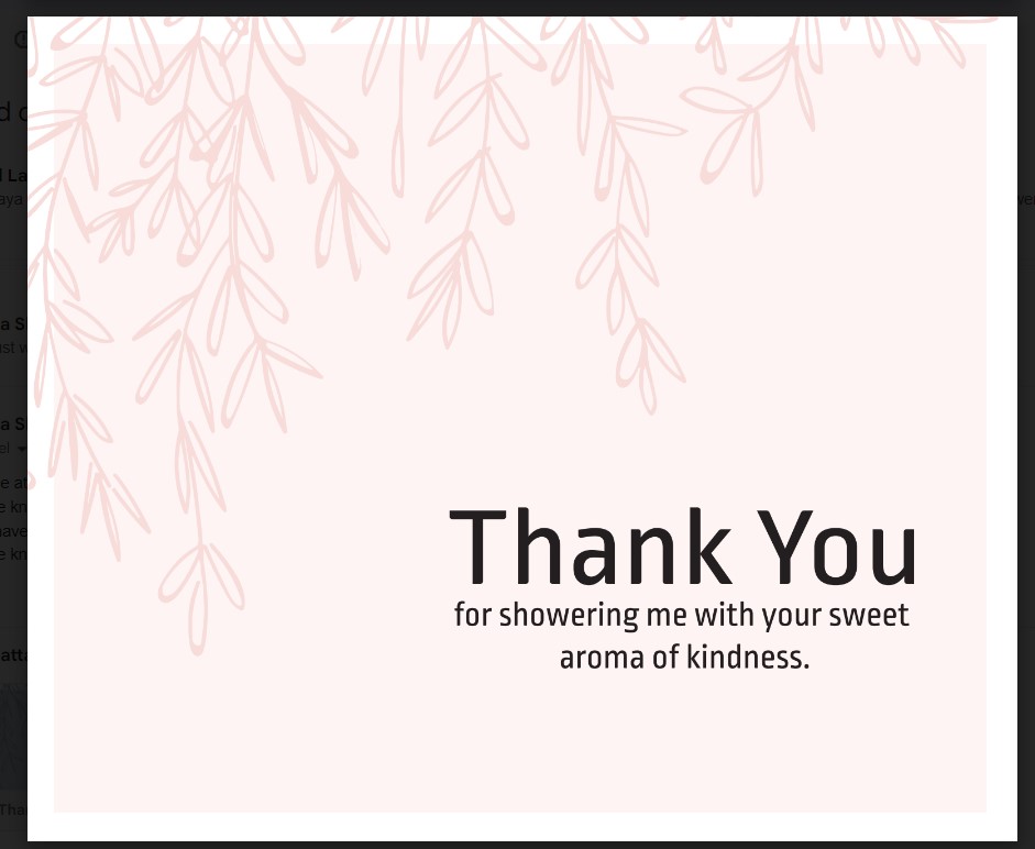
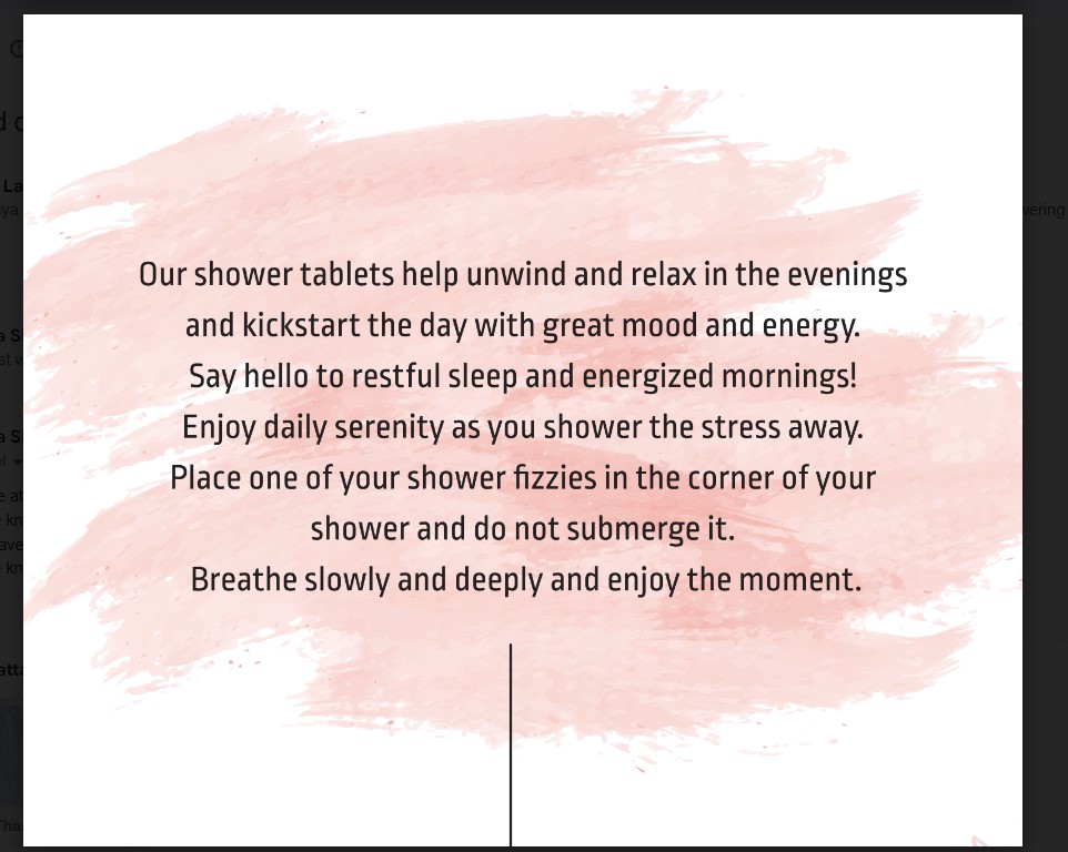
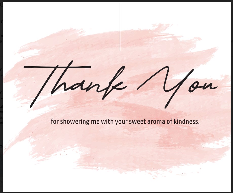
i really like both styles! very calming and clean
one thing- i think the word ‘you’ should be put into the first sentence so it makes more sense
“our shower tablets help ___ unwind”
Love the first one! really nice
Maybe change the font style of just the last sentence
For example different color or italics
I prefer the first one
Really nice!!
thanks everyone, here is the updated version.
Does the bottom text in the back of the card look good centered?
1 Like
love it!