I would love critique for this brochure.
(None of the pictures are bought yet)
Thanks!
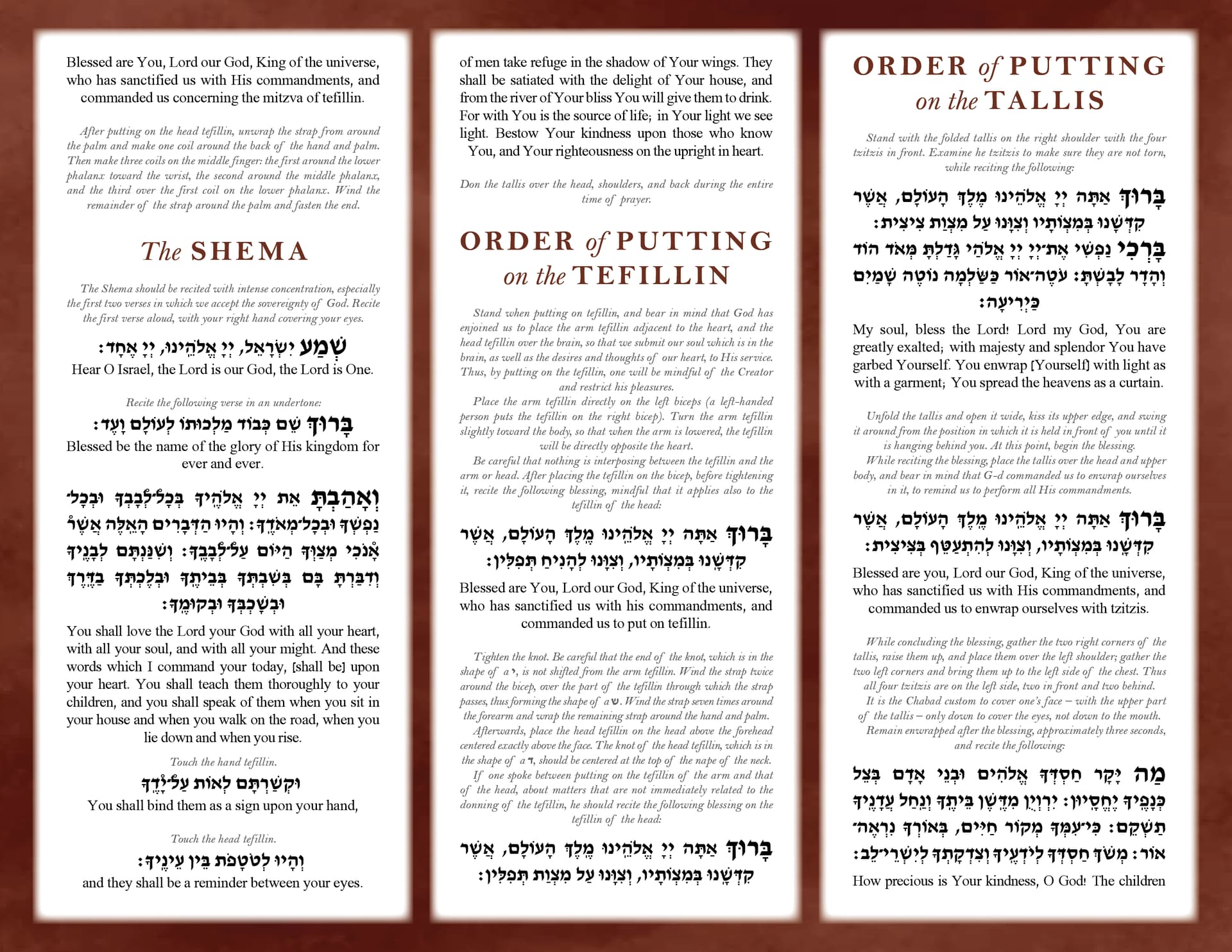
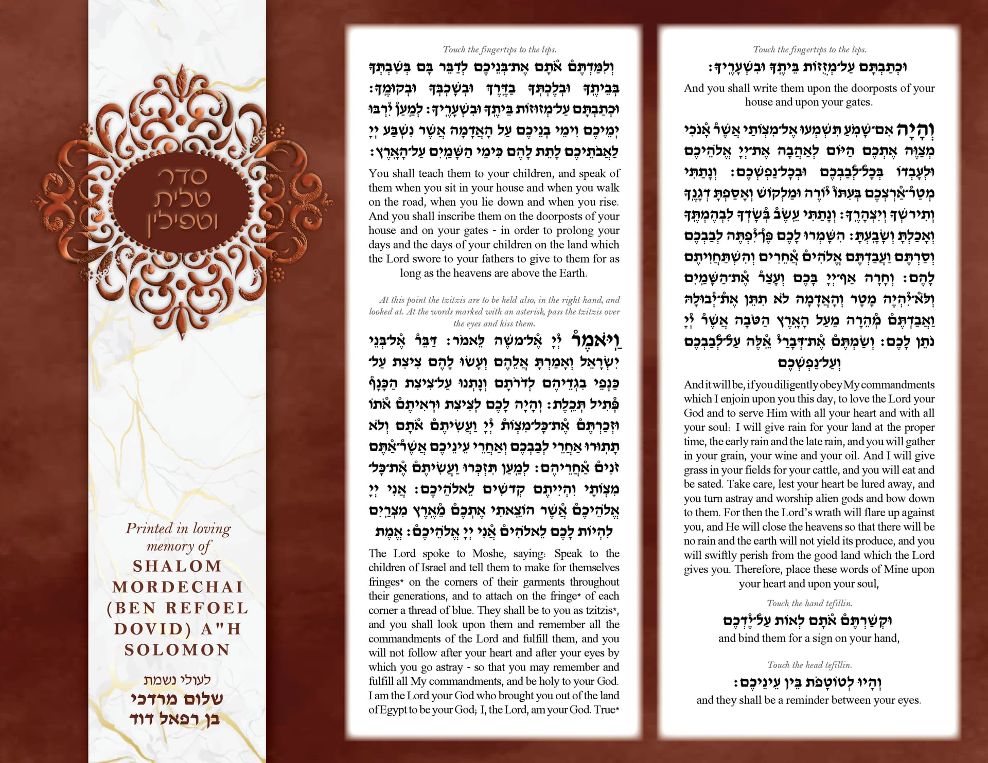
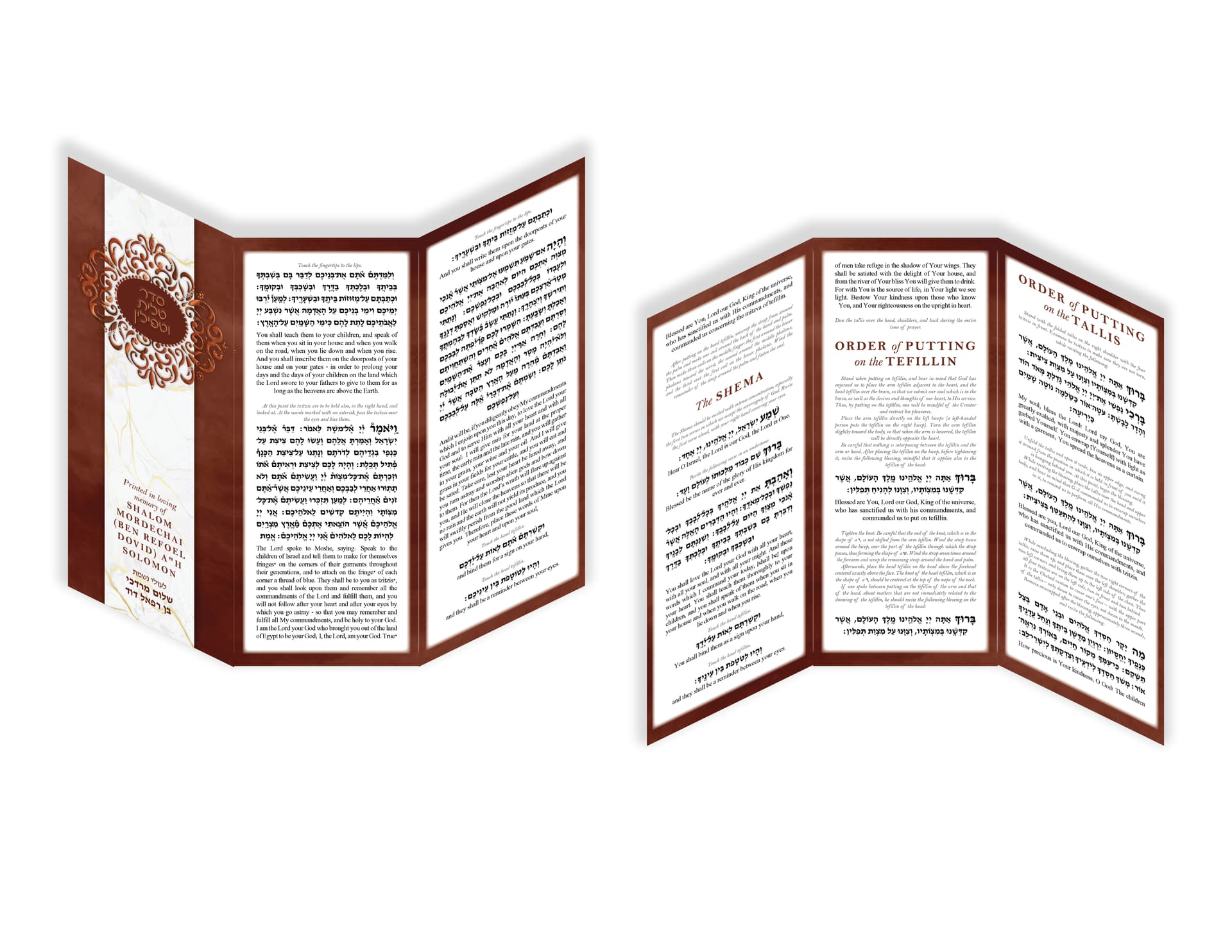
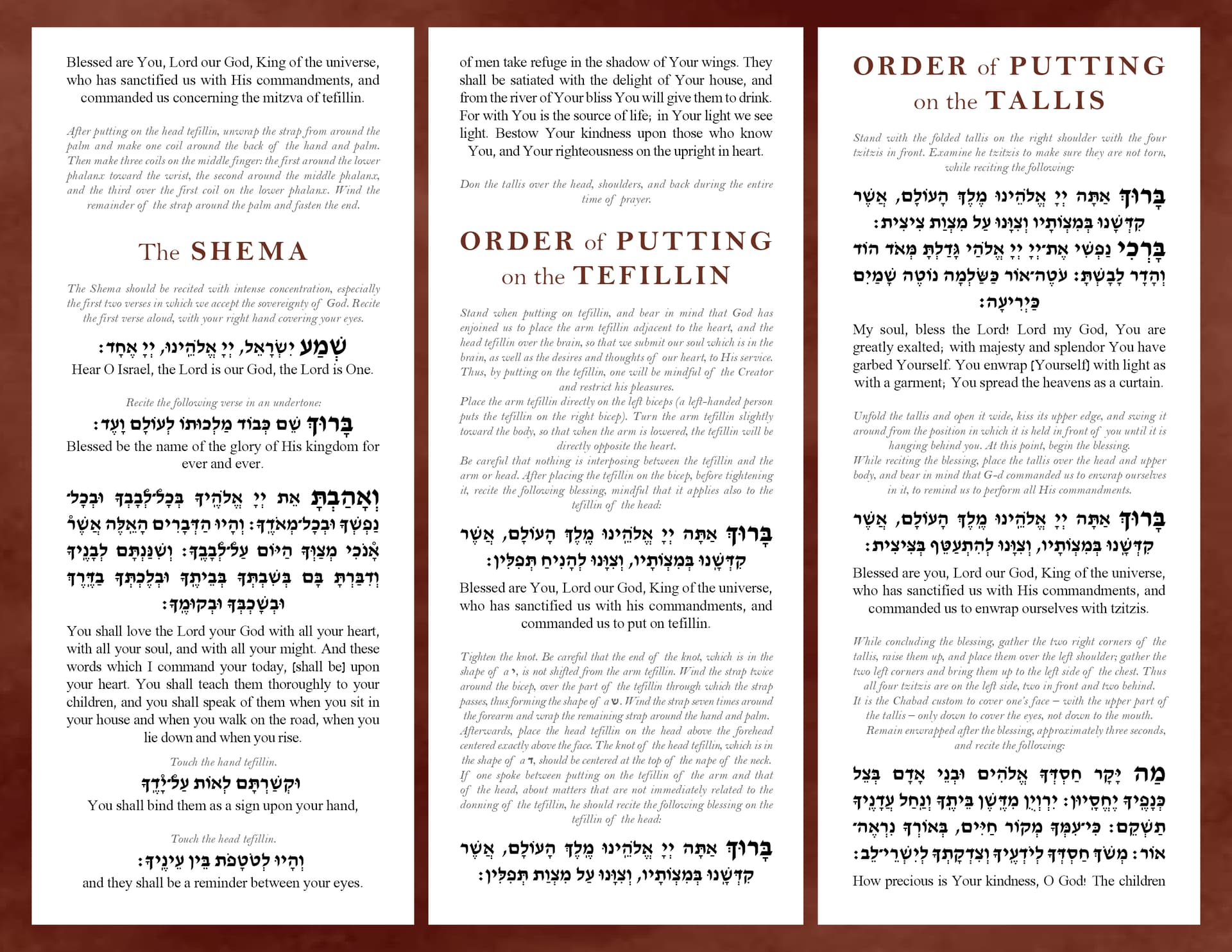
It is the seder for putting on tallis and teffilin
Anything? It aint perfect… but I want it to be!
Is it clear and legible?
Are the fonts good?
How can I make the cover look nicer?
Is the style nice?
Thanks in advance!
i think it looks great! iv never done something like this before so didn’t want to comment originally but it’s definitely clear and legible.One thing im not loving is the inner shadow on the border i think it might look neater without it. Also why are the secondary words of the title Italic? I probably would leave it regular and maybe even slightly thicker… rly nice job!
Its beautiful! Very rich looking.
The text is aligned- justified however the italic words aren’t. I would also align- justify the italic words.
On the cover the name in English can use less kerning (not sure if that’s the word) shouldn’t be so spaced. Also i agree to remove the inner shadow and I would give it the same effect you gave the bar on the cover page.
The reason why the secondary words (conjunctions??) in the tittles are smaller is because there is no room. But I took out the italics.
The text was also justified, but the paragraphs were indented, but your are right, it makes it look messy, so took it out.
Thank you both so much for taking the time to give me some feedback!!!
Another question, does $120 sound like a fair price for the project?

Definitely fair
wow amazing much better! idk how long it took you but $120 sounds on the cheaper side…
You did a great job!
Thanks!
malky-h, I charged 120, but how much would you say one should charge for this?