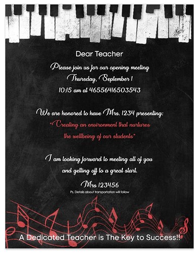
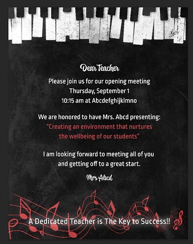
Hi. I designed this flyer for a teachers opening meeting.
They want to have the keyboard on the top and musical notes on the bottom.
Any critique or ideas are welcome.
Forgot to mention that I tried creating a chalkboard effect.
Very nice! I’m wondering- does the school have a logo for you to include?
Very nice! I think the Dear teacher and the principals name (the one signing off - not sure exactly who it is) should be in script and everything else should be in sans serif…
I also think you should tighten the leading between the sentences “creating an environment that nurtures…etc.”
very creative!
the text is hard to read all in script. but otherwise i think its great!
Looking good!
add a comma after teacher and move down “A dedicated teacher…etc.”
What sans serif font did you use for the text? I like it!
I used Ropa Mix Pro.
so nice!!! love the keyboard you used…
Love the keyboard! How did you get it to have the chalk effect?
I put my own images into a chalkboard effect mockup.

