Hi,
I started making this flyer for a shul and would love feedback!!
Thank you!!
Chani
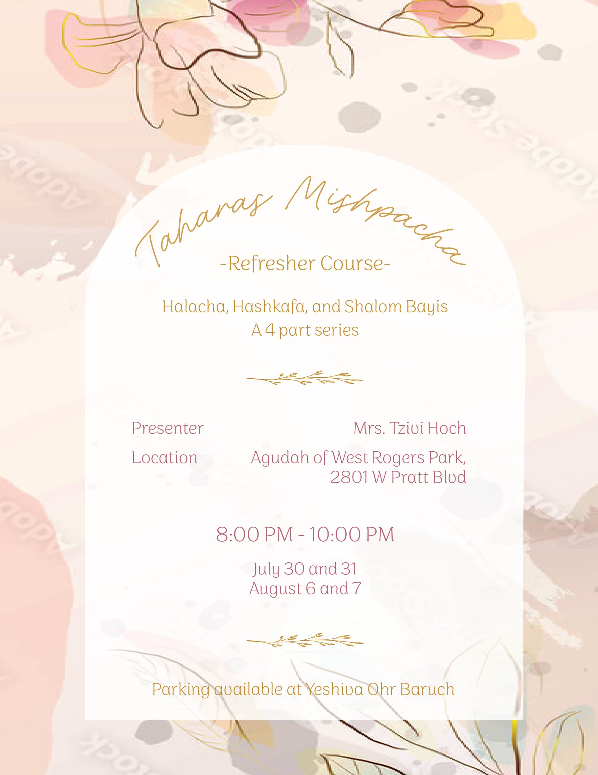
Looks really nice! I wonder if the shape in the middle should have more contrast to the background. Also shalom bayis is missing a ‘h’
Looks great!
Its really nice!
Looks stunning!
Maybe you can make more contrast between the words ‘presenter, location’- to the name and location… Like one them in bold or a different size
Really pretty! I agree, it could benefit from more contrast. The title should stand out more, and the presenters name and location should be bolder.
You might want to also use a single darker shade of one of the colors instead of the colors you used because it is a little hard to read
Really nice!
Maybe you could add an inner shadow to the shape to give it even more depth.
Thank you so much everyone!!
This is beautiful! The colors and shapes you used are so heartwarming. May I ask if this was done with photoshop only?
Hi,
Thank you so much everyone. I got the image on adobe and just added the shapes on illustrator. I did change the levels though to make it brighter.
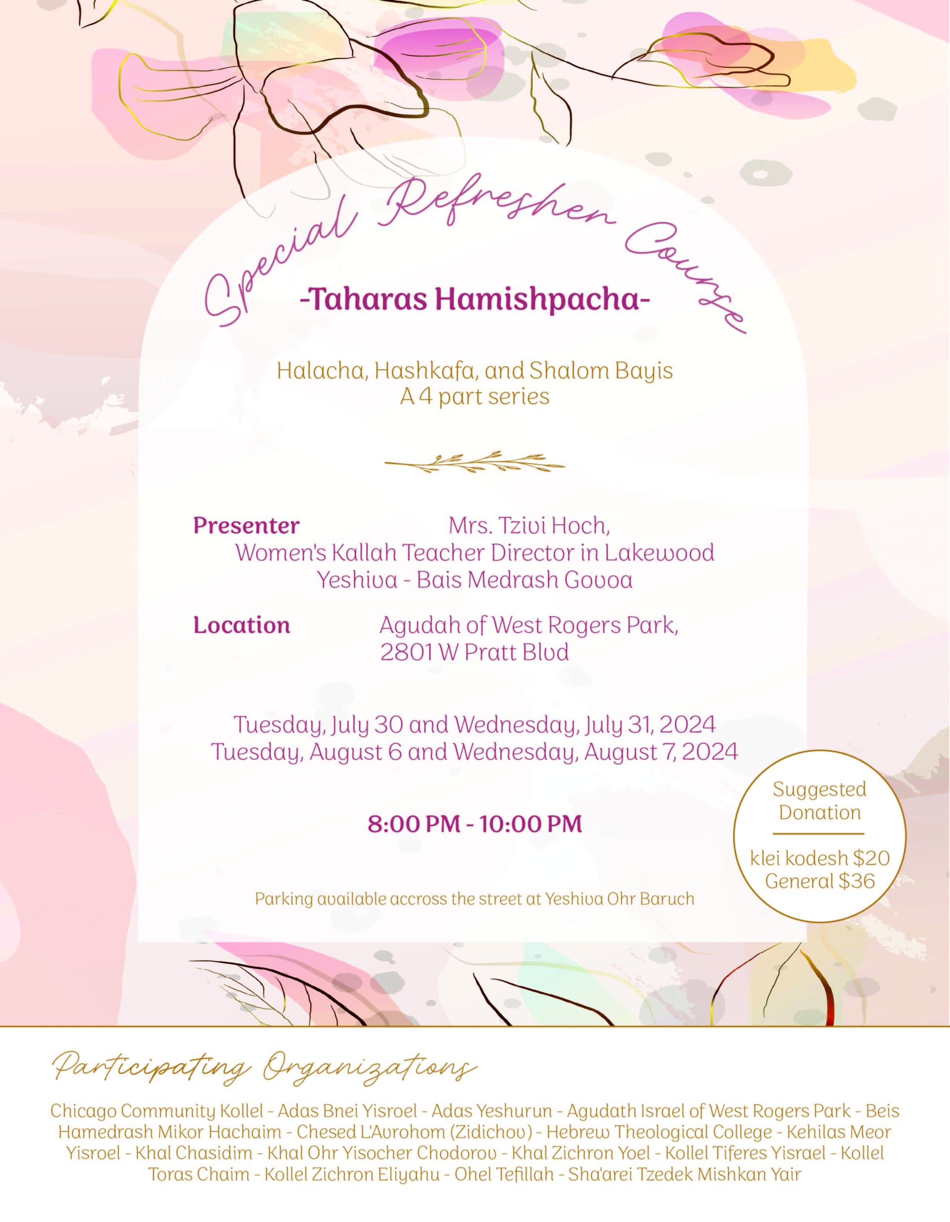
They wanted some more information added. I am trying to make it not feel to cluttered or text heavy though. They specifically want the participating organizations big, but I am having a hard time not letting it take over the flyer. What do you think?
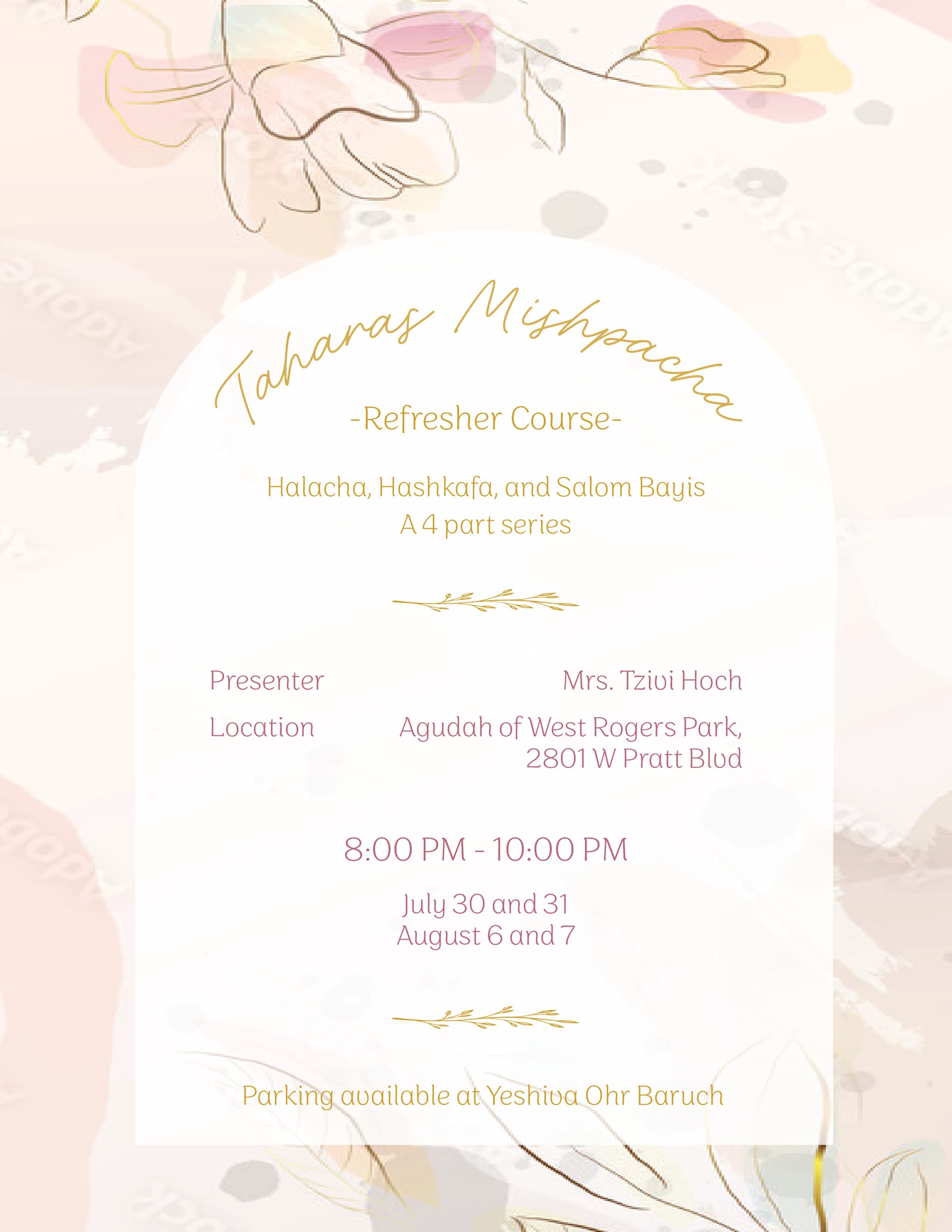
On my screen it shows up on here as almost a neon pink Not sure why. However, it printed not that intensely. 
In general, is there a way to make your screen match up better with how it prints?