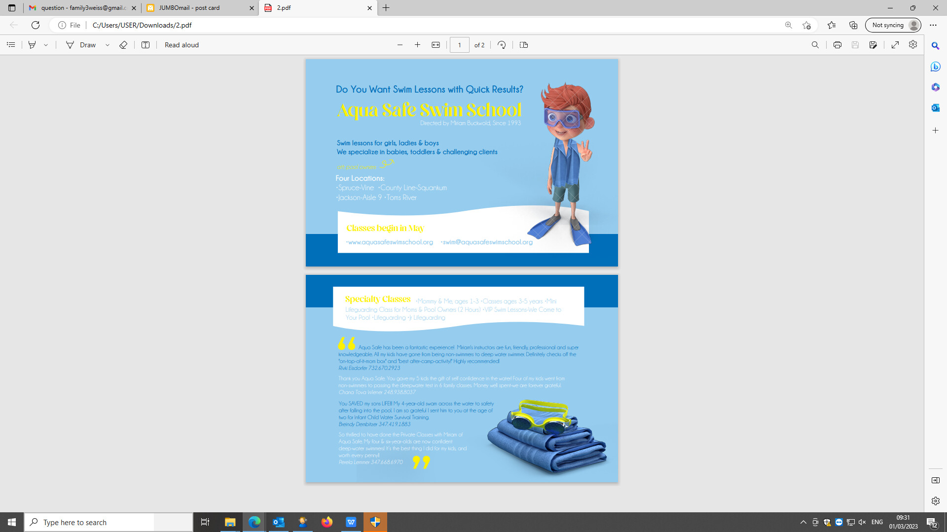
How can I work on the readability and clarity of the text? This is for swim lessons for both girls and boys, does this look too boyish?
@breindysalgo I was wondering how this pixelsquid works, once I purchase my image, do I get it in all angles, or do I pay each time seperately.
use bolder, darker fonts for the smaller text to improve legibility
really cute pics and colors
Thank you, should I change the font, or use the same font in bold like I did for some of the sentences?
You pay for a subscription (you can do just one month - I think its about $20)
Once you have a subscription you can download limitless amount of angles as a png or psd
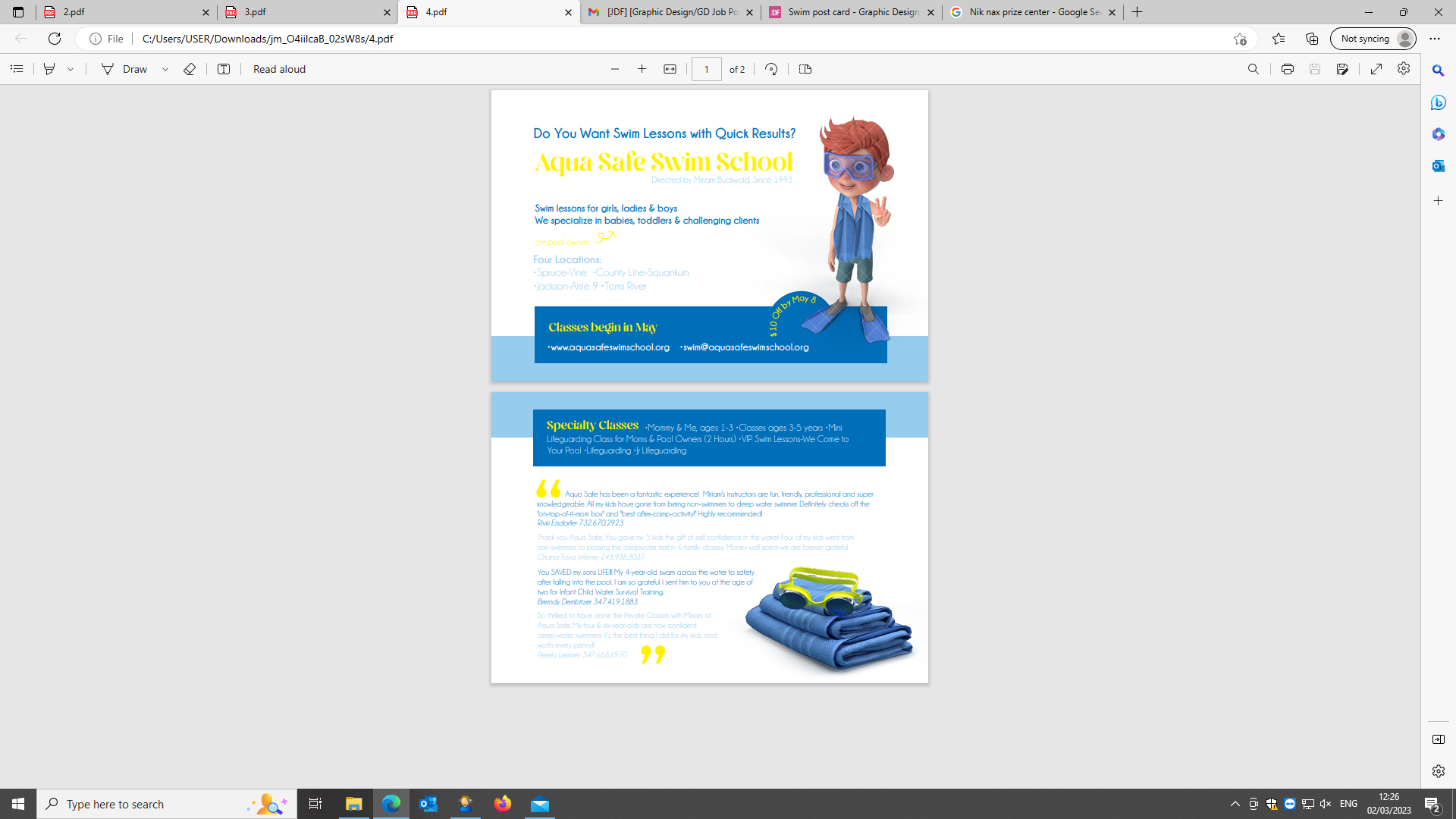
I have not yet worked on the fonts, just wondering which one you would opt for of all these options. My client can’t decide and I think would be best for me to focus and perfect only one of them.

Would love to hear your thoughts if you have a minute
Love the second one especially if its for girls and boys.
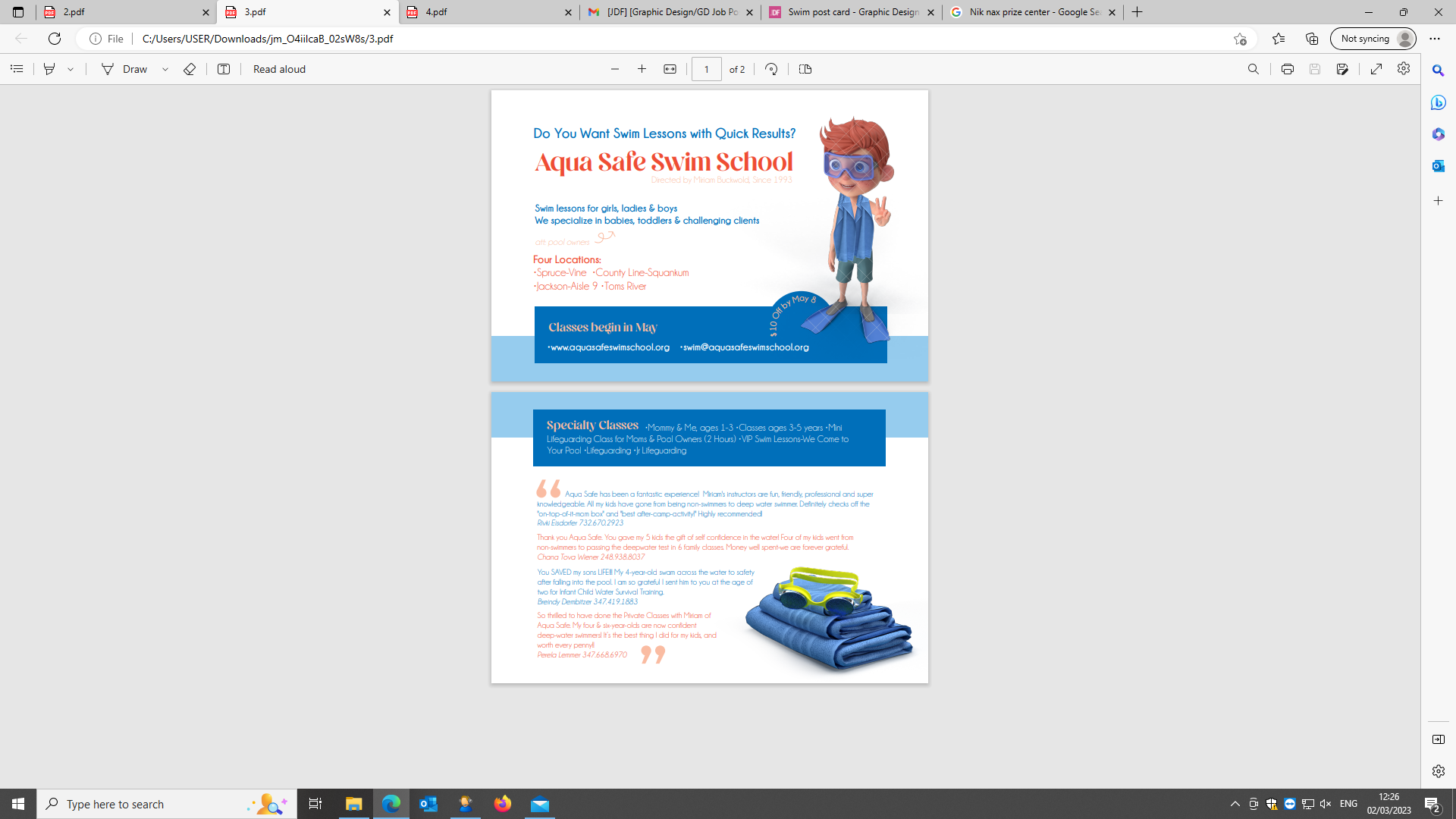
The red gives it a sharp focus. I would make the titles in the blue box the same red and the 10% off.
Really nice job!
Thank you for your suggestions. I added the red and sent her all. She ended up going for the blue and yellow one.