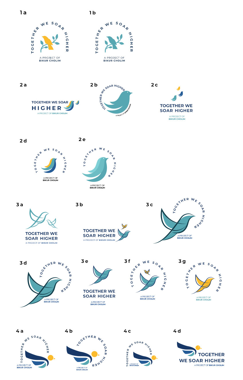
Hi,
I created some logo options for a mental health support group and need some help narrowing it down to much less options to send to client.
Also, would love to hear if anyone has any ideas how to make it more feminine. client wanted the logo to match their brand ( attached their main logo as well)
Any other feedback appreciated!
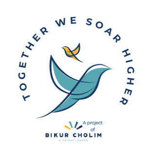
Hi, it looks really nice! How come you used a bird only? coz the middle ones all look a bit like the twitter logo… especially 2 and 3, i like probably 1 the best but i think i would change the layout maybe of the text to similar to 4d maybe? 4d is also a nice choice though i would simplify the bird there maybe take away the beak and eye, but again making sure it doesnt look too similar to the twitter logo… hatzlocho!
I like 3f too! the stroke on the 3’s give it a softer, warmer effect. And the second bird takes away from the twitter look… They are all really great!!
Even if twitter changed their logo people still associate the bird as their logo. It might not be a copyright issue but you don’t want to give off the wrong impression.
I like 3b and 3f (but make both birds facing to the right). Those birds actually look like they’re soaring
But I do like how the 4 logos match the bikur cholim logo better