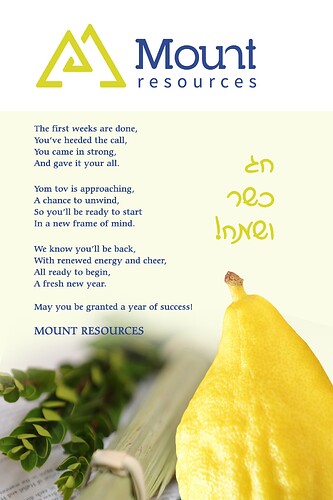
I was asked to design this card last minute for the company to send out to employees.
Any critique? Also, can anyone please advise what would be reasonable to charge for this as I am beginner and this was a rush job.
Nice! The pic is great! (Is it from frock n stocks?)
I think you should extend the top of the image until the top of the page since the white is making the card look divided…
The logo isn’t centered properly in the middle… - align center to the page
Maybe Mount Resources on the bottom shouldn’t be in caps and should be in script - it gives off a signature feeling…
I also think the chag kasher vsameach is a bit small - make it a drop bigger and tighten leading
She already wanted to send it out and she loved it as is, so I didn’t have time to do corrections. Yes, the pic is from frocks in stock 
Can anybody give advice as to what would be reasonable to charge for such a project?
It was a rush job and I wrote the poem for her.
Any advice would be appreciated!
Thank you!
