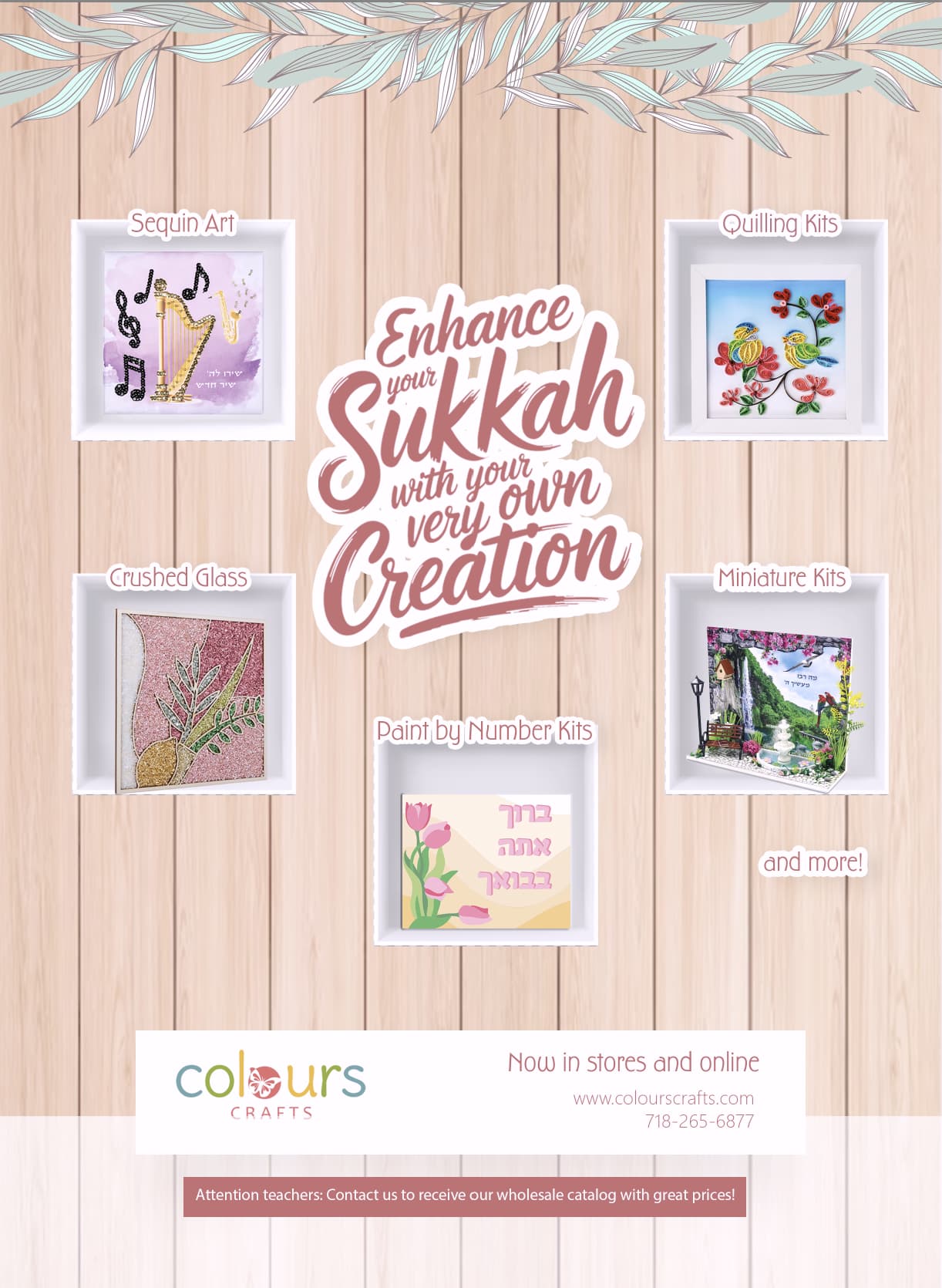
Any ideas on how to fix up this ad? I feel like something is missing…
Thanks!!
Love the concept! Can you make the boxes cleaner? Maybe lower the shadow and make the actual objects bigger. I would also change the font used for “sequin art” etc to something a bit more modern and bold. Can you somehow incorporate the boxes into the background? I like how you’re making it a sukkah wall, but the boxes look very “added-in.”
I would also stretch out the orange-ish box to be even with the white one (on the bottom)
I think if you darken some of the coloring it will pop more and be perfect.
All the maroon coloring should be darker and sharper for contrast
The words by each image should be a little bigger.
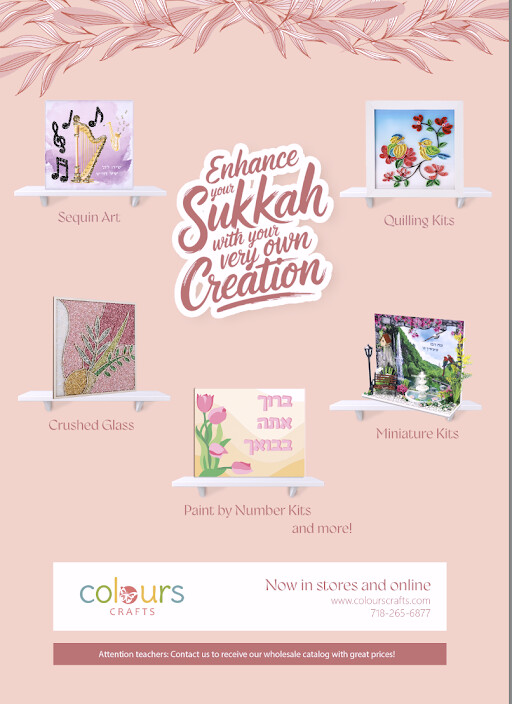
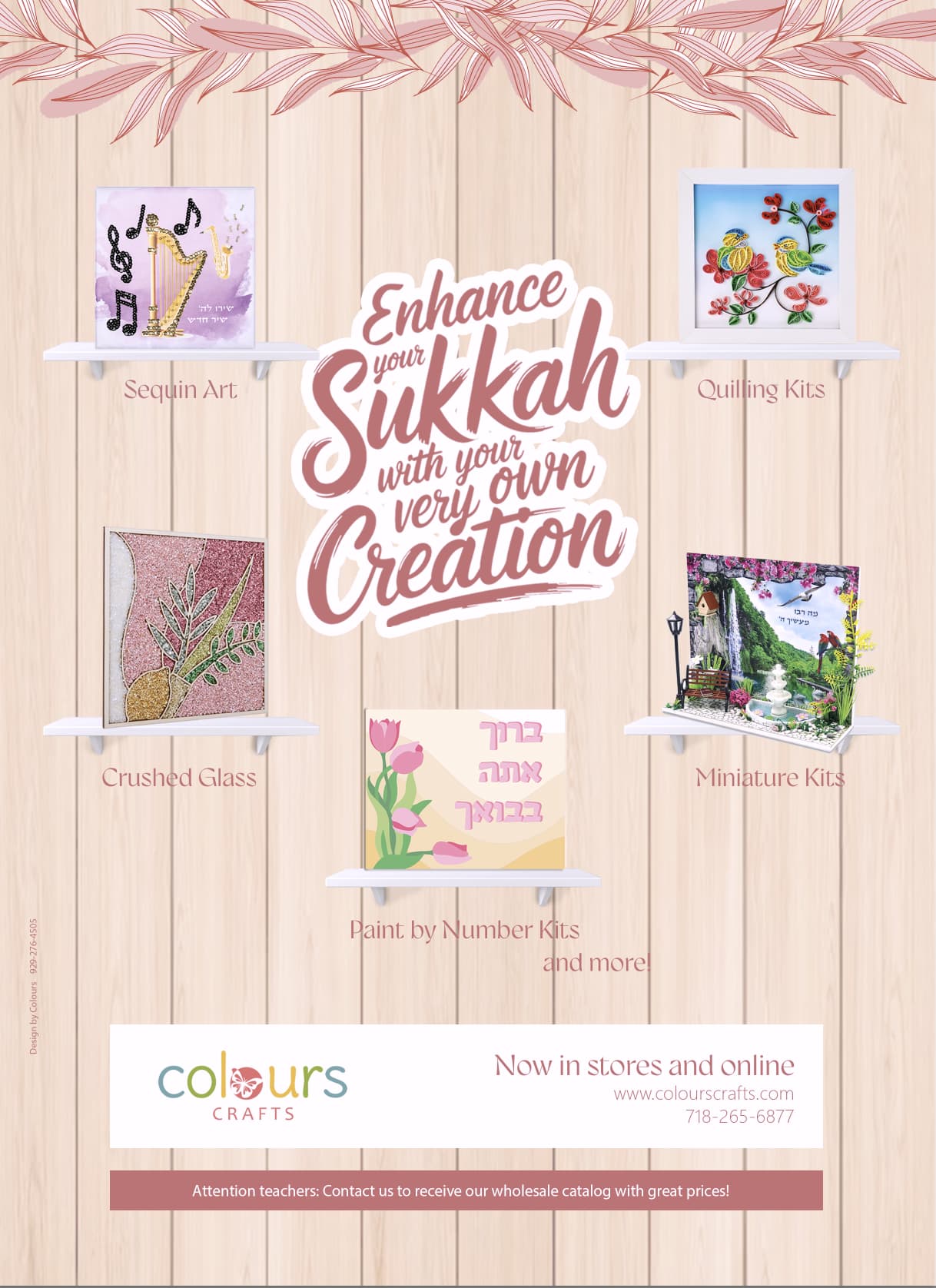
I like the new way you portrayed the projects but I liked the old wooden background and the green leaves
I second what Breindy-s is saying!
Agree, objects like the second but use the first sukkah. Make title bigger on second one, like the first.
Its looking really good!!
Maybe bring in another color for the words.
Yes, bring in a darker shade for the words. You might want to darken the headline text also
Maybe extend the shelf to have a “mini sign”