chavi
18 December 2024 16:52
1
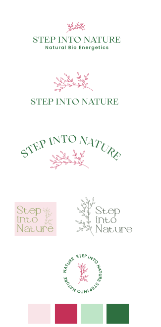
Hi everyone!
I just designed this logo and cant decided on a specific one.
Hes called step into nature, he does HK work and is an herbalist, so I went with soft calming colors.
He only needs it for his business card and to hang on his office door… So Im not sure he needs the tag line or I should just skip.
Any critique? feel free to share!
chavi
18 December 2024 17:05
2
last one is the icon I would use in addition to the logo I end up going with.
I like either the first one or the second. Very nice!
Laya2
19 December 2024 15:05
4
I like the first one. The pink is quite feminine though, maybe switch it to a more beige pink
Ruchy1
19 December 2024 16:53
5
I like the fifth one, but maybe change the colors of either the words or the flower to make it stand out more
i like the first and second… i love the font you chose. it looks very good
chavi
13 January 2025 16:44
7
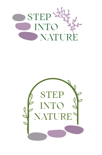
So my client had something totally different in mind. (I love when they realize what they want after you design something
Any thoughts on these?
LOL, that’s why I always ask them to send me some samples of designs that they like and explain why they like it…
Rtv
13 January 2025 22:53
9
really nice concept!
chavi
14 January 2025 01:01
10
Thats why originally I did only 2 colors but they asked for a try of these exact colors. Mabe Ill try with some of these colors and see what they say.