I’m working on a double-sided square flyer for an equine (horse) therapy company. Client wants something with lush greenery, and safe and welcoming vibe.
None of the text is finalized yet, I’m looking for critique on the design. All comments welcome
Thanks!
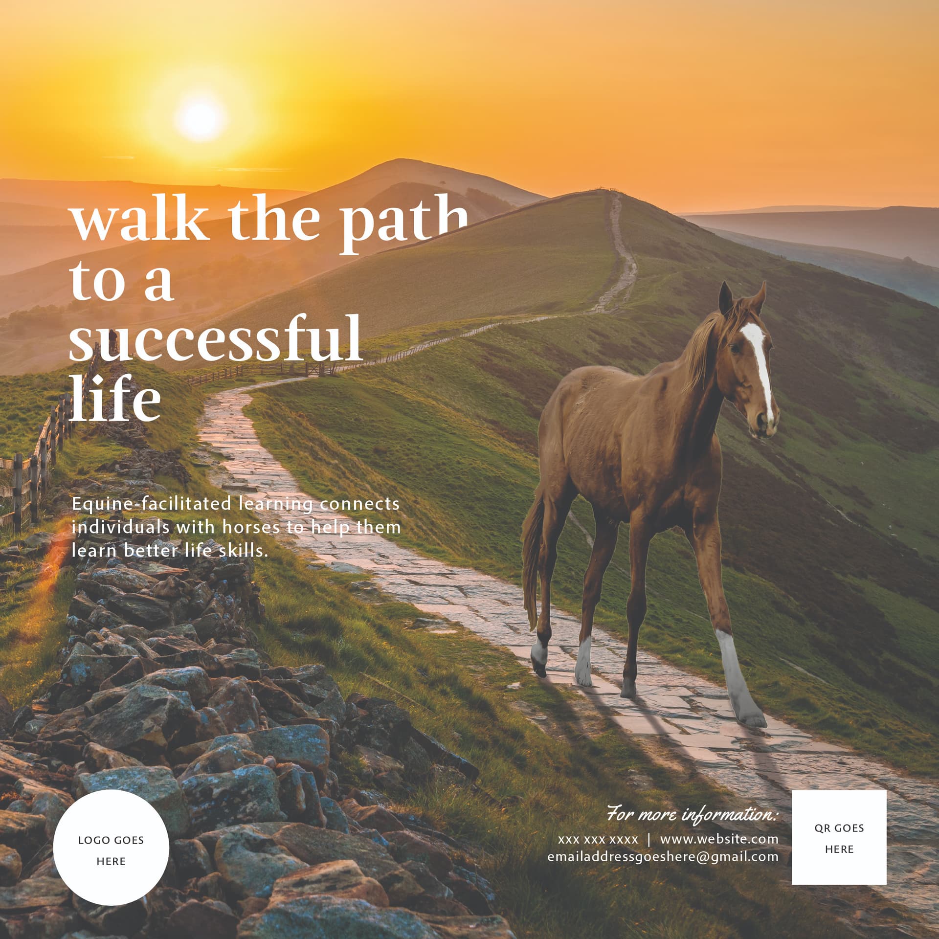
horse not looking real didnt bother me - it is a lovely calming image i would say to keep it…
the sub text on front side ‘equine-facilitated…’ is hard to read over the background - but if their logo is clearly about equine therapy maybe you wont need the subheading? and us aid text not final anyway
also i’m wondering if you need a more happy/healthy looking person with a horse even tho that girl is cute and nicely modest! but you may want ppl to feel they are going to be happy after the therapy by showing that emotion… if the ad is targeting parents/educators rather than potential clients themselves though it may not matter… i would say it def has the safe and welcoming vibe with muted colors etc… i’m just not sure red is the right color… maybe a light blue or green are associated more with saftey…(red is warm but also more of a danger/warning color)
u can also ignore all my comments - it’s really good as is!
Looks really nice! Love it!
Just an idea, try adding some of the yellow/orange from the sky, or some green from the grass to the back of the card to tie it together.
Looks great! Perfect vibe.
i agree with Sara to incorporate some of the yeloow/orange on the other side and the horse did attract me as too skinny.
Regarding the Logo Info and QR code, make sure they are all aligned at the bottom.
The horse does have a dreamy look to it, but I kind of like it. It matches the style.
On the back, in the grey and red boxes, the margin seems a bit too much to the right. I would move it over a bit to the left.
@schlomithsassoon does this look any better? @rivkah I changed the color from red to blue, do you like this better? I kinda liked the red, it tied the sunset in well @Silo@miriam I lowered the opacity on the black overlay so that the background is more visible, does that do the trick or do you think I should still add something to the back? @al1 Does this look any better?
Leaving the horse and girl for now - does the horse look natural in it’s setting?
I like the red better as well.
I think the horse looks very natural in its setting.
Regarding the alignment, I think what is throwing me off is that the bottom right text goes all the way to the edge of the imaginary box. I feel like it should fit within the margins of the other boxes. Do you get what I am saying?
It’s really nice!
I just think that the horse’s legs look funny, they’re bent at awkward angles and very skinny. I think horse’s legs are usually more bent when they walk. I’m assuming this is the only horse you can find that was walking in the right direction for your path. It’s really not the end of the world if you use this one
yup i agree the blue not as good as the warmer red
i like stronger coloring of front side and sub text easier to read now although hoping will be less text for you so you can make bit bigger/clearer
horse on front does look a bit surreal but i dont think it matters…