Hi everyone!
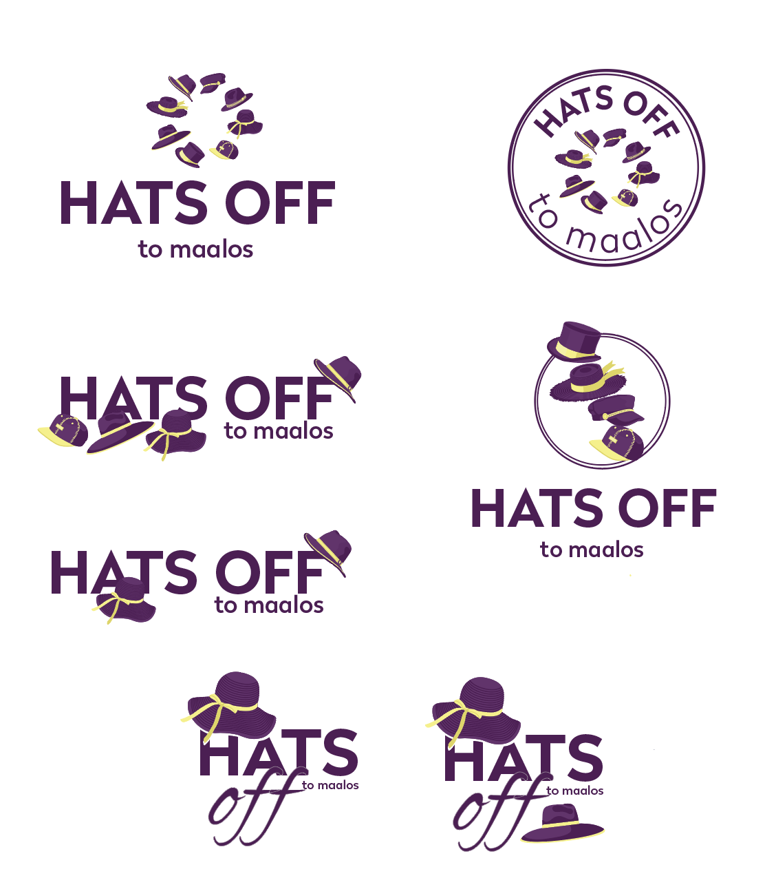
Someone asked me to create a camp logo for a special needs adult camp.
The camp theme is HATS OFF, they want all different hats in the logo e.g. farmer, baker…
They dont want it to look childish but it is for special needs. Any bright ideas for a logo?
I feel like its the font and colors will make it childish or not.
Letters wearing the hats.
Assorted hats on the ground in front of the words.
Hats strung to the words like balloons? that might be too childish…
How many hats do they have in mind?
How about 1 hat on the A, and then to laying upside down next to the “off”
I like the second to the top on the left side.
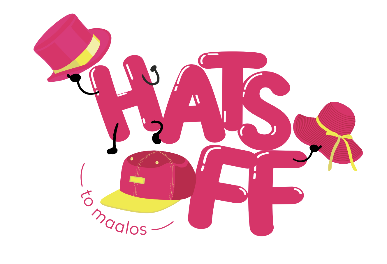
I think they are all a bit too serious for a camp logo. I think you should go for a more fun font and brighter colors
Cute
i like the idea of the piled hats
the circle idea is also has potential
I feel like the bottom ones look like a store logo
I think the text should have more personality