Hi,
Does this ad have good focus? I feel like there is a lot of important text that needs to stand out. Also - the client wants it to look educational but warm and inviting - does it give off that feeling?
Thanks!
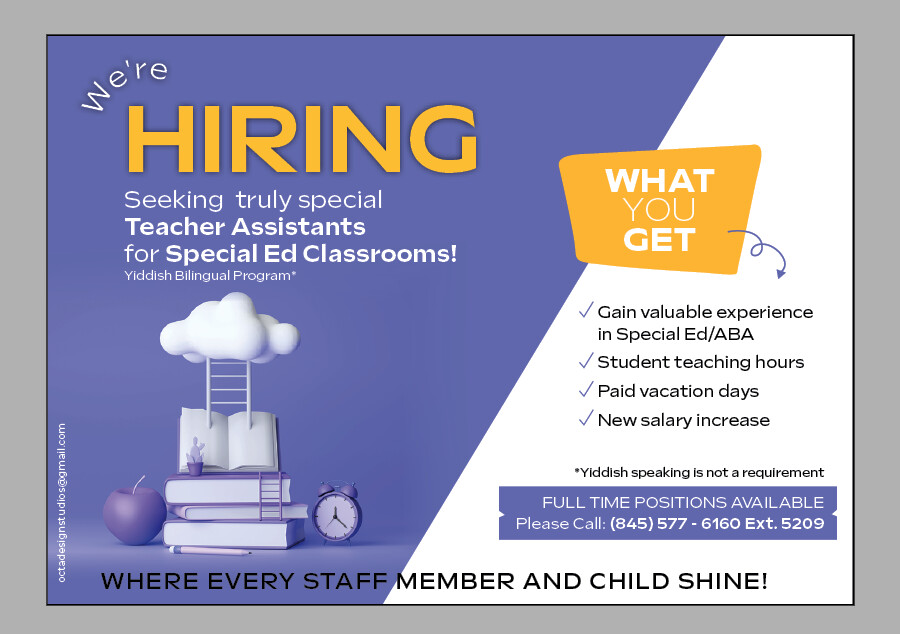
Can you pick a more striking font for the word hiring? Or maybe tone down the orange square a little bit. I think I see both halves of the page right away now
Nice! i think overall it looks great! i agree about picking a more striking font for the word HIRING. Also, “where every staff member and child shines” looks a little out of place there. Maybe make the text a little smaller, put it on 2 lines and put it under the purple box. Move everything up on the right side so that there’s more room for it.
Thanks Chana Miriam and Rivky! Great suggestions!
What type of font are you thinking of for the word HIRING?
Grammar wise, either “shines” or “can shine”
I would change the way it says we’re before hiring I don’t like it curved I would make it straight on top. Also don’t love how the words at the bottom go from the purple onto the white maybe make it uniform across somehow… the picture could also be slightly smaller as the ad is pretty busy atm and that doesn’t need too much focus I think.
my 2 cents:
design is nice.
- are you allowed to use photos of kids? i would think that’d be the most inviting way to appeal to people even though maybe it’s not so standard for a job. or even cartoon kids…
- can you add the institution’s name? or logo? or is this a recruiting agency for a host of schools?
- if you have a say about changing the text, i would change the heading to be something more like - ‘are you looking for a rewarding career?’ and then we’re hiring… coz the focus should be on the audience and benefits to them…
I really love the add. I agree that the we’re should not be curved.
Just wondering breindy, would one have to learn 3d to create such an ad or are there sites where you can buy these kind of images?
Thanks!
I got this picture from adobestock.
You just type in 3d xyz… like in my case - I think I did 3d school
thanks.
I didn’t have anything specific in mind, but I meant a headline/display style font instead of a subtitle font. That way it stands out the most
Hey Breindy, Im just wondering once you download the image are you able to play around with it? Or it downloads as a jpeg?
thanx
Hi,
This image that I downloaded was a jpeg but I think in the past I have downloaded ai or ps files…
When you go onto a site you can “customize” what you want - on the side you usually can click vector or psd…etc.
Also, if it downloads as a jpeg, you can technically play around with it in photoshop…