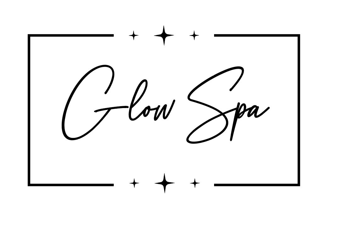
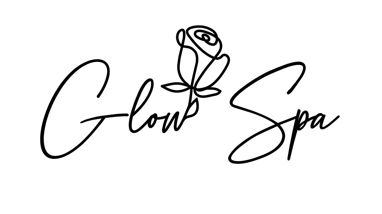
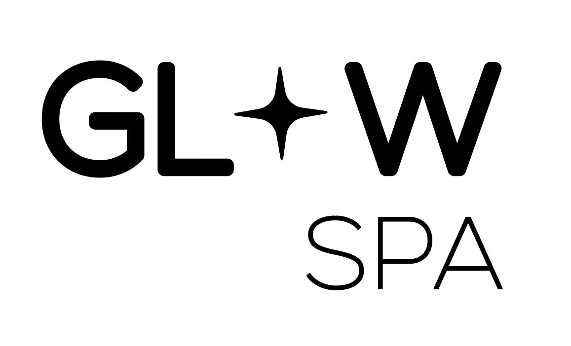
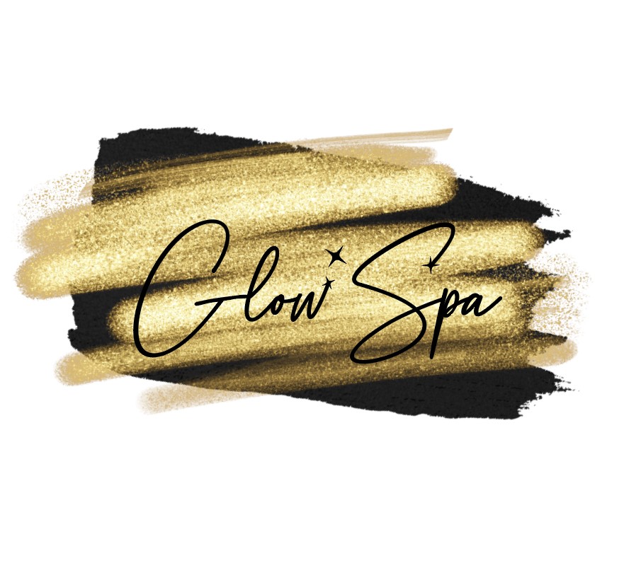
Here are my options so far.
Some of them still need work and also I didnt make color versions of all of them yet, just #5 (i personally like it the best)
also its my first real logo so I would love critique…
thanks!
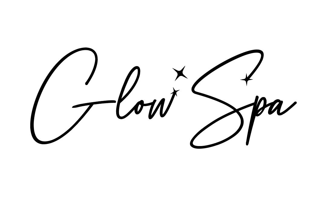
Here are my options so far.
Some of them still need work and also I didnt make color versions of all of them yet, just #5 (i personally like it the best)
also its my first real logo so I would love critique…
thanks!
I like 2 but I think the line of the G needs to be smaller, too much space between the G and L
kay thanks!
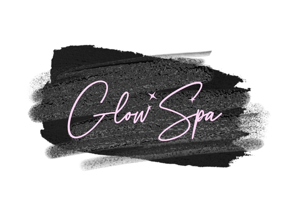
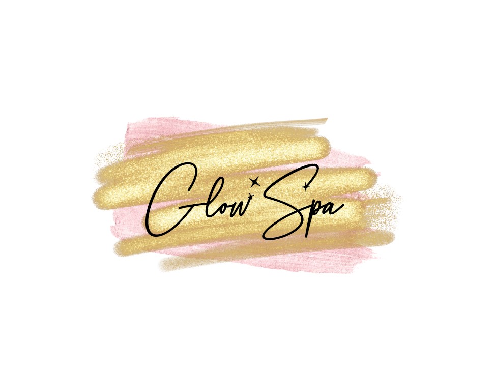
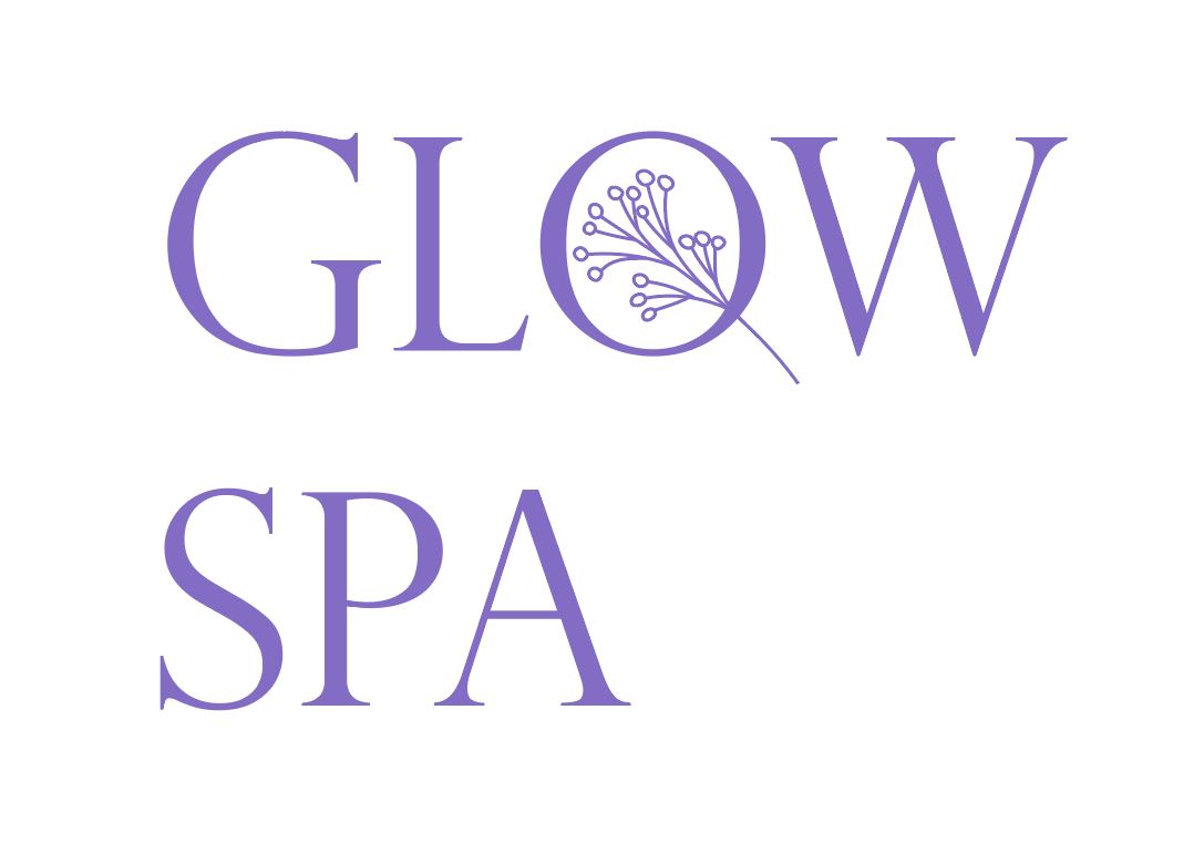
she wanted light pink with a gold background in this one. i dont see any way to do something like that. usually logos dont have backgrounds… here’s what i was playing around with… is this way too busy??
The third one makes the most sense in terms of color. I would find something softer for a Spa
looks really good IMO. i also like the third one.
i think you should still provide her with the plain logo files with no background but then also give ones with the background and it can be part of the overall brand identity.
is the background a vector image you can resize?
and is it cmyk or rgb? many times ‘shiny’ graphics look more vibrant as rgb and you don’t want to get disappointed down the line if you need to make cmyk for printing signs et…
thanks for the feedback! in the end she just wanted a background for her instagram logo.
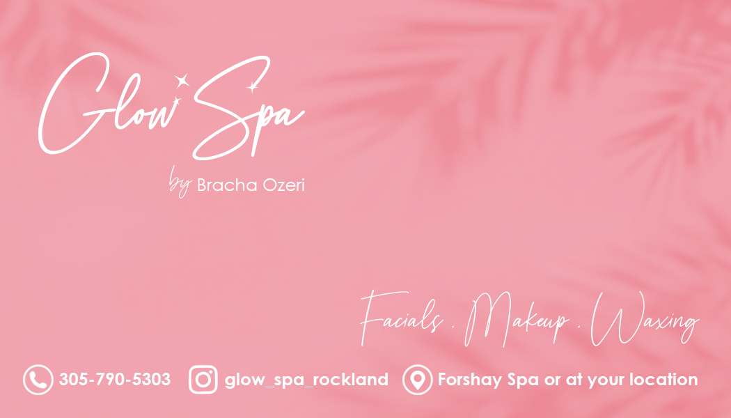
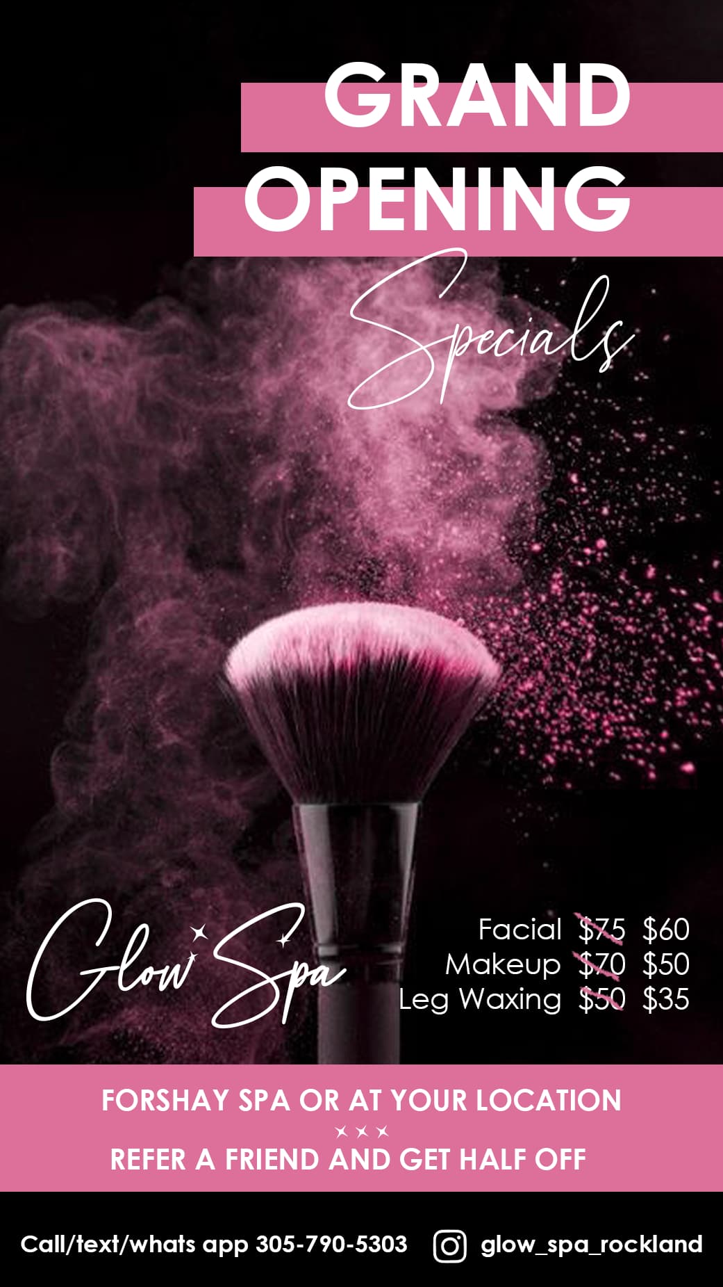
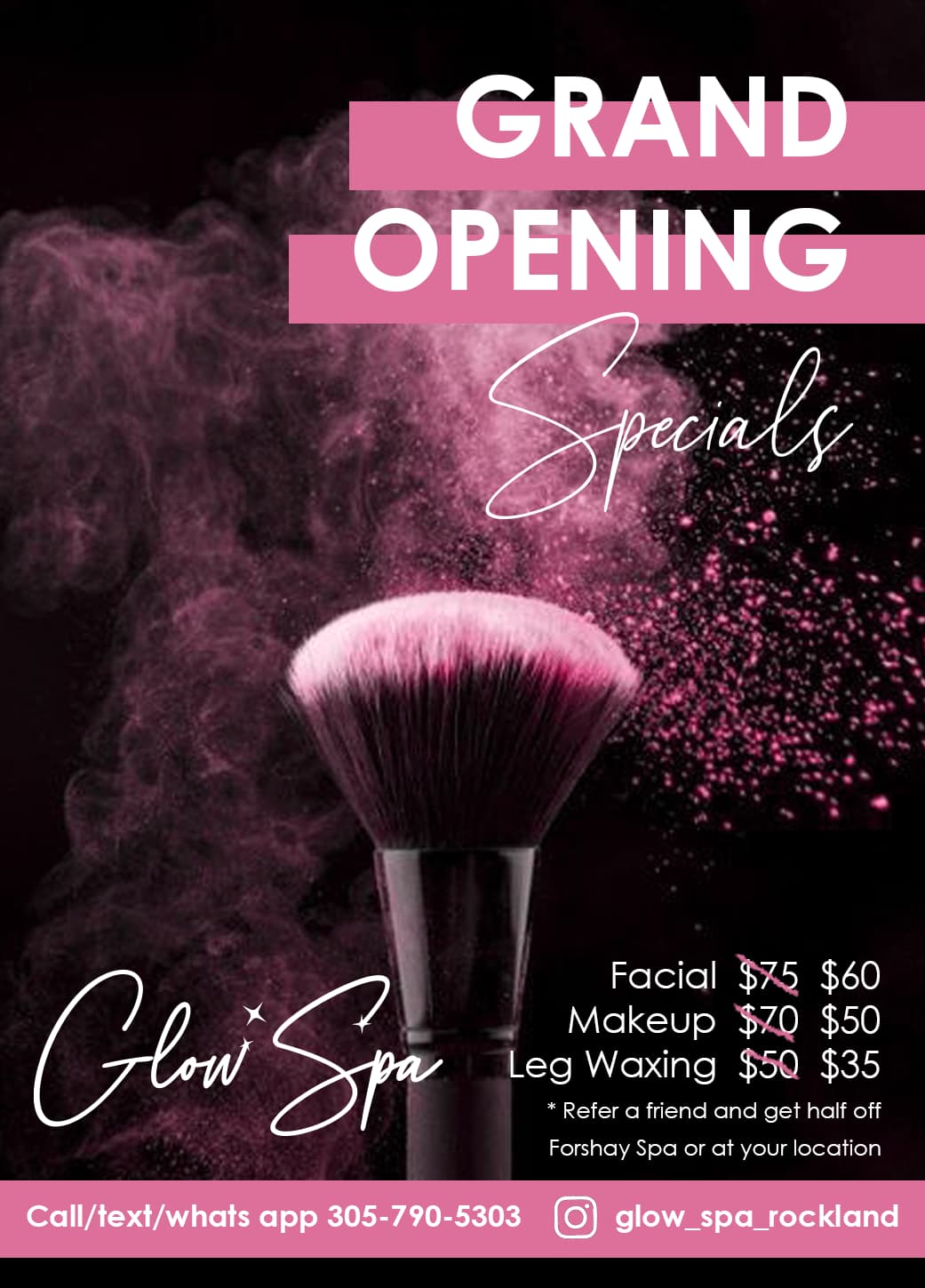
I also made her a bsns card and print/digital ad. I would love critique just to know how i could improve in the future, because she already likes is as is.
Thanks so much!
thanks shevi 
Beautiful!!
wow! really nice 
thanks so much breindy and miriam!!
Really nice!!
yup gorgeous!
ty so much shlomith and rivka!!
Really really nicely done!!! The ad looks amazing Keep up the great work!
thx!!!
Gorgeous! and even nicer in print 
lol thanks!