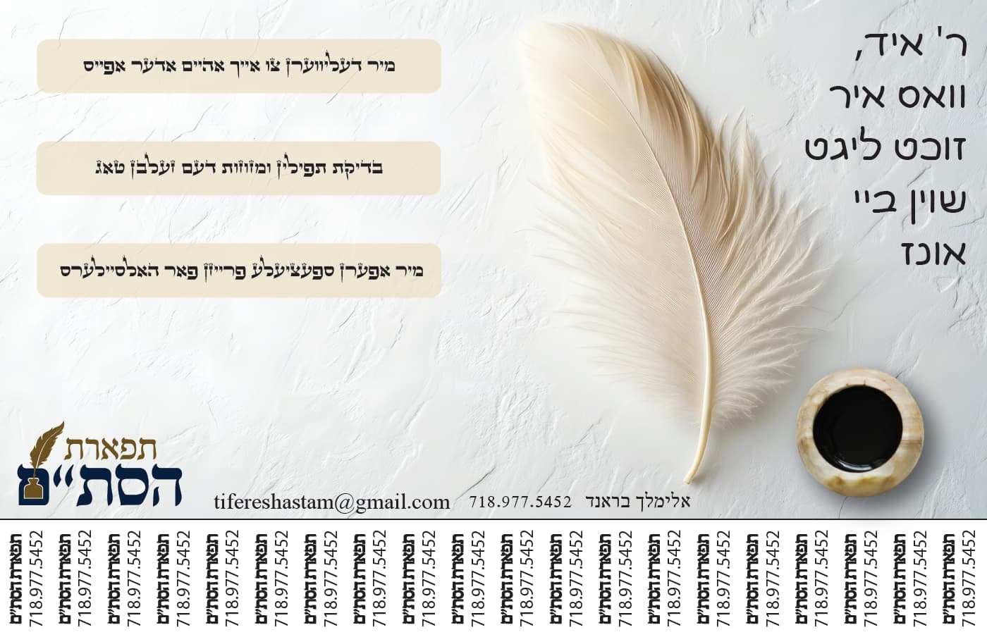
A Sofer sent me an old ad and asked me to update and modernize it. I sent this to him, he thinks the ink and feather are too modern and wants it to be busier. Any ideas?? Thanks in advance!
Old
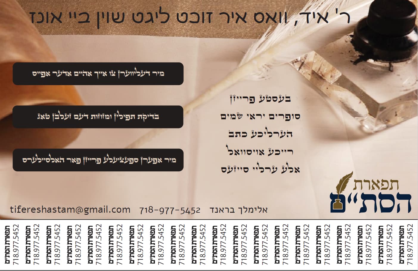
New
A Sofer sent me an old ad and asked me to update and modernize it. I sent this to him, he thinks the ink and feather are too modern and wants it to be busier. Any ideas?? Thanks in advance!
Old
New
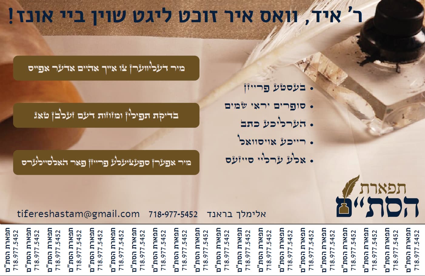
Any feedback?
Love the clean look! I like how his information is grouped in the old one, and sofrim usually do like a busier style for some reason ![]() Maybe you can have a feathered collage coming from the left side of 4 pictures of different items like mezuzos, etc (instead of the icon look he has before)…?
Maybe you can have a feathered collage coming from the left side of 4 pictures of different items like mezuzos, etc (instead of the icon look he has before)…?
Great job!
I would center the text at the right it should be in the middle of the 3 black boxes (if u get what i mean)
Can u get a more interesting font for the title?
And maybe align it to the right or add bullet points
Thanks will work on it
So nice!!
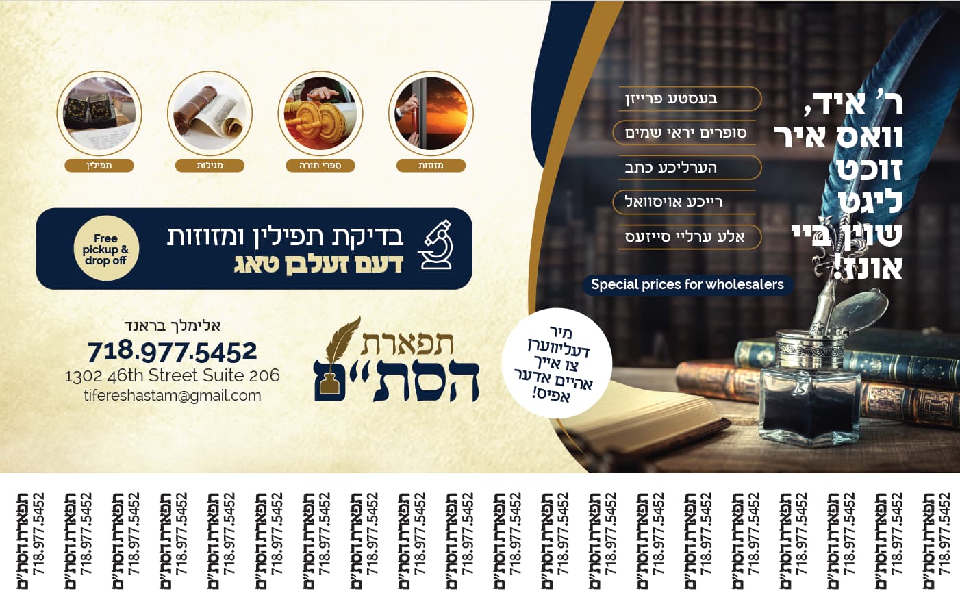
Right now there are many fonts being used (one for the headline, one for the contact, one for the boxes, one for the main info, and another for the pull offs)…
See if you can switch the headline to match the font of the logo, and then maybe make the pull offs and the contact info fonts match. Note how the numbers in the pulloffs all end at the same height. This is a better font for numbers than the one used by the contact details. Also decide if you want to use . or - to separate numbers, try to keep it consistent throughout.
Another thing you may want to try, to give it more polish is to think about bringing in the colors from the logo. Maybe instead of having the boxes and text in black, try to use the navy from the logo etc,