hi any thoughts on this add?
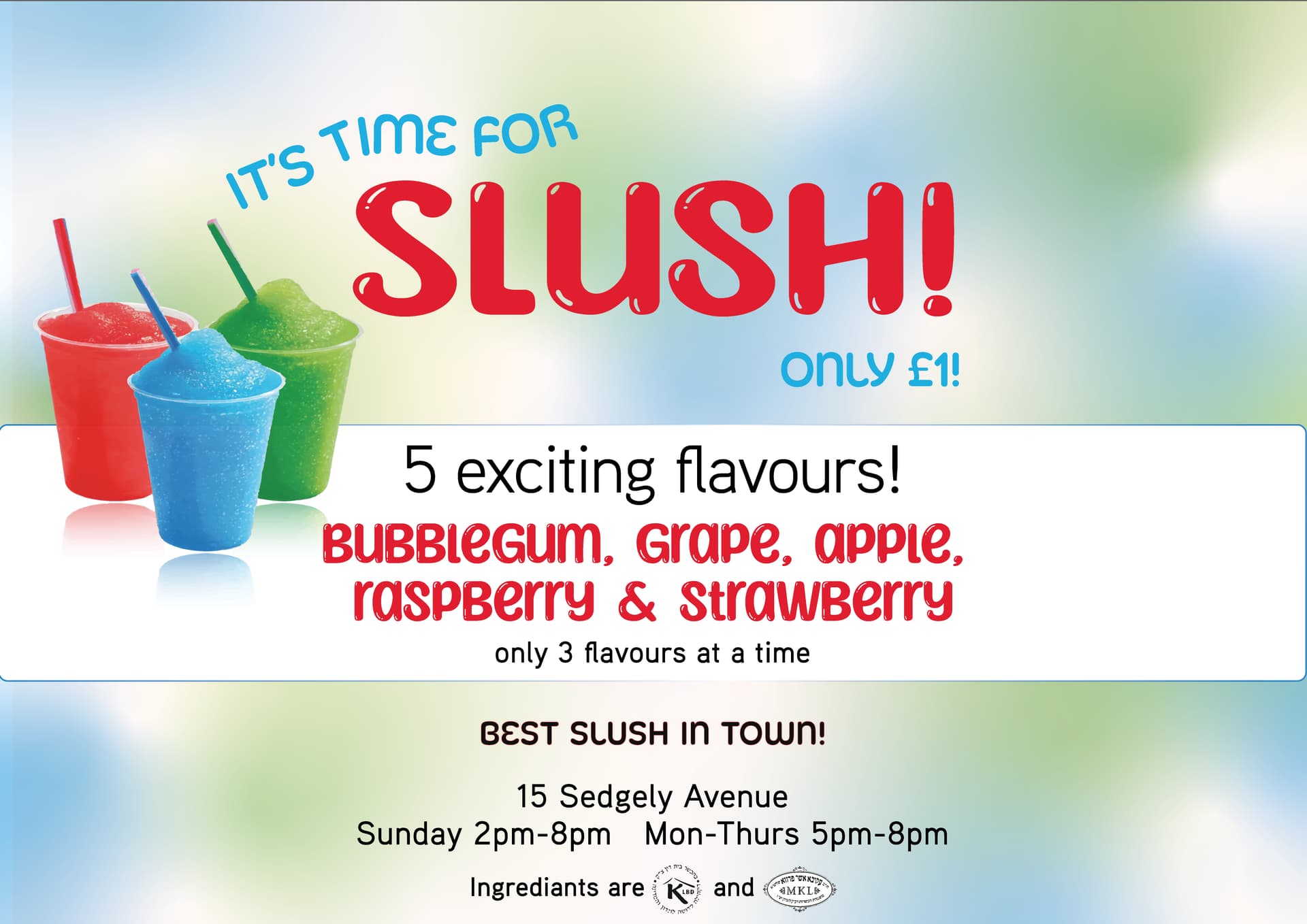
slush-01-01|690x488
thanks
Hi,
It’s cute but I think it needs a stronger hierarchy
I like how you wrote “It’s time for slush” - make it much bigger - right under it, you should write - Only E1 - have it align right to the ! of Slush!
Underneath that, you can write 5 exciting flavors in that blue box - do bubblegum,grape and apple on one line and then raspberry and strawberry on the next line. only 3 flavors at a time is good where it is
I think you should take out the text best slush in town - it feels out of place on top - maybe move it down to the bottom before the address…or take out completely
The address should be made a drop smaller and possibly the hechsher as well.
Also, I think you should only use the top picture on the left - enlarge it when you enlarge the words “its time for slush”
Can you make the pictures MUCH larger?
and maybe more of a subtle textured/fun background without overpowering the text… unless it’s gonna be home printed and you are saving them ink 
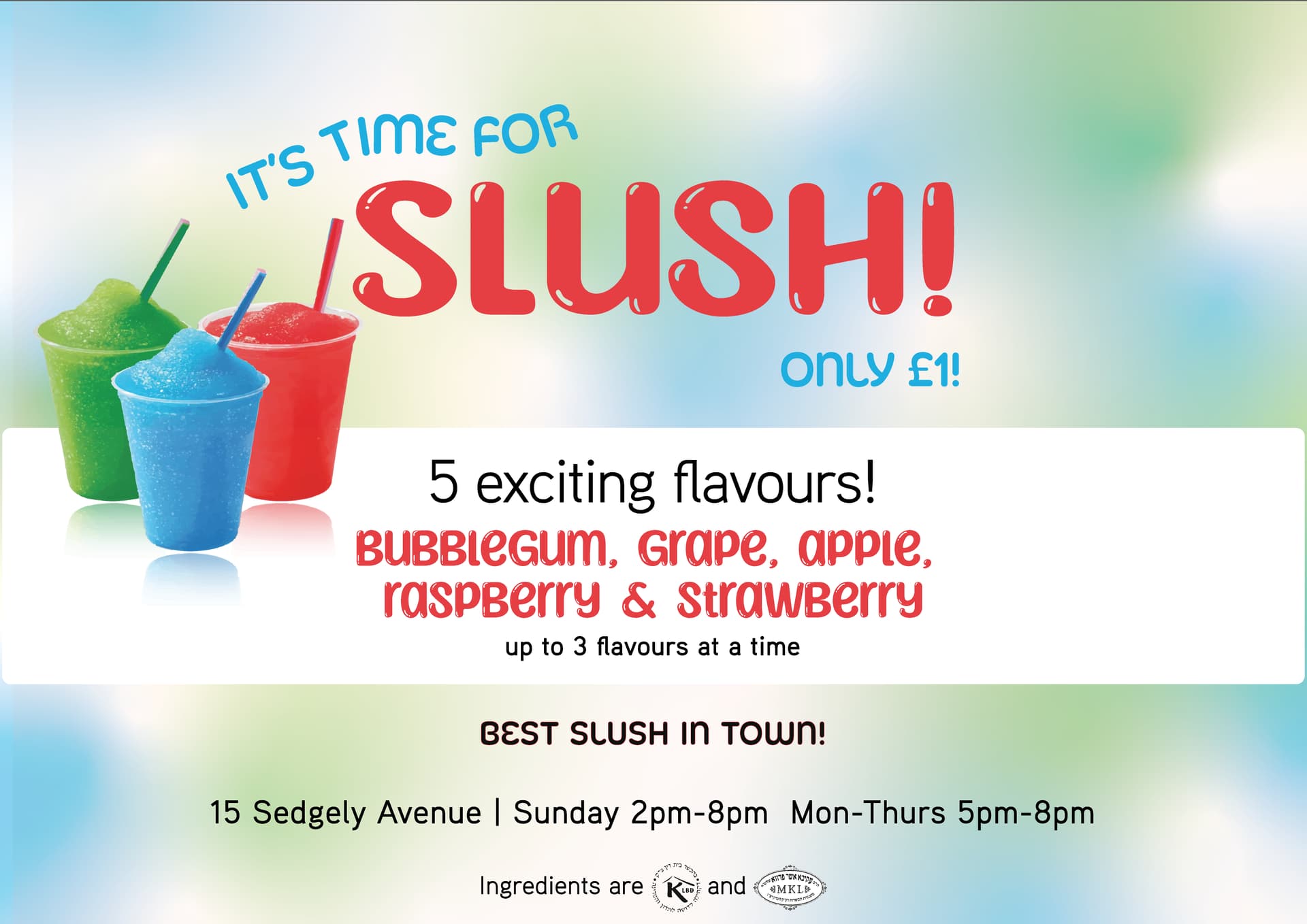
Much better!!
I think you should take off the outline on the white box and you make the address and time on the same line - divide it with a bullet or a little line like |
Love it!
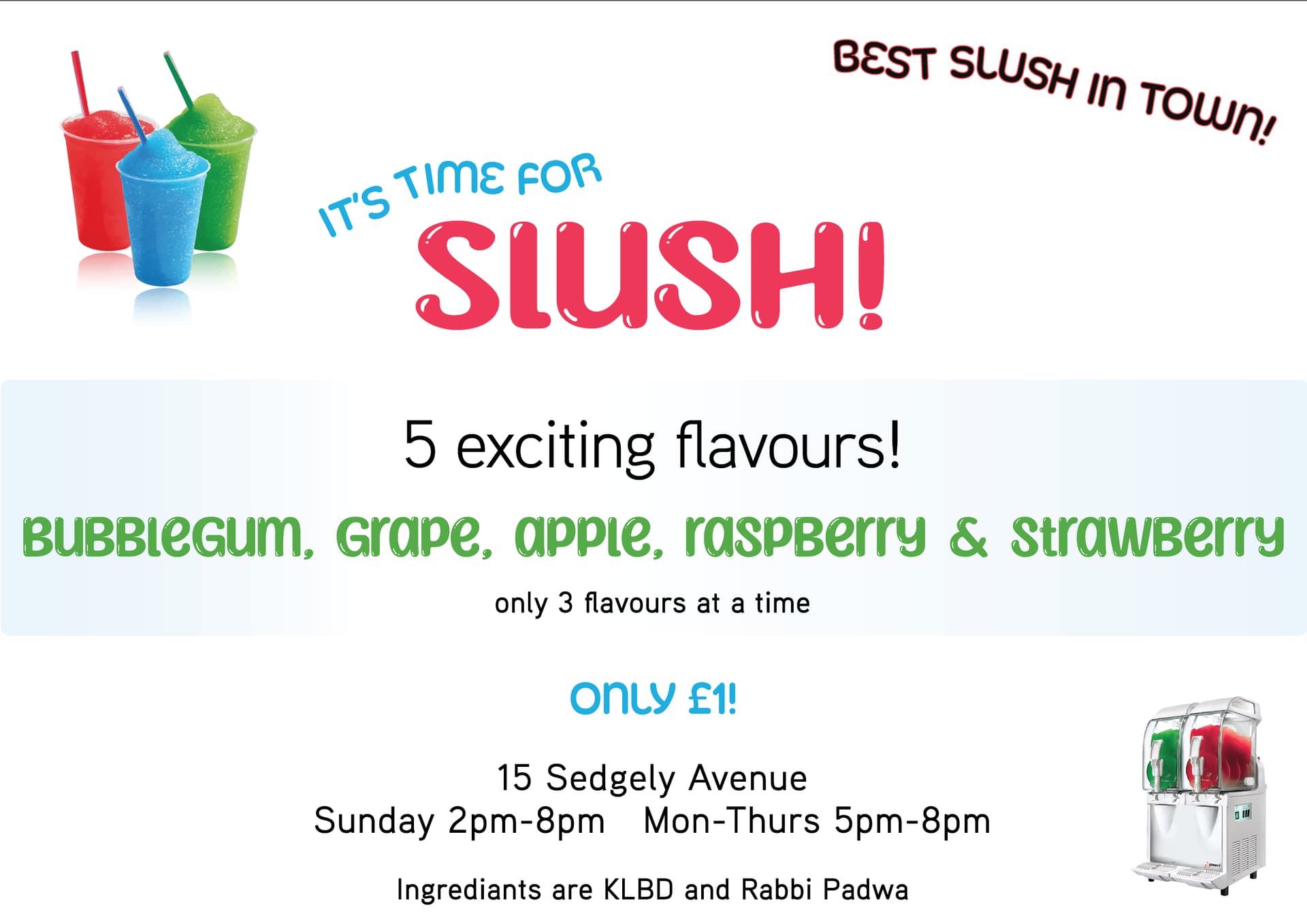
I would take away the outline from the white square and give the text in it some more margin- either make the text smaller or the square bigger.
ingredients should be spelled with an e. you can make that line much smaller and unbold.
Otherwise its really eye-catching!
Looks amazing! Love all the improvements!
Wording suggestion - Up to 3 flavors at a time instead of only 3 flavors?
Good luck!!
One more point, Can you flip horizontal the slush cups? The straws should face in towards the words instead of pointing and drawing the eyes off the screen
can you also either make the edge of the rounded rectangle off the page or fully visible on the page? its getting cut now
slurpee color corrections need to be a drop more perfect
Looks great!
I think ingredients is spelled wrong…
yup i was gonna say the same points
It looks so cute!!
Fun. Really nice!
great job!
thanks! 