client wanted some kind of image of yerushalayim on the card. is it ok or should I remove it for my portfolio. would also like overall feedback. thank you so much
Processing: ruchele hager.pdf…
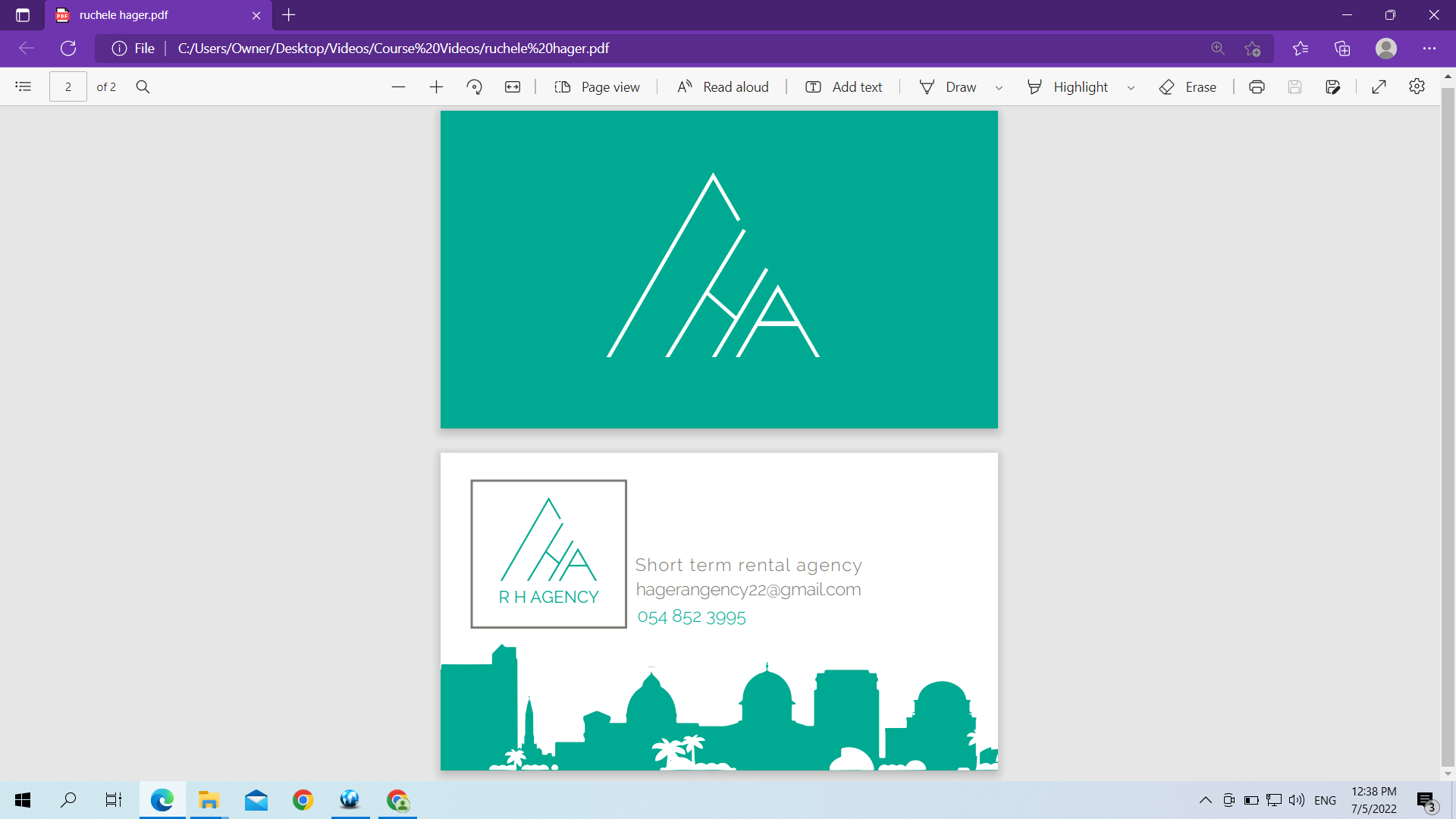
Looks good. Does it need the square around the logo? Maybe try the layout of the the email and phone number right aligned?
will try that thank you. what do you think about the buildings. does it look like yerushalayim or some kind of Arab buildings?
i hear that point - you could try silhouettes of migdal david and the chords bridge instead/as well. looking again, the building on the far left could pass as migdal david…
If that’s too much work, you could simply remove all spikes/bumps on the top of the domes, just leaving plain domes, i think it would make them look more jewishy or at least neutral!
the rest is good.
Does this look better? does the text look ok-right size and right spacing? any changes anyone thinks i could try
thank you so much
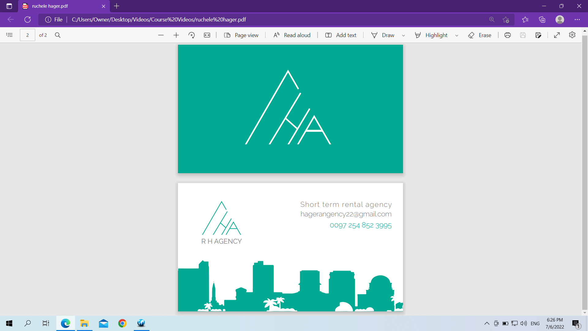
i like the text layout better now.
i would still try and add a chords bridge if you want it to look more jerusalem-y rather than one of the rectangle buildings
Thank you