
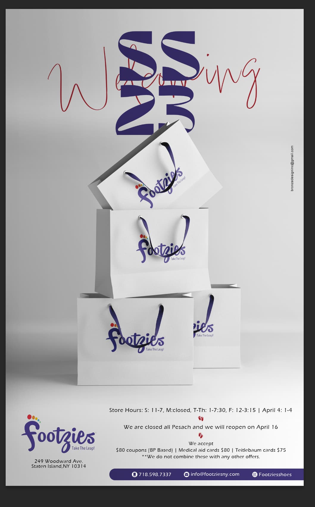
HI. Can anyone please help me with the bottom text layout for this ad?
Thanks.
1 Like
wow i like how you did the render!!
I would move the last section of the text under the blue bar. maybe also put the blue bar centered on the bottom, the logo in the middle and then the first 2 groups of text on each side of the logo.
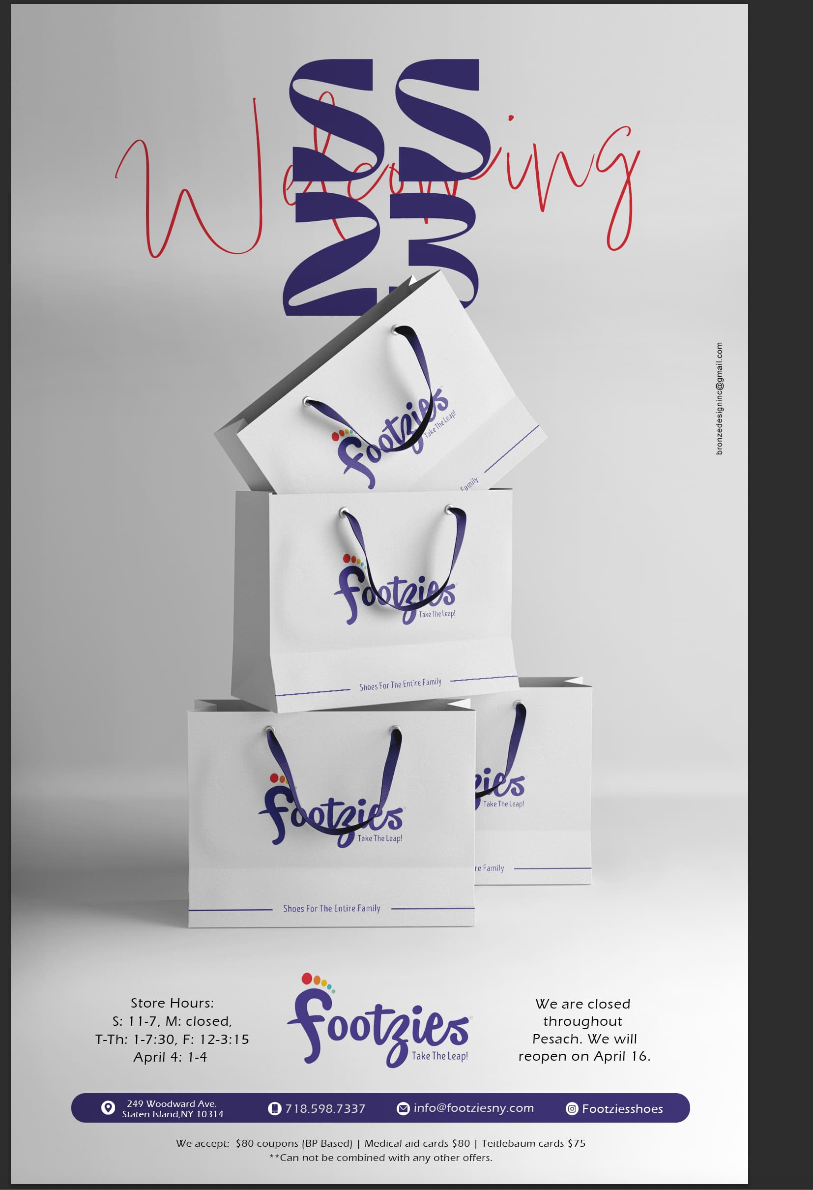
Yes it looks good to me. well done!
Thank you very much.
the contact info looks good now but it bothers me that the word welcoming is being block by SS23 - can you maybe do a vertical line going up writing welcoming near the S and 2? or make the welcoming a little smaller and put SS23 to the right of it
I really love it, I would do as @Breindy-S suggested and also try the welcoming in the same sans serif as the rest of the information…