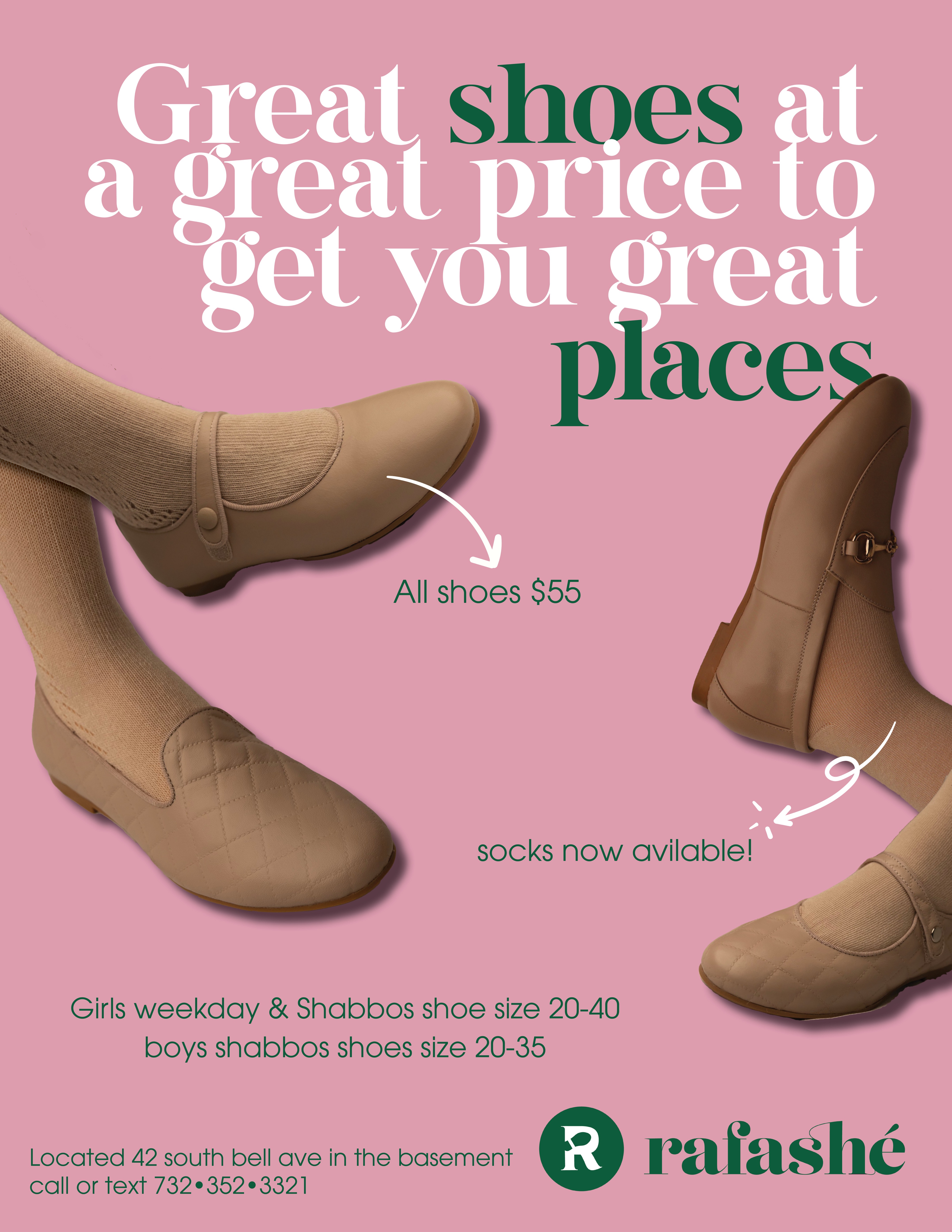
I need to fix the photoshopping of the shoes but just to get a basic idea of what the flyer would look like…
Any thoughts on this design?
cute design!
I would make the shoes on the right a little more in, something is funny with the shadow under the show
make the arrows a bit bigger to add some life
leading needs to be touched up on top
really cute and eyecatching!
i dont know if it means you need to change anything but i actually read all the small text before the headline and the headline last…i think b/c i focus towards the images and also the arrows drew my eyes in…
Thanks! It also seems pretty plain to me. Not sure what else to add
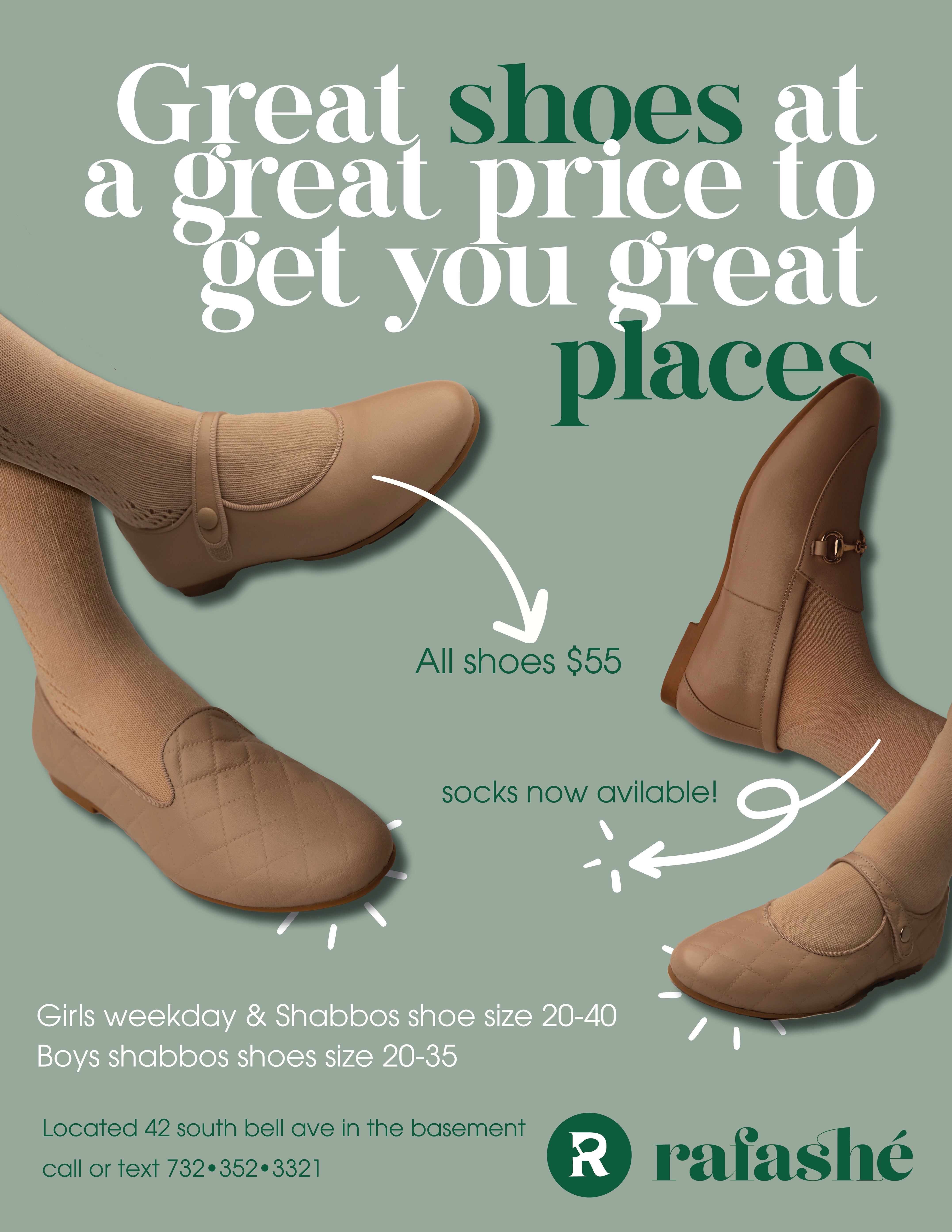
Yes it looks great! love the click marks you added under the shoes
Yes I love these colors so much better! Brings everything together
Nice layout. Are you able to make the shoesthemselves have some color in them, I fell like the image is a little dull…wouldn’t be anything too dramatic as I realize you want to keep it muted, but something to make them look a little more interesting, maybe even more contrast for a bit of a shine would help. For the text, would either color all the Great instances or if keeping it as is seems like PRICE should also be in color. Perhaps some punctuation in the main line would help as well, such as a comma after shoes and after price. And should it say to get you “to” great places? Not sure exactly what it is, but something feels awkward about the wording and coloring on that top line.
Capitalize Socks. Add apostrophe in Girl’s weekday… and Boy’s… and caps for South Bell Avenue. Capialize Call if you are keeping Located caps to be consistent. Fix spelling in “available” Perhaps semibold the two green lines by the arrows, or semibold the $55 and the word socks, but only if it will only be a slight difference from the regular style, just to pop out a bit.
Nice work.
Thanks for all the feedback!
They wanted a lighter and more summery background so here’s another option. One of the shoes coloring needs to be fixed since it’s a little too light so that’s being worked on now.
Would love to hear more feedback!
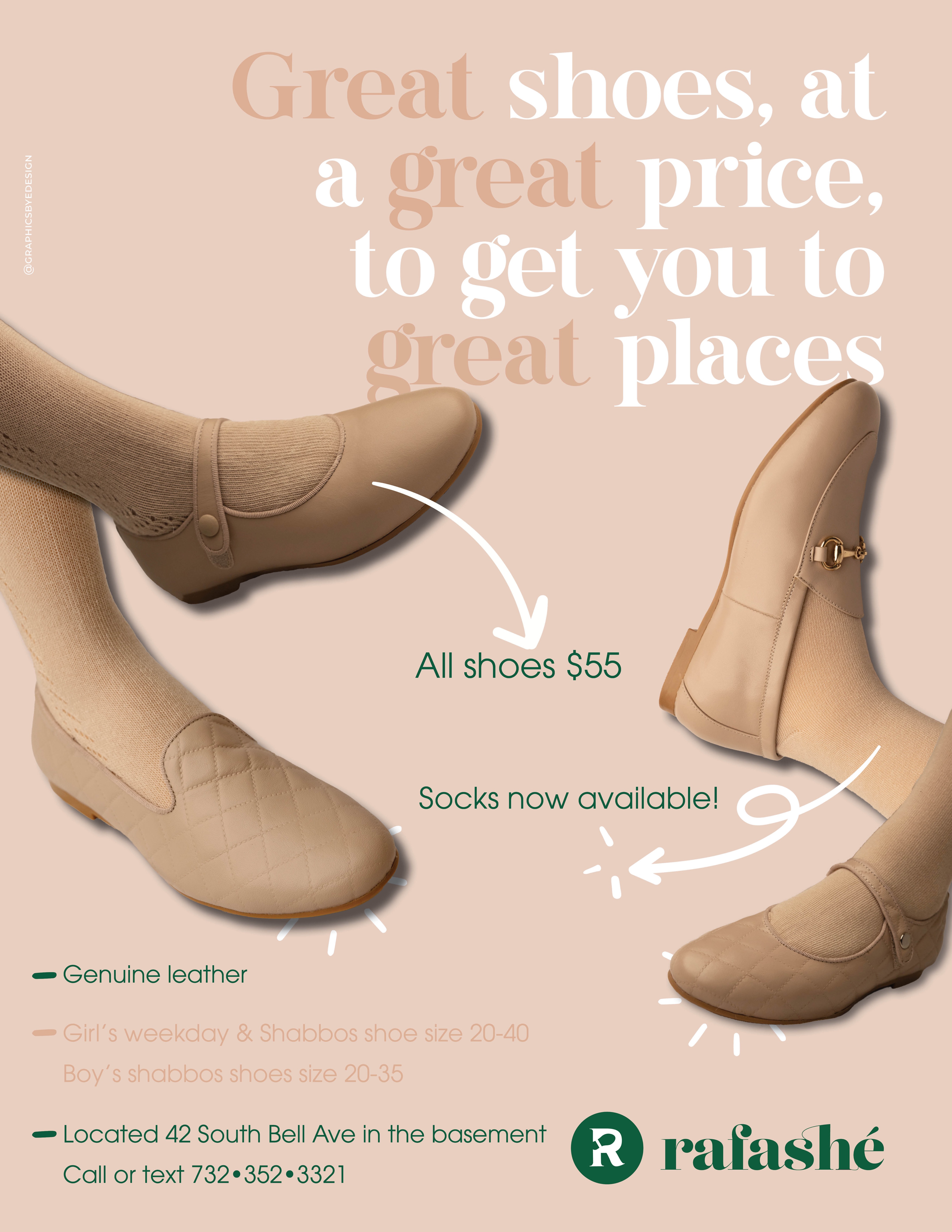
Nice ad! I think the color of the words GREAT has to be a darker shade, and also by the point on bottom where it says “girls weekday and shabbos shoes…”
Looks great.
I think you should tighten the leading for the 3 pointers.
I think all three pointers should be green
looks great and making me excited for the summer 
They had some more information to add to the bottom of the flyer. I feel like the bottom is a little text heavy especially since it’s all in green. I can’t really bring the pink down because it’s too light for the text.
Any suggestions? And any last final thoughts on the overall ad?
Thank you so much for everyone’s help!
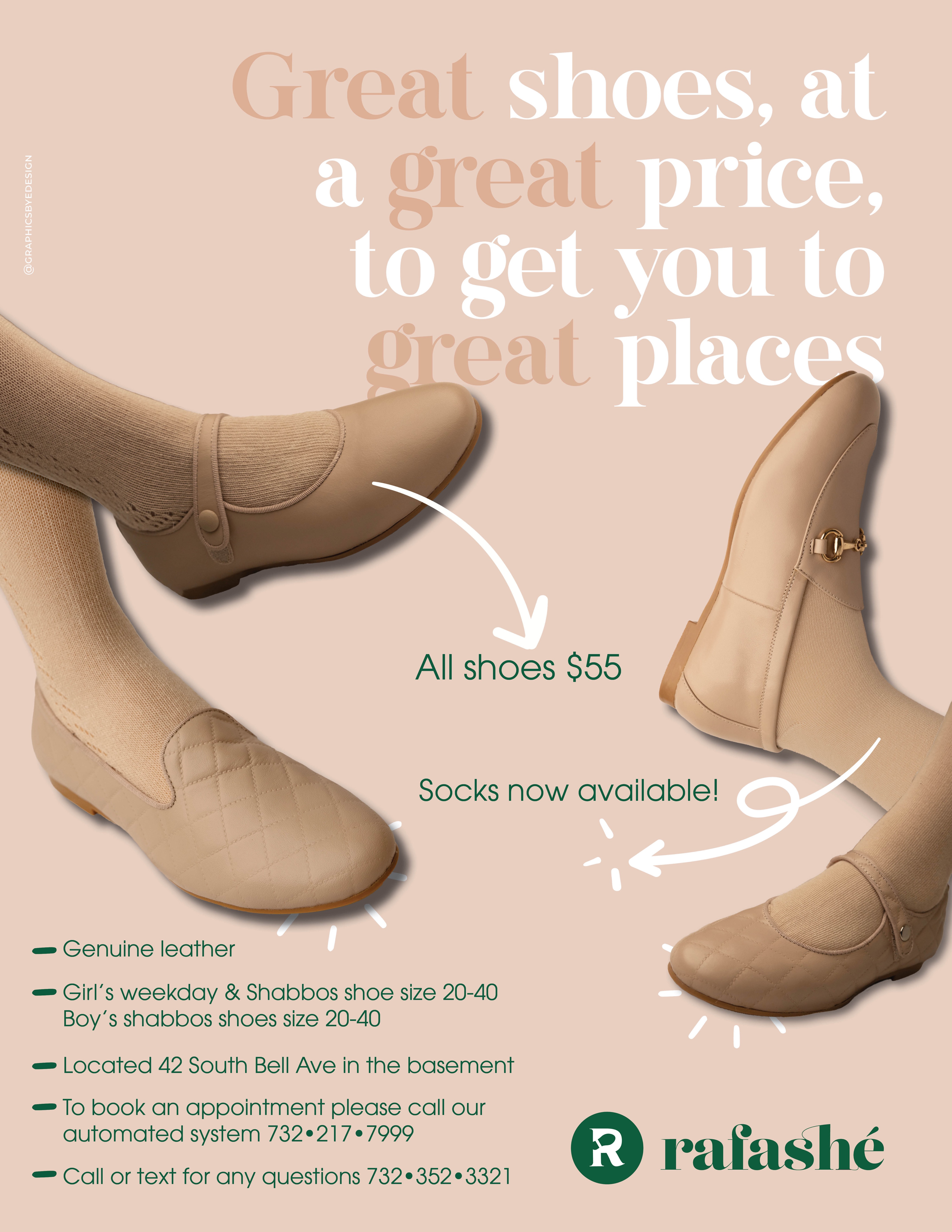
I was in a little bit of a rush to send it out this morning so here’s the final version!

Really nice job!