Hi everyone!
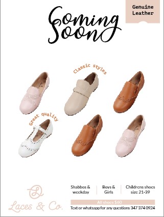
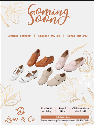
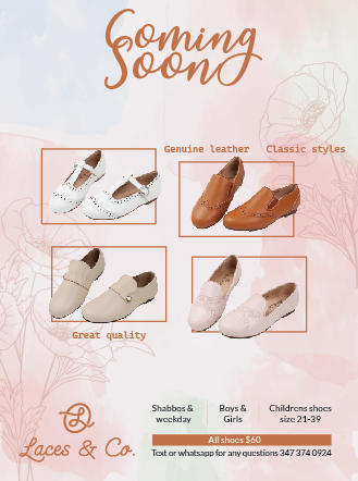
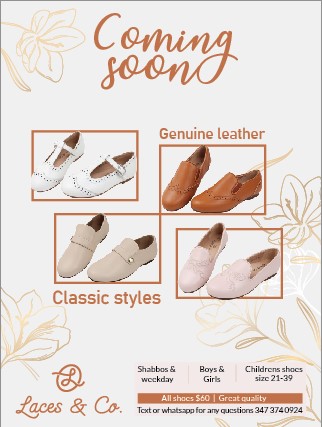
Im working on an ad here, 3 options. Am I crazy or does a plain white background look the best? With a white background which one would you all recommend working with. I like the simple white one with no flowers the best but is it to plain and simple?
First off, great ad!
Second, what jumps out at me is that the coming soon overlaps and makes harder to at first realize which word is first and second, and then doesn’t work well overlapped. That’s the first thing that jumped out at me.
Coming soon in white makes it simple but the coming soon with the boxes is more colorful and interesting. At least, for me.
I think Al Pi what to go with, if a white background still interests you, is the boxed ones. Makes it look more organized. I would also high suggest to have the boxed ones with text align. Maybe have them both at the top or make an interesting combo where one is on the top right and the other one is at the bottom left, which i see you did. I wouldn’t change the size of the box unless it’s a cute idea of top right, bottom left idea, where they’re both the same size while the other two are the sizes we see in that picture. The Ikkur is let’s repeat. Make it look cohesive, which I also see you did. Just I would suggest to emphasize it more. And I would suggest to put the text either right aligned or left aligned to the box, depending on its location; not wherever the text allows itself to be. And the less busy that is, the better.
Love the second option best (like the background) I agree with @ShoshanaElisheva about the heading. Maybe try a different font. I would also work on organizing the shoes in this advert a bit differently. Do they need all the shoes, or could just one style work?
i like the second option too
white backgrounds dont always print well in publications- may show through the ad/text on the other side so keep that in mind
Thanx everyone, so second one wins. She wants all the shoes and that’s where I’m stuck. Designing ads with images I find the hardest.
in that case, maybe use the same layout of the shoes as the first advert with the second background…
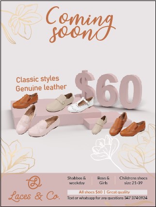
I think I like #3 the best. The first one is also nice.
On #3 I would move the Coming Soon down. Make the classic styles genuine leather a bigger and give it more line spacing.
Logo at the bottom can be a bit smaller and give the whole box more padding (especially on top)
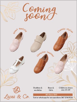
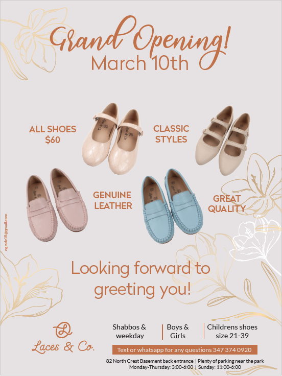
In the end client went with the first one.
Now she wants changes. should I do the slanty shoes or straight ones? Also how can I give the text more oompf?
should it be “stay tuned for our location” or “stay tuned for location” leaving out the “our”
Thanx
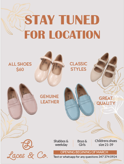
The slanty shoes makes the ad come more alive. I would just make everything a little smaller to give more margin space (Specifically on the right and left side)
Also I think stay tuned for our location sounds better
Really nice! I love the background =)
I agree with Breindy-S
I would make the text next to the shoes smaller.
I few other suggestions:
- Maybe try a serif font for the tittle. Or a decorated, fancier font.
- I would raise and shrink the logo a drop so that the bottom and top align with the bottom and top of the text.
- Bring the logo and info a drop closer together so that they are centered on the page, but further from the edges giving a bigger margin.
- Lower the information 'shabbos and weekday…" closer to the brown bar.
- I like how you wrote the information (that is around the shoes) in the second option you gave the best. Can you do that evenly aligned under the ‘for our location’?
Looking forward to seeing the updated version (whether you listen to my suggestions or not  )
)
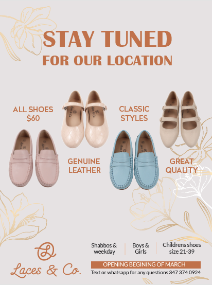
Thanx for all these ideas, she wanted a few small changes so it worked out well!
we are now up to the 3rd change for client. (every week I change the text of the ad)
What do you do when client wants so much text. I feel like my eyes dont know where to look first.
You can limit the amount of changes, and charge more for additional changes.
Make the main text bigger, and the secondary text much smaller.
You can also play around with color of the text. It doesn’t have to all be the same. You can bring out another color from the shoes.