Hi, I designed this ad and am looking for some critique. (specifically on the typography) Thanx!
I love the oil painting effect!
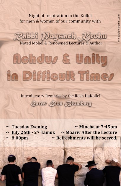
I think the title “Achdus and Unity in Difficult times” should be closer together and on top of all the text. I think it should read night of inspiration…with Rabbi Paysach Krohn… and then under Introductory remarks…Harav Don Blumberg… Right now the speakers look ungrouped.
Also the box could be organized better - write “Tuesday Evening, July 26th - 27 Tammuz”
and underneath that write “Mincha 7:45 • Maariv following the lecture” and underneath that “Refreshments will be served”
Why is the text in the white box bold?
Your name looks too close to the margin - move it a little bit away from the edge and make a drop smaller - should be around 7 pt.'s