Hi!
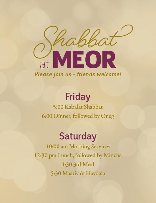
I’m designing a Shabbos schedule for a kiruv organization. I’m doing a quick one for this week and then I’ll Iy"H design a nicer one for the future. This is what I have so far. Any suggestions? They want to send it out tonight!
Thank you so much!
Nice!
I think you should write on top of Shabbat - “Please join us for” and then “Shabbat at Meor”
and then underneath like you have it “friends welcome!”
Friday and Saturday look a bit boring - can you either use the same font as Meor or Shabbat?
6:00 Dinner…etc. - You should bring followed by Oneg onto the next line (and the same thing by followed by Mincha)
Also I feel there are too many fonts - You have
- script by Shabbat 2. thin font by “at” 3. bold block font by Meor 4. italic by Please join…etc. 5. Friday and Saturday - sans serif and 6. the times are serif… I’m personally not a huge fan of serifs so I would change that to the sans serif font of either “Friday…etc.” or “at”
Hope I’m being clear enough…
Good Luck!!
Thank you!
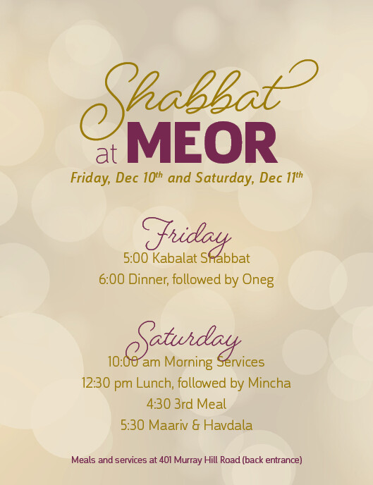
They wanted to take away “Please join us…” and replace it with the date.
All the san serif is the same font (Argumentum). It just has a bigger font family. Do the different variations look part of the same font?
So in total I have three fonts: a script font, a san serif font, and a serif font.
I tried using the script font for Friday and Saturday but the 'y’s were too long and overlapped the schedule. So I decided to break my “two fonts or less” rule and use the serif font for “Friday” and “Saturday” and add a serif font for the schedule. (Using the san serif font for both didn’t look so good.
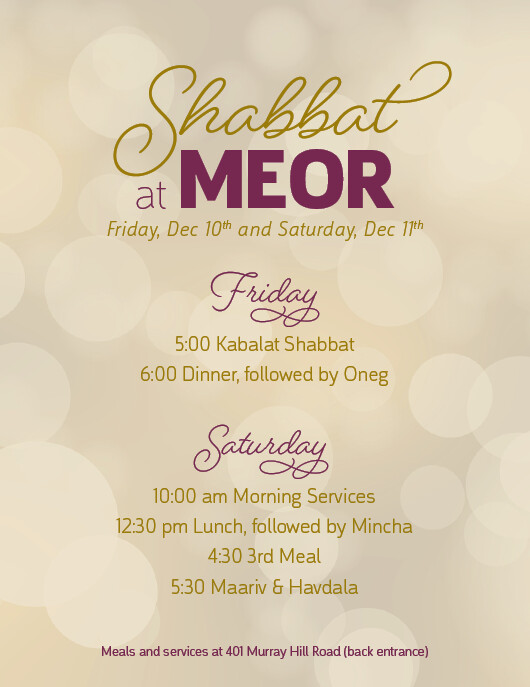
Here it is with the script font:
I tried figuring out the 'y’s using different glyphs. How does this look?
1 Like
Beautiful 
I’m glad you figured it out!
Thank you so much for your feedback! It was really helpful!
Have a great Shabbos!
My pleasure  - glad to be of help!