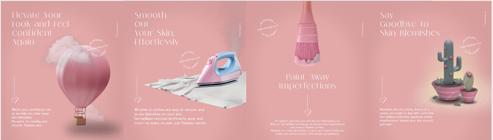
I designed a series of ads for a client that does in skincare. (acne, blemishes, warts, birthmarks…)
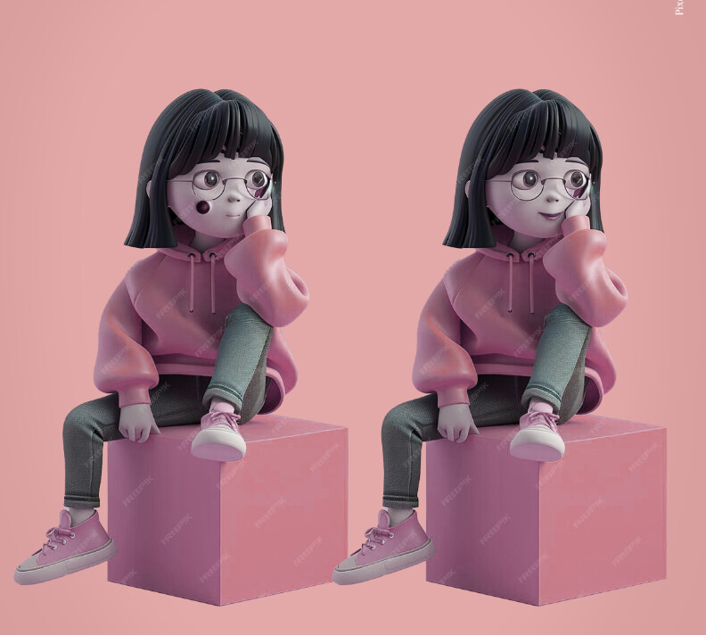
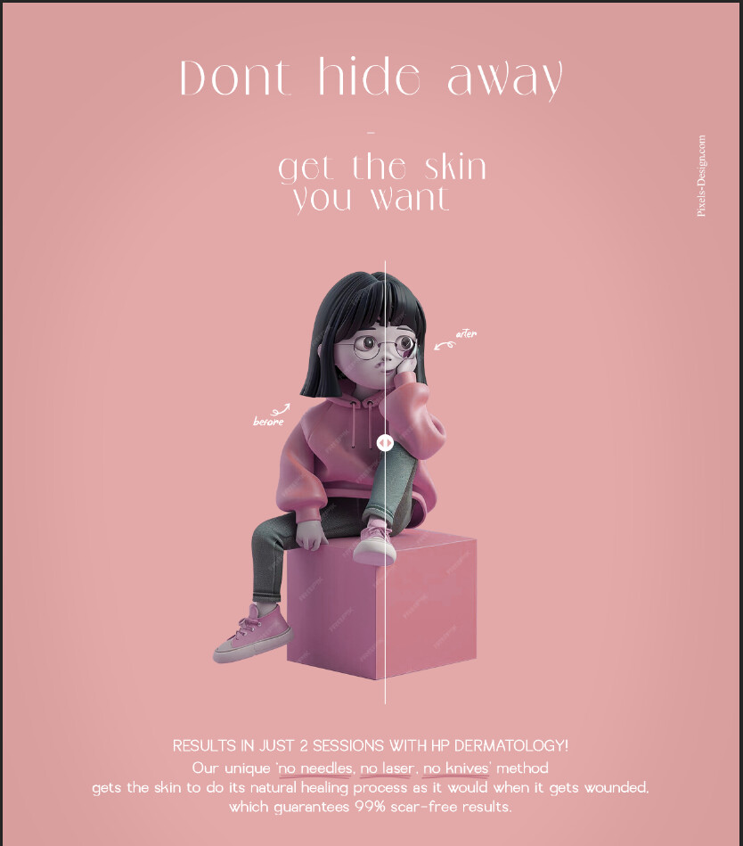
I thought it looked great, and she did too at first. Now, she feels the message isn’t coming across well and wants to switch to a character drawing style. I’m not sure it will look as good.
Should I try to convince her to keep the original design, or should I go along with her new idea?
Do you guys have any other suggestions?
This one’s also nice but I think the first concept comes across much stronger. You can explain to your client that the fact that it’s not so clear at first glance makes it much stronger - as in, ppl need to catch the metaphor.
Is pixels-design.com your website? I tried googling it and it’s not working…
my website is not so amazing…
i want to do a real website, but its very expensive.
Any web designers willing to do it for me, and i offer them graphics?
Very interesting, this link worked. But when I put it directly into the google search (with the exact address…) it doesn’t work.
Not sure why it would do that… But if you leave it on the ad like this ppl who try to google it won’t get anywhere…
Your site can be improved by making each client job a page, and adding more mockups in the subpage. Did you see Adina’s video on using adobe portfolio?
Or you can try wix, it has more features than adobe portfolio.
Coming in on this a little late…In the original ad, I like the wording a lot and the way the images represent what you are trying to say. The white text on pink, especially in that font, is a bit hard to read as the thin sides get swallowed up. Stronger contrast would pop more. Also, I don’t mind that all four sections are basically equivalent, but wondering if there is a way to tie them all together better, ie. the logo and some kind of company info/slogan that runs along the whole bottom and in a stronger color, to sort of tie together all four sections, for example. Or, perhaps if each of the main four headings were visually stronger that would help as well.
In the version where you have the girl…it feels a little visually disturbing to me, with the big mark on her face (obviously I get the idea, just not so pleasing to get viewer to look at the ad and stay focused…) and the character seems too young for what I imagine would be the most typical skin care patient. Also, and this might just be personal, I am not a huge fan of what I feel is a typical “AI” look for these kind of characters. I can see that she might want something with characters in them to give it more of a personal look/feel, that people might be able to identify with it more at a personal level, but I feel like that would only work if the characters were more personal, unique, individual, likeable, etc and represented and targeted more of an appropriate audience/age group.