I created amini card for a Hachnosas Sefer torah, for the clients kids to give out, any advice on how to make a look a drop neater?
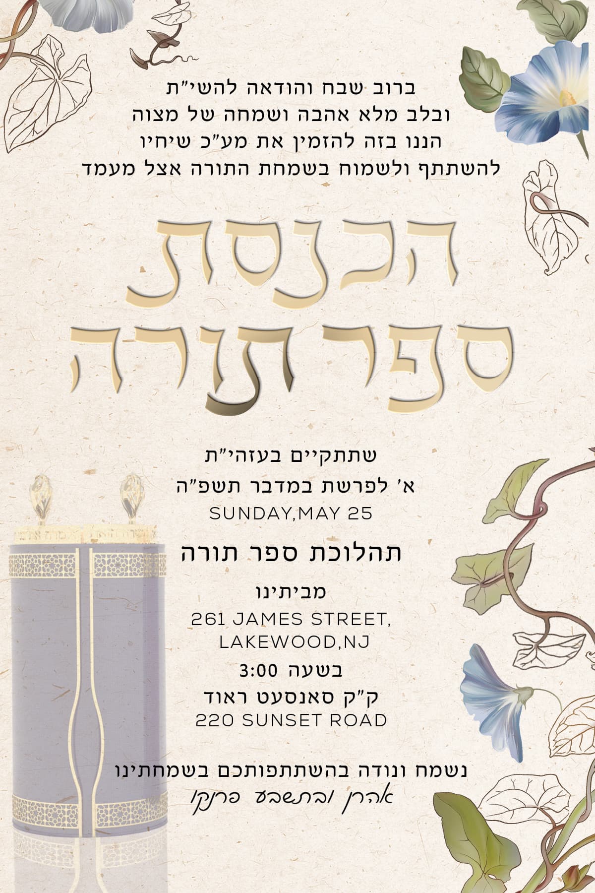
Pretty! I love the font you used for the hachnasas sefer torah
Move the flowers closer to the edges of the paper and away from the words to give it more breathing space.
I don’t think the faded sefer torah is adding anything.
Can you make all the text a bit smaller? I don’t know the sizing, so this is your judgement. But if you can, it will help with the hierarchy and give more breathing space between the paragraphs.
Thank, they want the Torah…, the font size for the english text is 8.5 so it can’t really get much smaller.
Visually, the Torah’s not adding anything faded out in the corner like that.
I wonder how it would look if you would make it smaller, full opacity, and incorporate it into the hachnasas sefer torah words.
No. Don’t make the text smaller then. Move the flowers away from the words. Make the text start a bit higher and end a bit lower by adding space between the paragraphs.
It’s really pretty!
I agree that the Torah needs to be smaller and full opacity would give it more relevance. You may want to make the flowers in the lower right corner a little smaller/less of them to allow for more breathing room
What font did you use for the main Hebrew title? It’s a really nice one!
Thanks so much for the feedback, i’m not sure which font I used- its outlined now, ill try to check later.