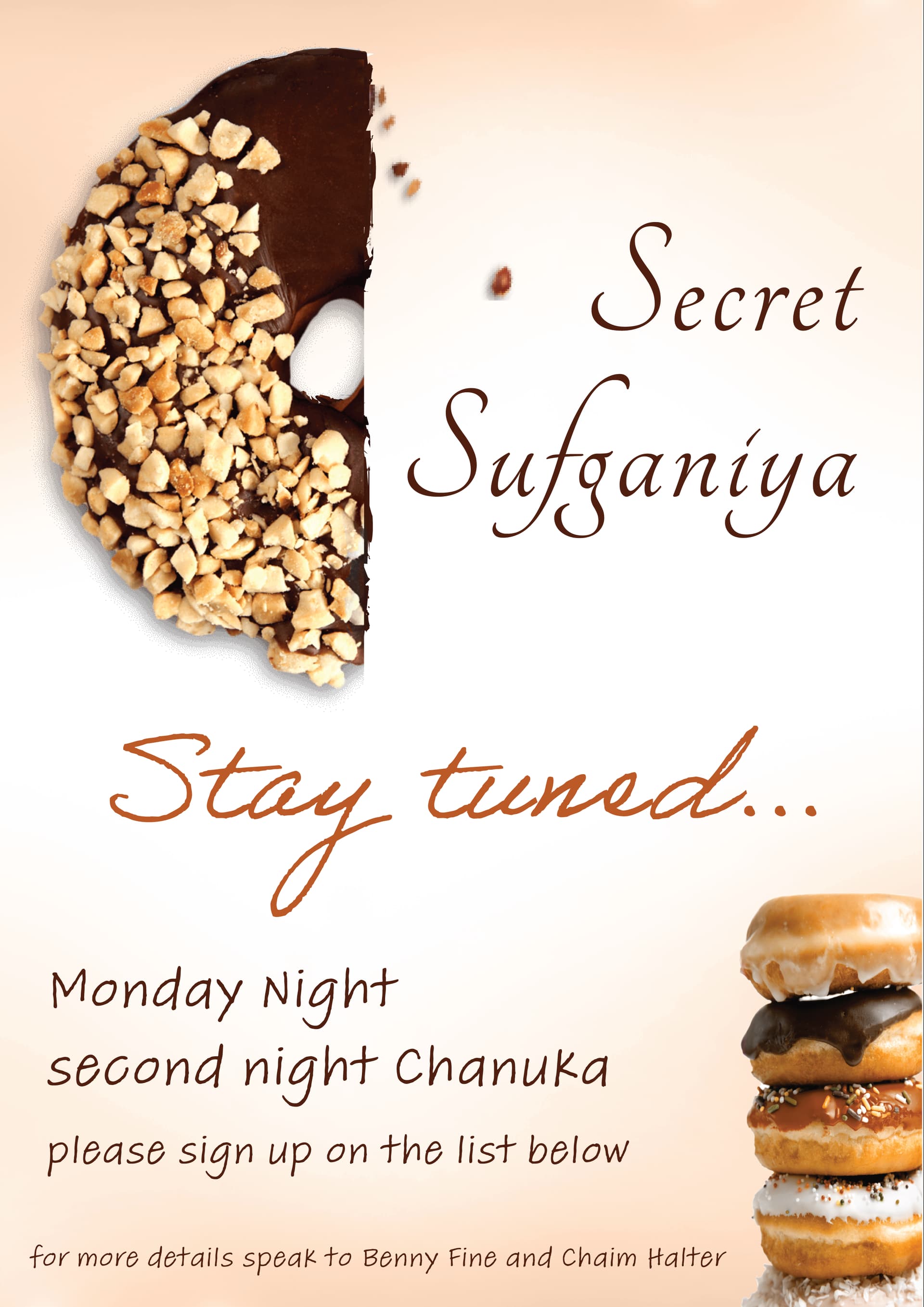
hi, i am made this sign for my brother’s yeshiva and just want some feedback please as I still pretty new at this ![]()
thanks
Cute.
Cut the doughnut in half exactly. I would stick to 2 fonts and not 3. second i would write 2nd, it breaks up the text
looks yum!
agree with sticking to fewer fonts - also the ‘secret sufgania’ font seems too feminine for a yeshiva to me - the other fonts are good though. i think u could even do a bolder all caps font for the heading…like a ‘top secret’ sign would have…
thanks so much for the feedback!
is this the sort of font you were thinking of?
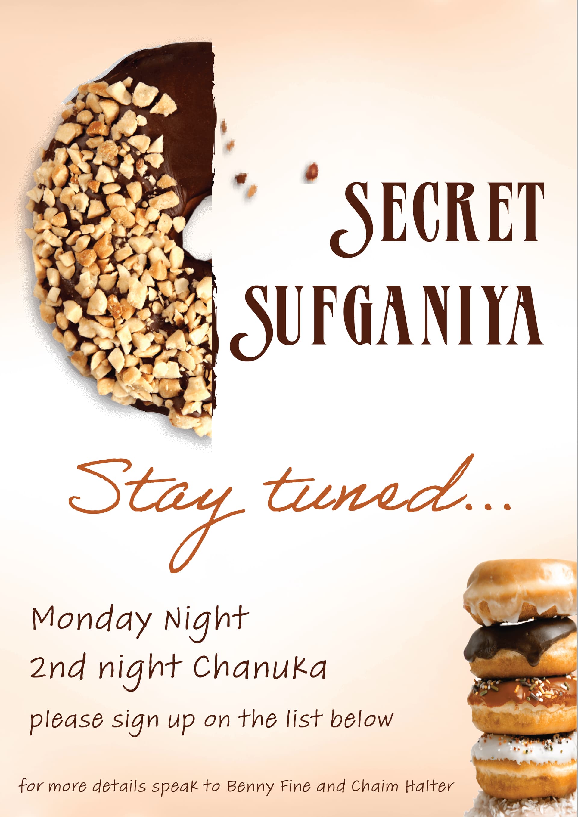
I tried to change bottom writing but it looked really heavy in that thick font of the title and too hard to read in the curvy font of “stay tuned”, whats your advice on this? what fonts should i change?
thanks so much
Looks good! i would do stay tuned in the same font as the writing below - or change them both to a different maybe basic sans serif font
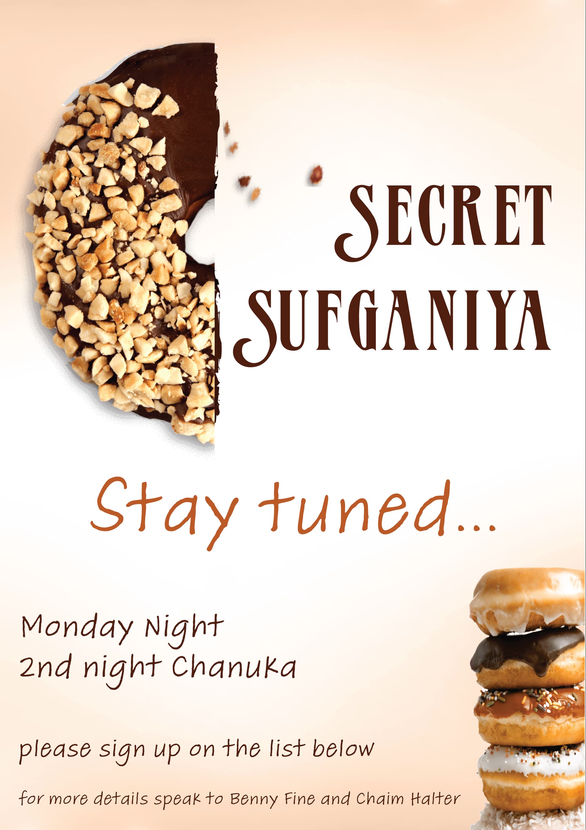
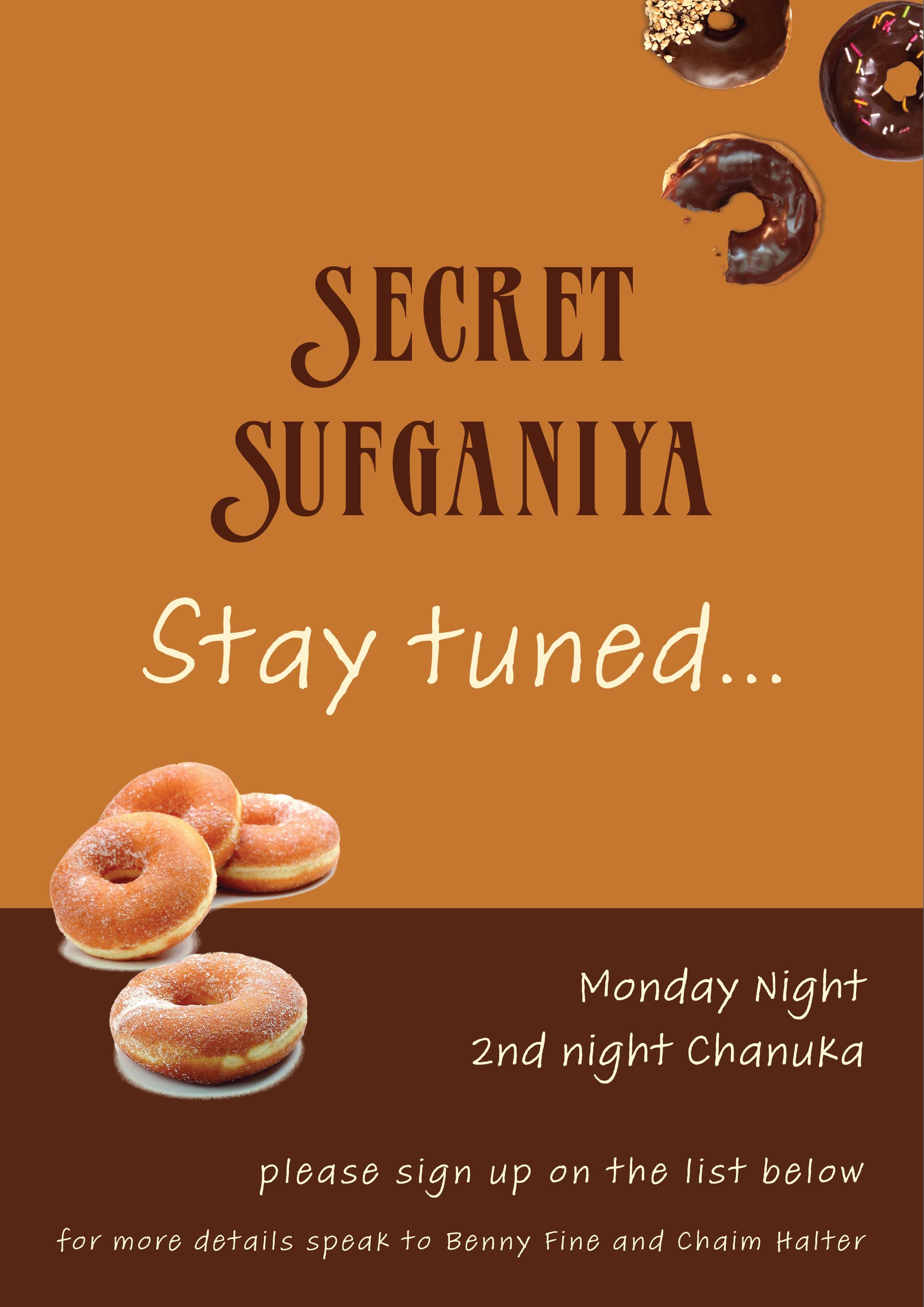
I like the lighter version better. Add a bit of margin on the left and bottom. Font can be more bold
i also like the half donut lighter version better… and i like the new font for secret sufgania.
i’m not sure abut the stay tuned and smaller text font only b/c the t’s look like christian crosses… i try and avoid that if possible esp. for a jewish ad… but maybe i’m just paranoid for no reason and its fine…altho i have had clients who cared about it too… maybe it has an alternative ‘t’ glyph? or maybe can be all caps… it bothers me more for words ‘stay tuned’ than the smaller text…
or as malky-h said maybe a plainer font there…
I agree about the ‘t’ and it really bothers me when people use fonts with those 
2 Likes
thanks so much for pointing it out- I hadn’t even noticed it but now it’s the only thing i noticed!  so true, will sort that out, thanks so much
1 Like
I like the lighter one. Can you angle the donut for more visual interest?