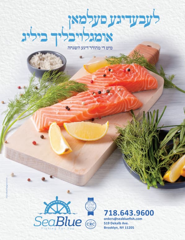
Looking for critique, thanks! i know the image isn’t blending into the background yet, it’s still a draft.
He wants it very striking, any advice in that department?
TIA!
I love this! Great job!
I wonder if you can somehow emphasise just a bit on the second line of the title - maybe make it a bit bigger? not sure what, but maybe it can have a bit more emphasis.
Also, do you think it would be better if the logo (+ hechsherim) is left aligned with the title, and the contact info right? I think it might help, because the main image is already breaking out of the margins so maybe the details should have same margins as the title.
Thanks! good points, I’ll work on it!
Very professional!
Love it!