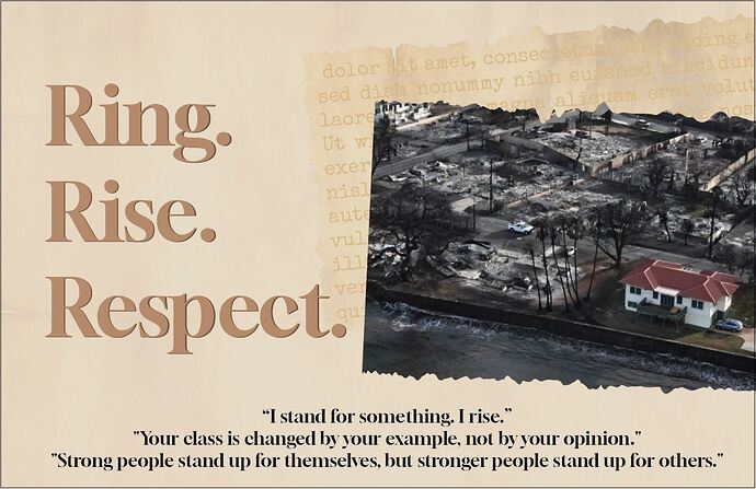
I am looking for critique on this poster. How can I arrange the bottom 3 quotes to be more pleasing to the eye? If I left align, its very unbalanced since one is really short and 1 is really long. Yes, I need to use all three!  `Also, client wants me to emphasize the three R’s since she is alluding to the 3 R’s of school -reading, writing, arithmetic. How can i emphasize them in a nice and subtle way?
Try make The R maybe in a different color? It probably taka looks better like this but if that is what the client wants… For the bottom, maybe try doing a rectangle split vertically in 3 like with a subtle line and each quote in the centre of the split? so then the long one will just go to a few lines an the others not?
Also i see you put dummy text on the parchment - i love the look but maybe change the text to something different? coz like it hit my right away that its lorum ipsum
I know… how can I get different dummy text? Am working now on the other changes…
Also, what about the overall design?
BTW if anyone is wondering about hte image how it relates, it doesn’t! Principal gave girls a speech and referenced the fire in Hawaii from the news in the speech so she wanted an image of it to remind them.
Use ChatGPT for dummy text that is relevant
There’s a website called cupcakeipsum.com that your can generate different kinds of text on. One of those might work for you
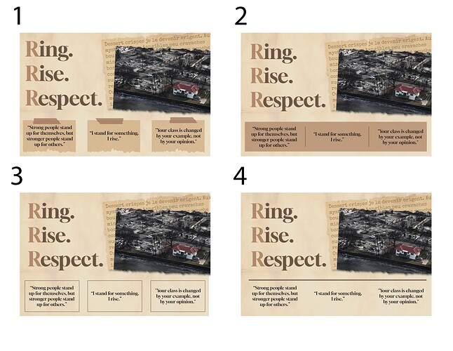
Here is what I have so far. The bottom quotes are giving me a really hard time!  Any advice and critique on these 4 options? How can I improve them? Also, any critique on the entire design? I used randomtextgenerator.com and chose language French, how does the text look now? What about the emphasized R’s? All advice will be appreciated. Thanks!
I like #2 the best (the third quote there isn’t centered well)
(and wow I heard about that Hawaii story but the picture is crazy!)
Number 1 also looks very good
We had gone with #1 in the end since that is what my client liked most!


