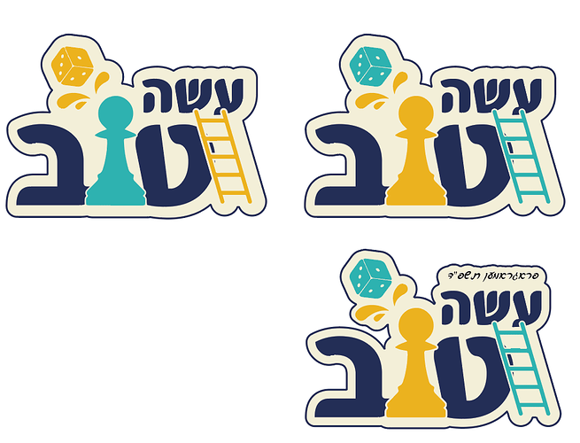
I designed this chutes and ladders themed logo for a school extracurricular program.
Any way I can dress it up?
So pretty and neat! It looks a little bit like a chess piece maybe just make smooth edges on it? I love the splash ![]()
yes so cute, i presumed was a chess piece so def a good point Blimie brought up!
maybe you can add a ‘shine’ over it or super subtle gradient to the beige background…
good idea about the gradient.
I didnt chap what was looking wrong with the ‘pawn’, so good point 
Really cute!

