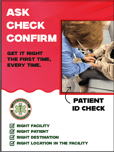
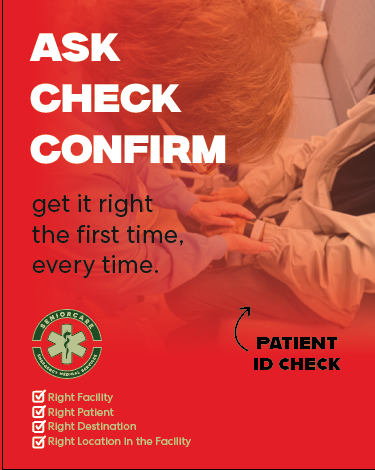
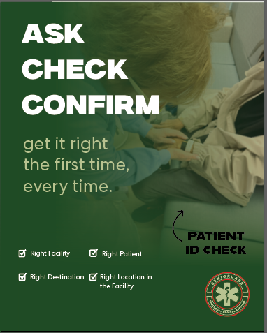
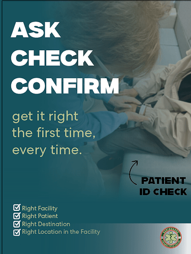
Any thought on this?
Any Ideas how I can pull this together or if anyone has a completely diff idea on how to lay this all out. Ill take that too. Thanx
I wouldnt have all the text in uppercase…
Also could you get a more professional looking pic? Maybe the image can be superimposed over the red background instead of in a frame?
I was thinking to make the image much bigger, but its a bad picture, you think I should ask them for a better picture or just try to search something?
Client said I should just take any stock image. Anyone can help in finding a good stock image. Im having a hard time pulling something up.
Thanx
Shuttertstock. Try different descriptions as you go along. Takes time
Can you get a nicer shade of color? maybe blue? Work on the hiarchy. The four points either list under neath each other or in one line. add color block banner at the bottom with the logo
use equal margins all around. give enough margins all around. 4 points increase leading.
4 points above the banner line. why not keep it white.
can you find a nicer font?
ASK.CHECK.CONFIRM. - with period on one line maybe
then the next 3. bold more bright.
try white background and colors as font.
patient id check in white
Thanx for all your help!
I gave the client and dark and light options (I really like how light option came out as well)
he loves the dark and wants to go with it.


