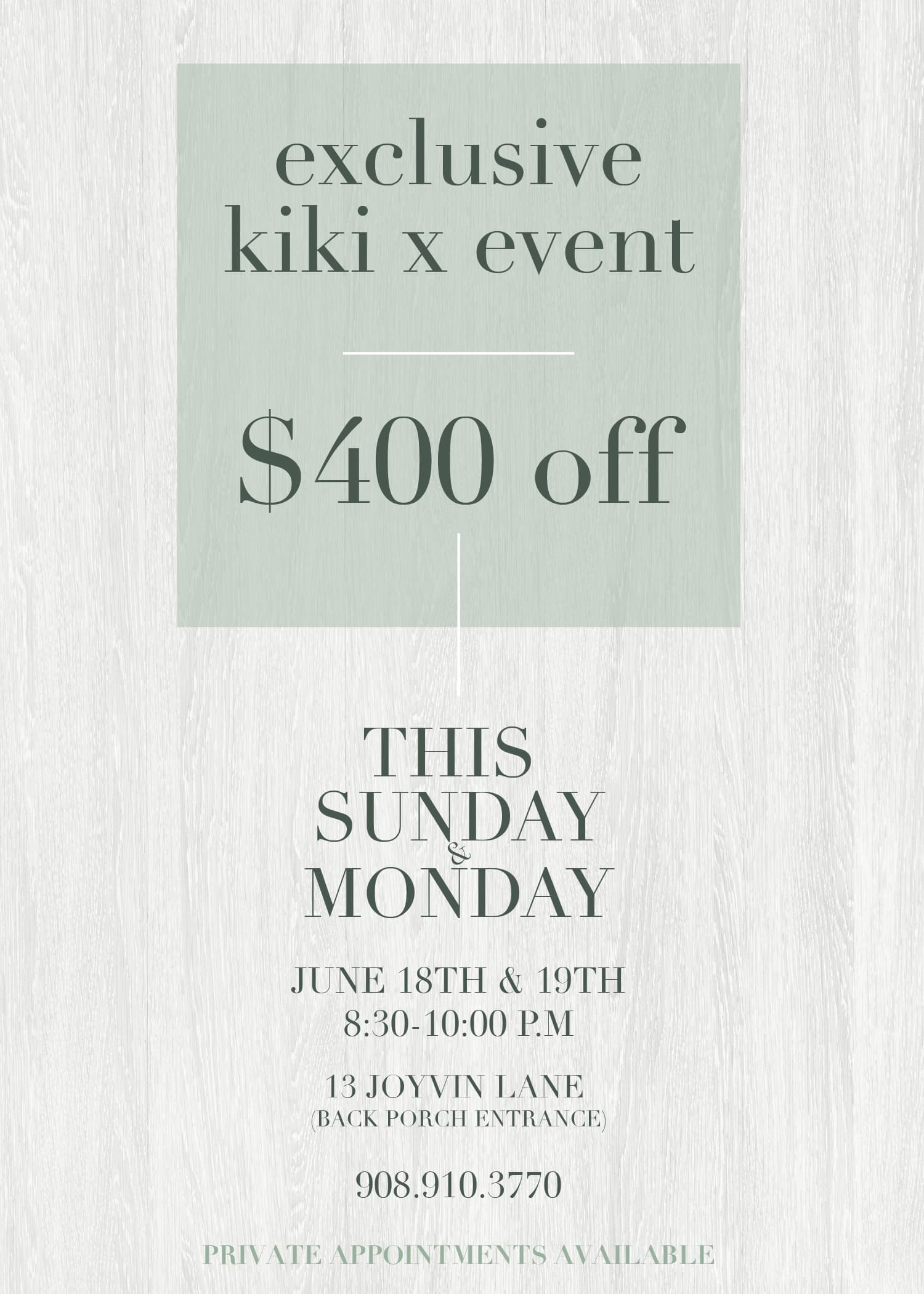
any comments or critique? client wants a very simple, classy/sharp look
The first one is definitely a lot easier to read.
I do like the look of the light text so maybe try darkening the box and the bottom text a little instead of going straight to black text
And in the lighter version have the ‘private appointments’ in a different shade like you had in the other version
Great job on the ad design! I prefer the black lettering for a sharper look. Consider using a sans serif font for the bottom information to keep it clean. You can also work on the layout to make it more neat and organized.
As a beginner, I found it tricky to nail down the information layout. I used to browse through advertisement magazines like Monsey View for inspiration. Good luck!
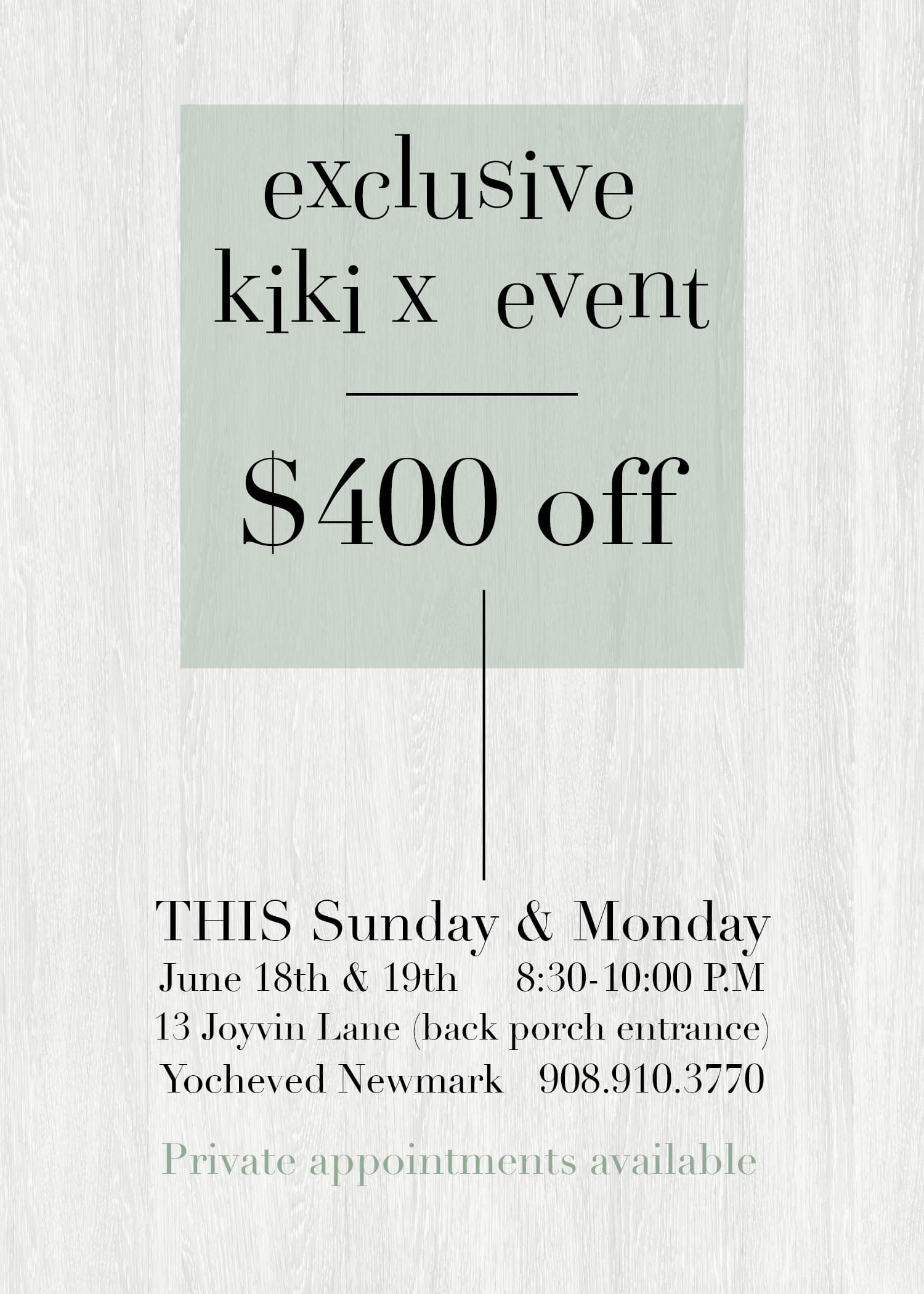
Thx for the suggestions. how does this look? (side point this is just being sent out via text and email, not being printed) and mostly sent on flip phones so needs to be very clear and easy to read…

how about a two-column layout? Align the date and timing to the left in one column and place the address, phone number in the right column. maybe you can consider centering the name beneath in a script font for an elegant touch.
@ShevyR what about these?
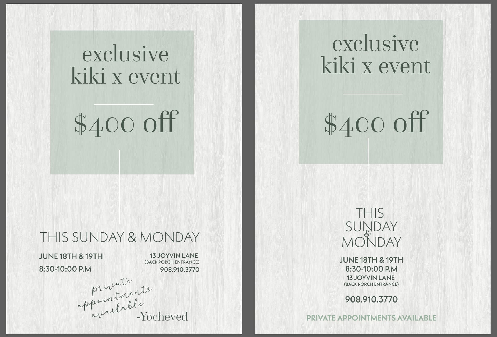
I like the one on the right.
I think there is no need for the vertical line going from $400 down to this Sunday… take away the line and then move up the text and give more space between text… there is so much space on the right and left sides - you can extend the info a drop more than just the center… like the date and time could be on one line and then the address with (back porch…etc.) can be on another line
I like the one on the right. Very sharp and neat!
I also like the right one. Maybe make the vertical line shorter and the text on the bottom a little bigger with more space between them.