
Hi! Would appreciate critique, thanks! Especially with placement for the logo and text right above it, thanks!
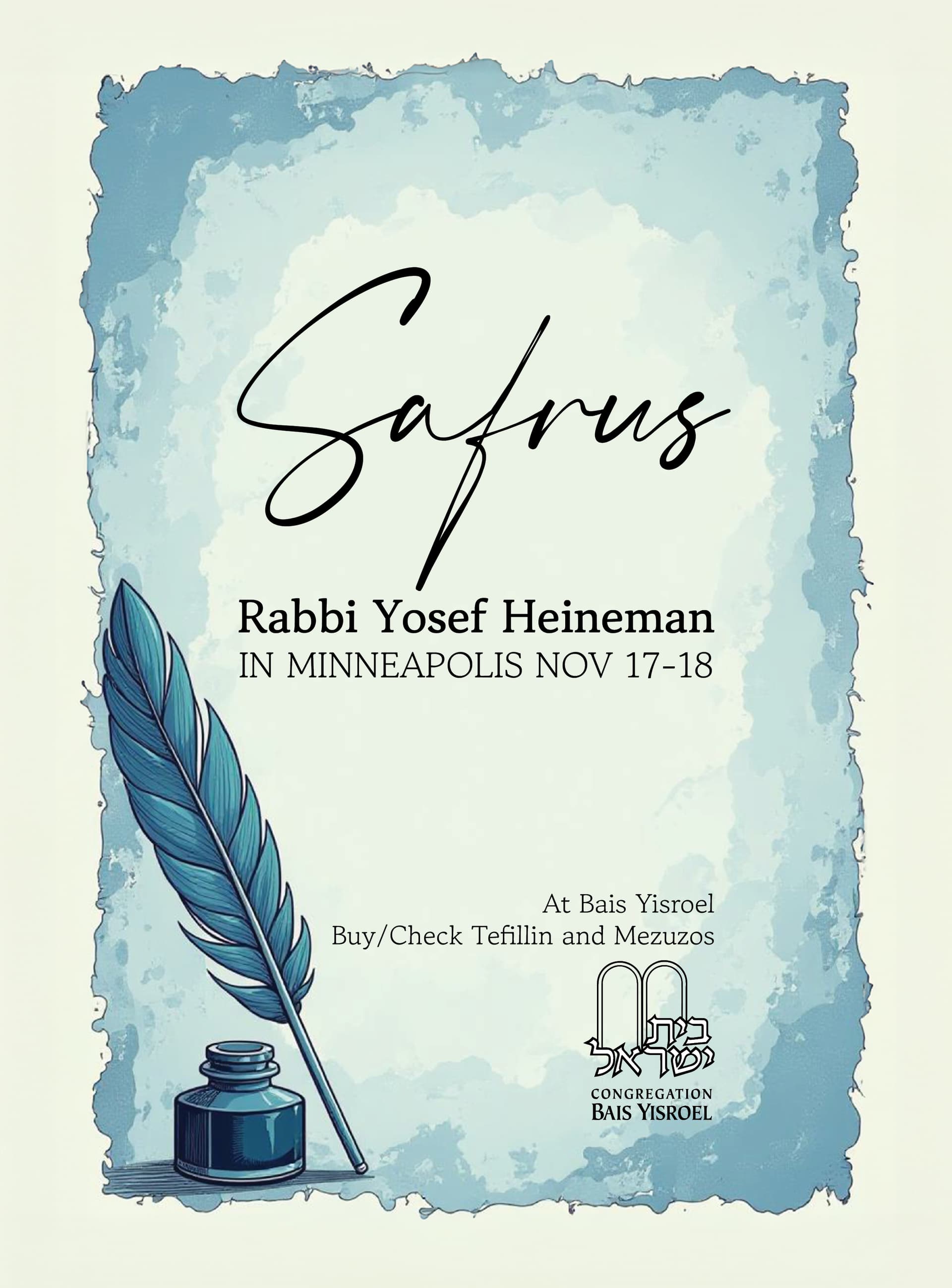
It’s stunning i love it. Maybe align the logo with the ink bottle
I would have the quill/feather top extend a bit out of the frame- at the moment its creating a funny tangent
Thanks! Will work on those edits
So nice! Love it!
Wondering how you made this middle square in such a cool way… trying to copy it 
Thanks! I got a pic from online and then edited it…
beautiful! bring up the logo a bit
well done!