Would really appreciate your help for this logo. It is for an outsourcing company. Needs to have a professional feel (geared for men/business owners)
waiting to hear which one i should improve on and how I can work on them further. Thank you so much!
Client wanted that Icon included:
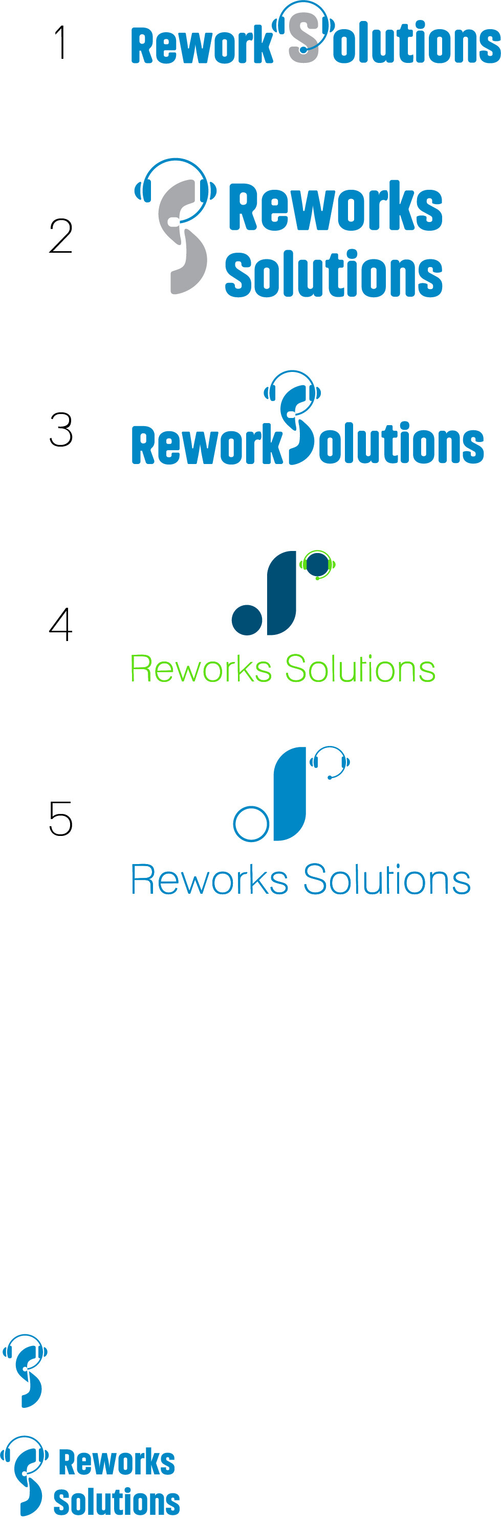
I like #2 most from those here. Maybe you can incorporate the icon instead of one of the O’s?
I think the colors of 2 are great too!
Thank you so much. I will def try that…
The grey and blue I think are the best color options.
I like #1best! Creative idea!
So its between one and two…
They are also the same color combinations @chavi (thank you for your feedback)
There is something about number two that does not feel right to me (maybe solutions is smaller than reworks…) Any suggestions? is it bothering anyone else?
Yes, because it is not substantially different enough. It’s too similar in sizing.
I will work on it. Thank you so much for all your advice.
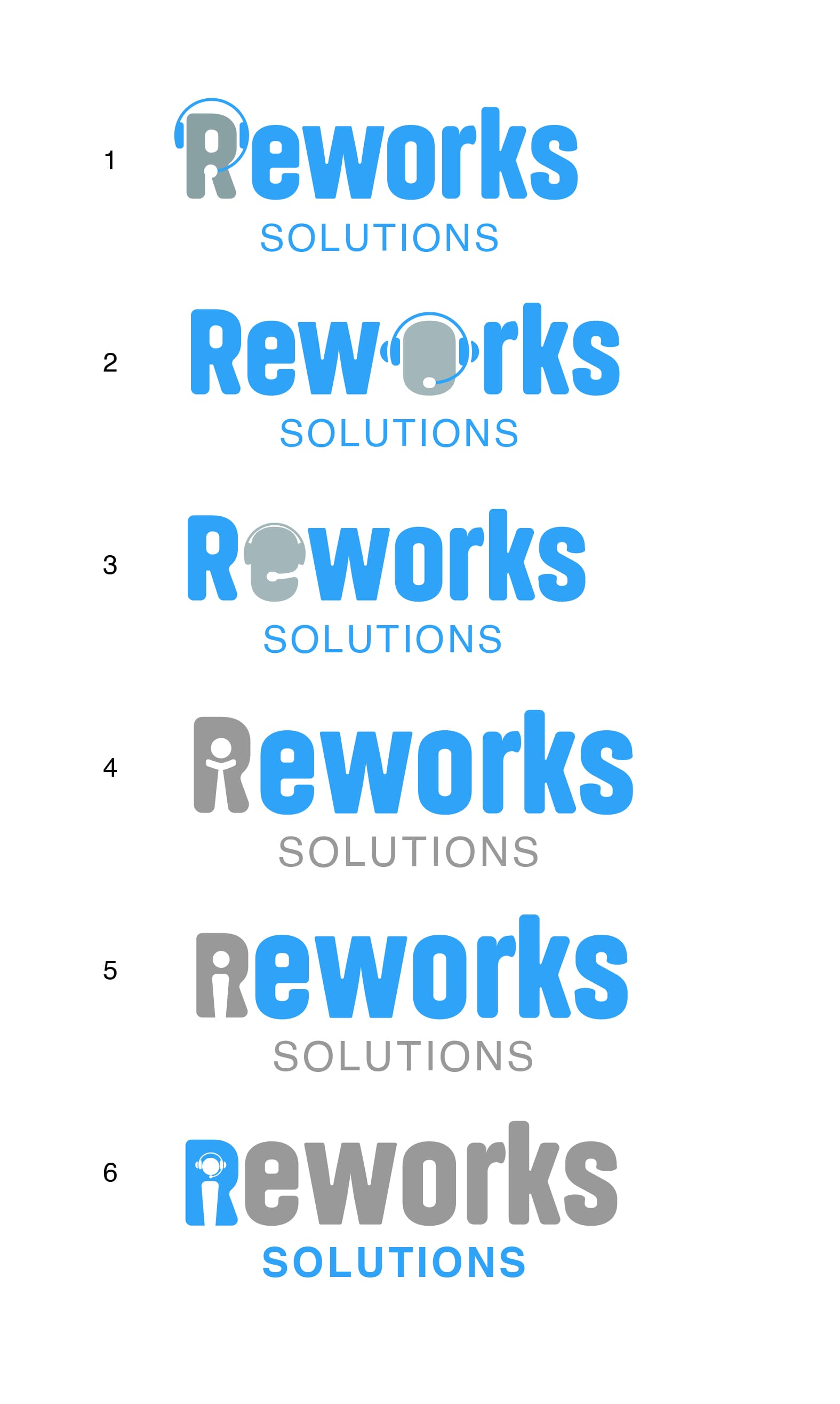
Hi, here are some updated ideas- the client loved what i sent her but said she forgot to tell me that the company is really called only Reworks (which she wanted in big) and solutions was supposed to be much smaller- what do you think of these? any feedback is really really appreciated.
Another weird question for you: She showed me her previous logo which she had done on Fiverr, I really think it is good and have no idea why she wants a rebrand. Really, what is it that we offer in a logo that they can’t get on Fiverr? (she is happy so I am just going on, i just sometimes feel stupid charging a price when it seems they can find good designs for so cheap…)
u
2 Likes
They’re all such good options!
I love love how you’ve used the R!
I think 1 is great… and 4 but if she wanted that icon?
Also 6 is amazing - in the business card it pops, but in small is the icon too detailed?
Would love to see what 3 looks like with the middle of the e there?
Wow this logo is great! Love what you did with the R.
I’m just wondering how come you chose to leave the capital R the same height as the lowercase letters.
love 1 and 6, would also like to see 3 with the inside piece… In 6 I love how the neg. space looks like a person…
Wow I love!!! So happy reworks is the main word!!
Love! All of these look great!
Client went for something totally different in the end. Thank you so much all of you for all your help!
2 Likes
Love. minimalistic and clean.
yes, looks great!
Thank you so much