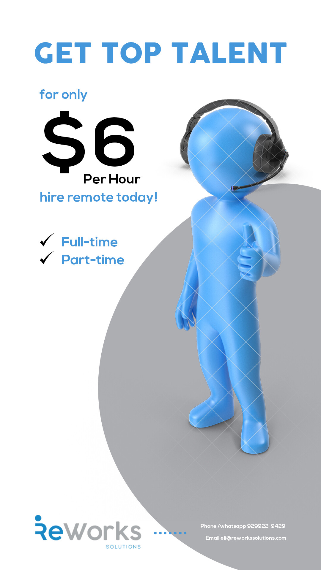
I think this advert still needs a lot working on, but for some reason I can’t figure out what is bothering me. Maybe too much white empty space…
Would appreciate any feedback possible.
I think its to much white maybe put a contrasting blue maybe even a slight patter, also it would be cool if the guy could be on some sort of stage/podium cause he’s the top
Maybe a patterned background?
Also, did you add headphones to the guy? There’s a shadow under the headphones that shouldn’t be there…
Otherwise, looks good!
I did, thought to get rid of the shadow after i purchase both renders,
Makes sense 
Just noticed it…
Empty space is fine its the coloring, reverse some blue and white.
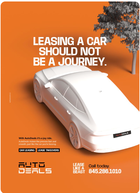
see below this add pops because the background is orange and the white car. Maybe do something like this with a blue background and white person…
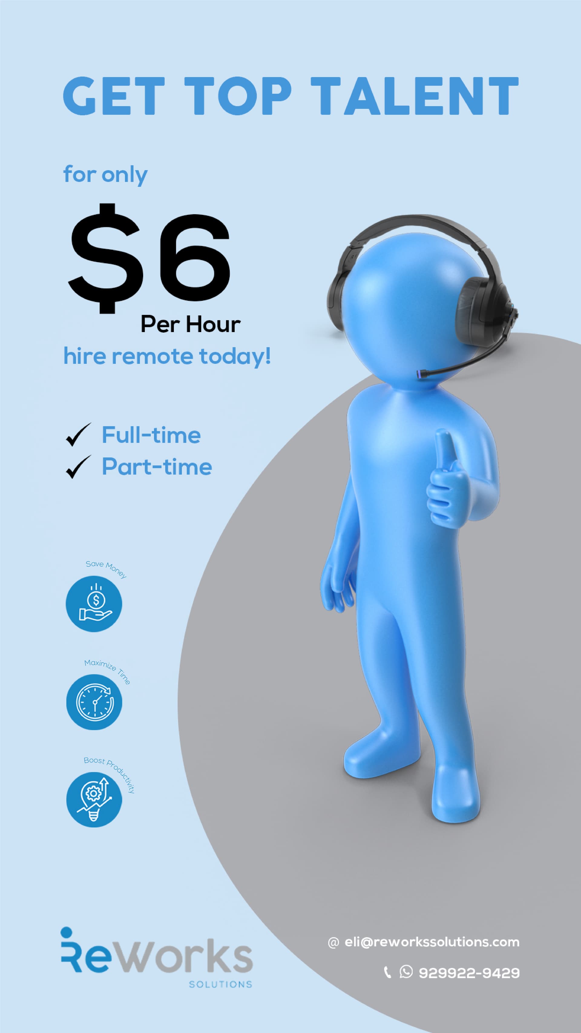
Is it better with light blue background (do not want white menchy as this one is more personalized for her company)
I think something that is bothering me is the gray circle and the shadowing behind the head and the feet. Maybe the gray should not be behind the head or should be behind both ears.
Can you try the circle in white?
Are the words above 3 circles (save money etc…) too small?
oh just read above about the headphones…
Client feels it needs to be more striking- Here are the two versions I gave her. She likes better the first but feels it is not eye catching enough (she does like the blue man). How can I fix, font change or add some color… Thank you so so much!

Sorry here is the first version (which she likes better) and above is the second option where she did not like the coloring. Would love to hear how I can work on it further
Blue is not such a striking color… how about adding an accent color, like neon yellow? to give it pop?
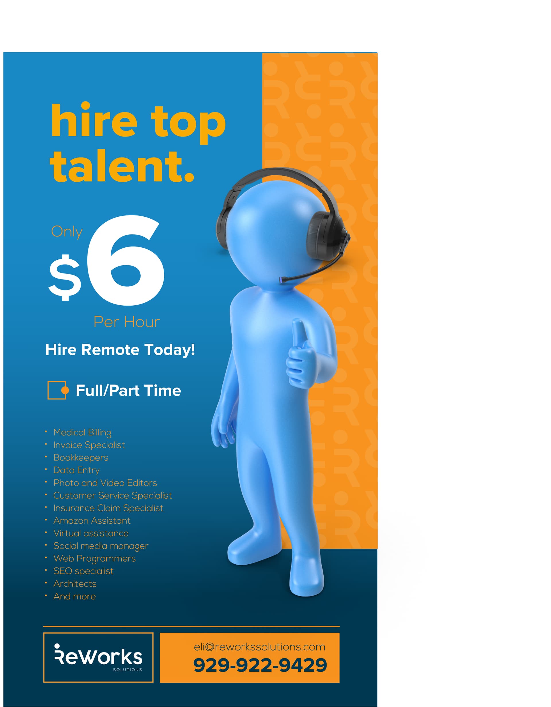
Thank you so much.
What do you think of this?
Is it more eyecatching? (I tried yellow, but liked better the orange)
Something about it is not right but I can’t figure out what it is…
Waiting for your advice
Thank you so so much

Or this!
Rs more flashy 2|281x500

I like the yellow- it is definitely more eye catching!
I would arrange the long list differently so it’s not overlapping the diagonal shape.
looks great!
I love how you’ve played with the title! It’s looking really good!
I would maybe curve the yellow - the font is rounded and so is the box you’ve done…
The font is good but too lightweight.
It’s the $6 that’s not reading well cos of the top and bottom placement.
Now if you introduce the curve to the yellow background - you could curve the text round the $6 - not sure how you would word it to exclude / include the $6 in the sentence… But something to that effect!