Hi,
I typically use elementor to build websites. There are 3 standard responsive sizes. On large screens the websites don’t look as good. What is the industry standard here? To create media queries for every screen size?
Hi,
I typically use elementor to build websites. There are 3 standard responsive sizes. On large screens the websites don’t look as good. What is the industry standard here? To create media queries for every screen size?
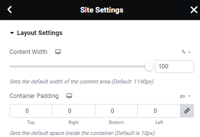
Elementor now has an option to add more breakpoints… Check the tools section
I sometimes add a query at 1920px to make everything fit a bit wider, but I also always cap everything at 2560 – meaning, I put a max-width: 2560px and margin auto on the site container so that even if someone decides to, say, open the website on a wide-screen TV (I know someone whose client complained how their site looked when they did that!), it can’t stretch out of shape.
I just noticed that! Thanks @Chani_Freedman-Thumi
@peninah_adler - good idea to set a max-width, thank you!
Max width 1920 or 1440?
Instead of many media queries, I like to use percentages for the container widths so it adjusts to various screen sizes - does that make sense?
Also in regards to a max width for widescreen as @peninah_adler said, would you know where to set this in elementor? (support wasn’t very helpful)
That’s what I thought, thanks!