anyone have any opinions on these concepts for a reflexology clinic?
(they specifically don’t want any toes…)
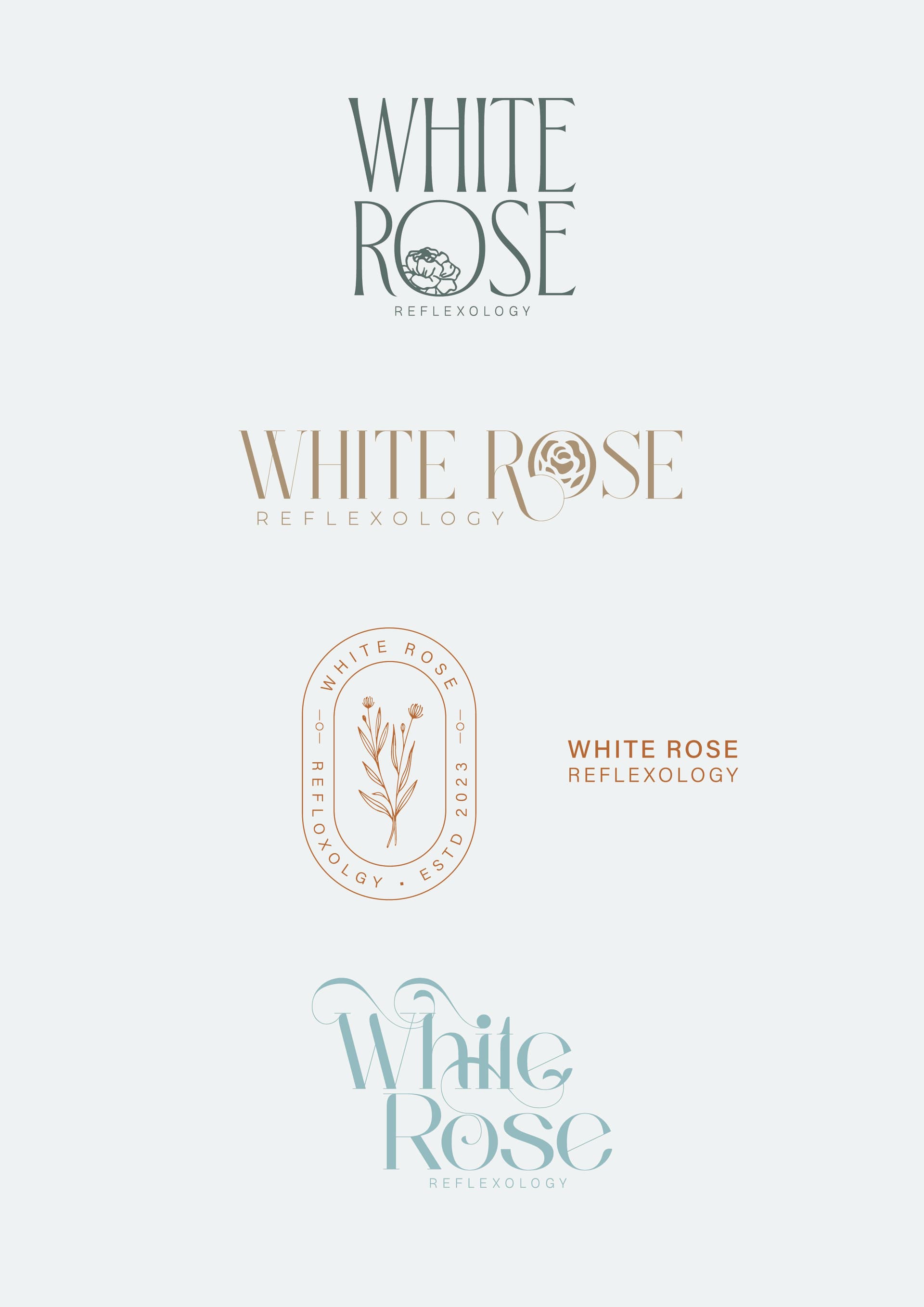
I like them all! (besides for the last which i find a bit heavy)
by nr 2 i like the R and the O combination
1 Like
Really nice!!
I like 2 and 4 the best
1 Like
If they like the swirly kind of idea - with number 4 I would incorporate the swirls into the letters and not have them random. Now it just looks disturbing; like maybe change the end of the e or have it going through the t…
Such a nice vibe!! The second one - I’m finding the combination of the O and the R a bit too heavy. and in small there isn’t really a negative space going on - the O just looks chopped.
@Tali thank you for the feedback,
these are just concepts/styles, they are going to choose the feel they want to go for and we’ll work from there.
about the second one (all of them really), i would probably give another logo for small use
@hindigrinfeld Can you please email me at talikahn21@gmail.com?
I want to ask you something.
Thanks.
I love number two.
1 Like
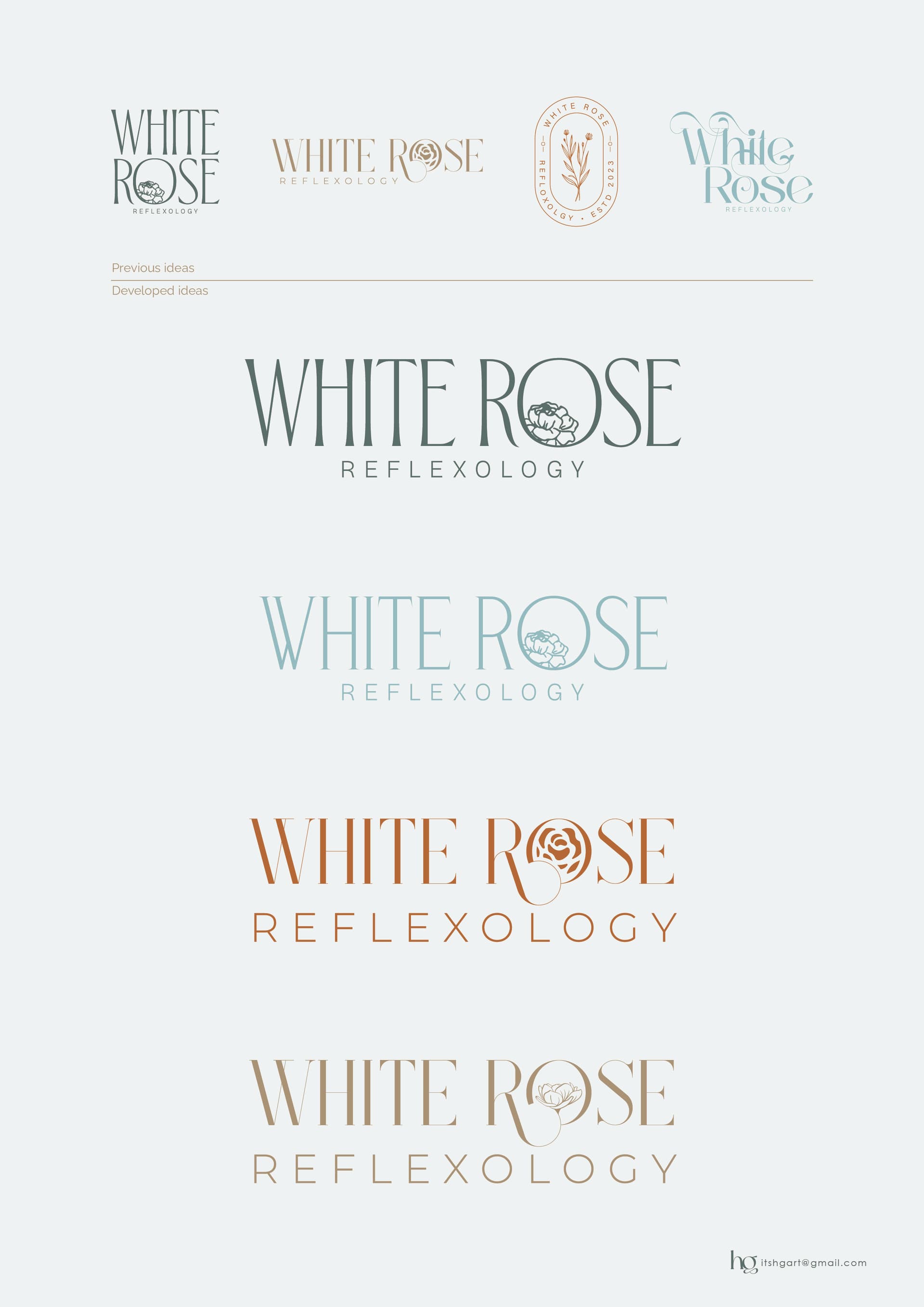
thank you all for the feedback, i’m still waiting to hear from client, will post any developments…
these are beautiful!! the 3rd one reminds me of more of a scent essence logo.
I really like the 2nd and the 4th. they’ll need a drop of tweaking but otherwise really nicely done!!
1 Like
I love how the rose comes out of the R by the bottom one, and I like the reflexology text in smaller. The font though, the thin lines are really thin. Maybe make them a bit thicker. I’m finding them hard to see… Though that could also be the color combo with the background color…
My second choice would be the first one…
1 Like
These are so nice @hindigrinfeld You really captured the vibe- delicate, relaxing , soothing etc!
I like all but the bottom one with the rose growing out of the R in the O is really nice. The color is a bit light though
1 Like
@AMiller and @adinacahn thank you for the feedback, i’m waiting for feedback from client before perfecting the final…
the final logo will probably be the colour of top logo, or a dark brown.