
Hi,
I’d love your feedback on this ad for a new recording studio which will be posted on WhatsApp status and Instagram. I designed 2 options (one having two layout options). Her original logo is the blue and grey one.
I’m open to critique and suggestions.
Thanks so much!


1 Like
I like the2nd one the best. The layout keeps my eye on the page as apposed to the blue one.
Thanks  I was thinking the same! Do you think I should create another option as well or not necessary?
Totally not necessary, it looks great!
Looking great! I’m also loving the pink version!
Would you do 1 big bold headline so that it pops even more, and then you could have the rest of the info in small. Especially on whatsapp, you want people to glance at it and get the message.
Ok. Thank you!
Thanks! That’s a good idea- any ideas for the headline?
Hmmm you could even do ‘All your recording needs’ in huge and maybe somehow interacting with the picture like having it behind one word and overlapping another word… Think that could work?
I’ll try that. Thanks!
I also love the pink one! I would move the mic down a little bit and mask it with the bottom of the circle - something about the little space between the bottom of the mic and the bottom of the circle keeps catching my eye. Meaning making the mic a drop bigger or longer so it looks like it is coming out from the circle and not just placed on top. Hope that makes sense 
Thanks for pointing that out, I’ll fix that!


Also, can someone remind me how to convert the logo to vector? The client’s friend designed it on Canva so it’s an image.
Yes this effect, though I think the image should go a lot larger so it’s similar size to the entire headline. It would be super bold! Maybe have the headline left aligned so the image can be to the right of it.
Re logo, if you have a high resolution png that should be ok for this…
Hatzlacha! Can’t wait to see!
And important to mention, these are just my personal suggestions. You could take it or leave it
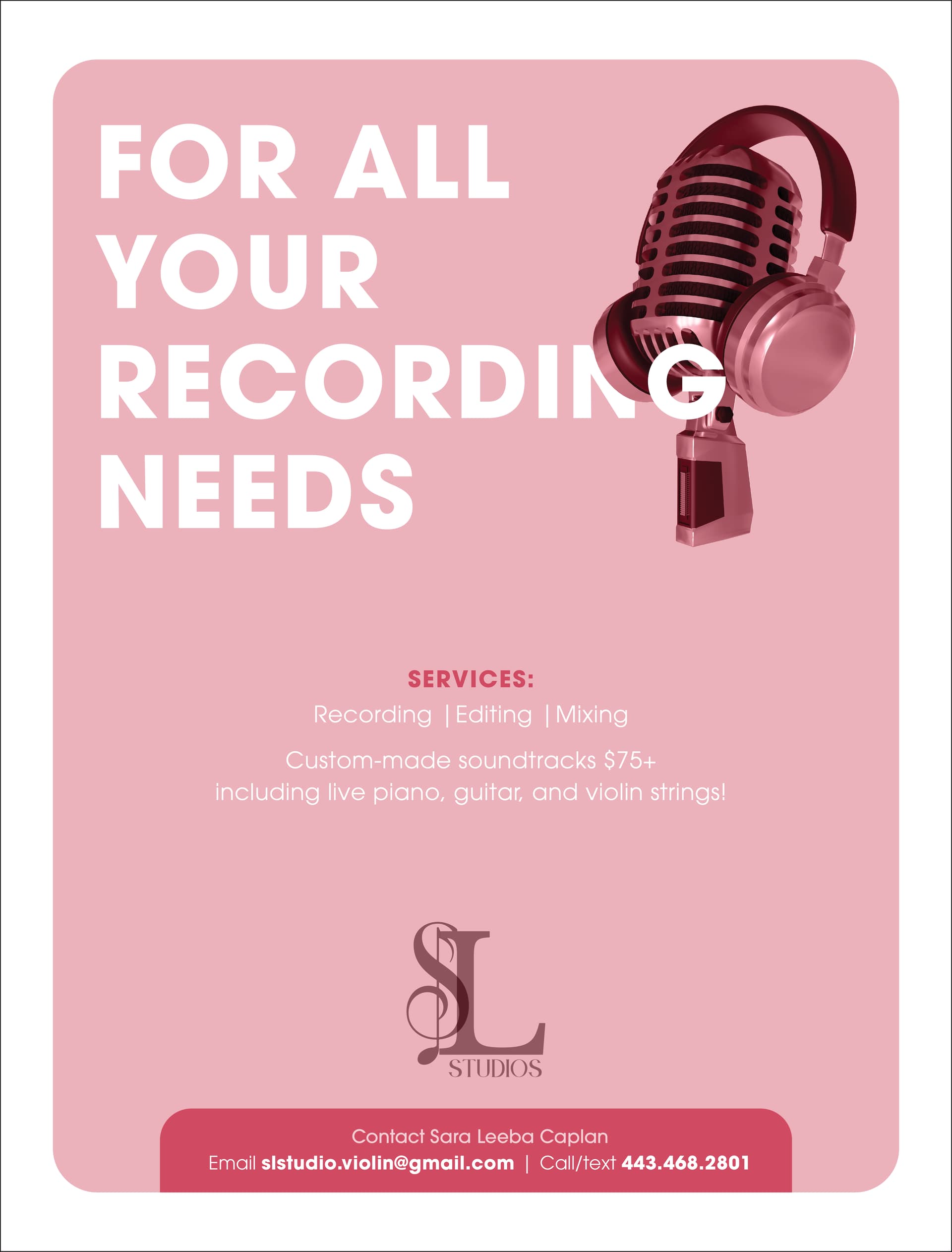
Maybe even bigger like this. Though I don’t like how the bottom is hanging so it would need to be perfected or maybe bringing back the circle in the original pink version can work…

2 Likes
Ok great! I’ll send the client this idea.
It looks really good, I would send also the circle version because I really like it and maybe client would like it.
