Hi,
I am working on rebranding a day camp that has been around for more than 40 years!
They are looking for something new and fresh but classy and modern all at the same time!
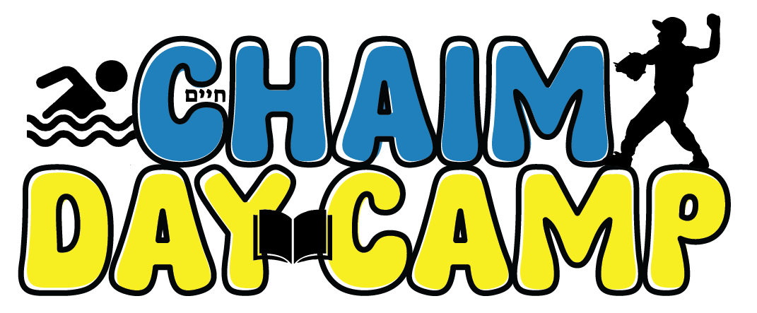
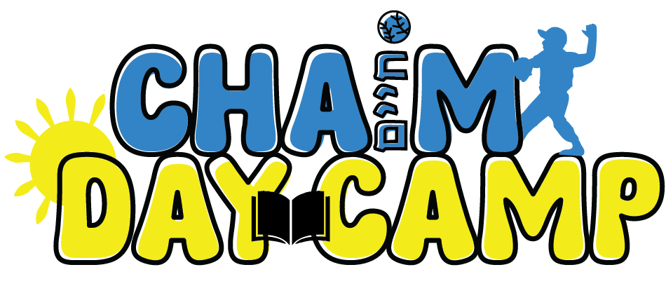
Here’s their old one.
Anyone have any ideas for me? They would love to stick to yellow and bright light blue if we can!
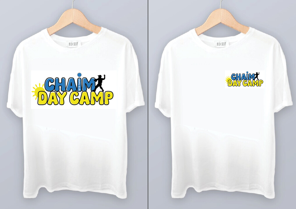
I think redrawring it with a more vector and less handdrawn look, darker green instead of neon. And then work on the text- Serif doesnt work nicely for a camp (well maybe 40 years ago it did!!)
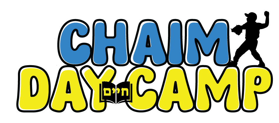
I love what you did with the siddur!
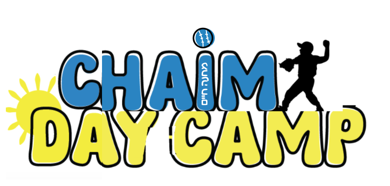
I think it looks off that the swimmer is a stick figure and the baseball player is a real silhouette… maybe put the Chaim in the siddur or going up the “I”/“M”?
I would take the siddur out since I think its not adding to the logo…
also it’s not clear - do they want the Chaim in Hebrew to be fully omitted or they just didn’t like where it was placed in the first version… I don’t think its necessary especially since their original logo didn’t have the Hebrew Chaim in it…
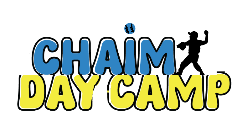
I would move the whole top (Chaim and silhouette) to go in between the D and A and would maybe put a baseball dot by the I so it looks like the silhouette threw a baseball… hope Im being clear
also maybe it would help it be brighter and more vibrant if the silhouette was also in blue?
just some ideas…
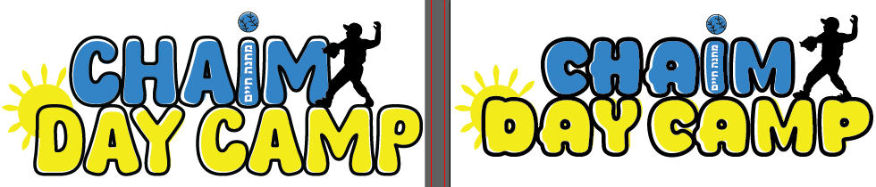
Keep the I - just put the Hebrew Chaim inside it like in white or blue
make the lines of the baseball a drop thinner and a little neater…
The black silhouette is working better
I still feel like the siddur is taking away from the logo…
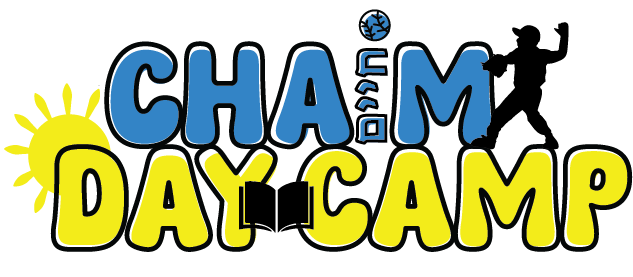
The left one (original font) is nice now.
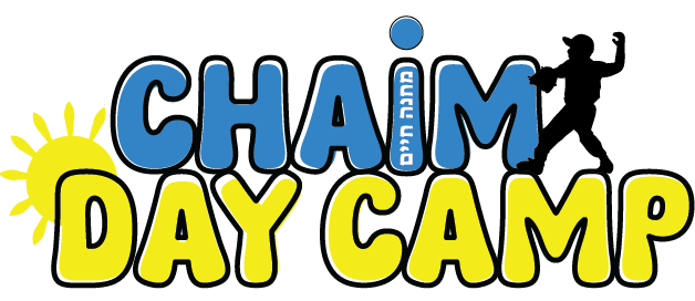
Maybe just make the dot of the I plain blue with a black outline - it doesn’t look so neat…or try to neaten it up…
Yeah, I think its great now!!
maybe just try to brighten up the colors a drop…and as @chavi mentioned, make the stroke of the i match the other stroke…
 thought they wanted the same modernized