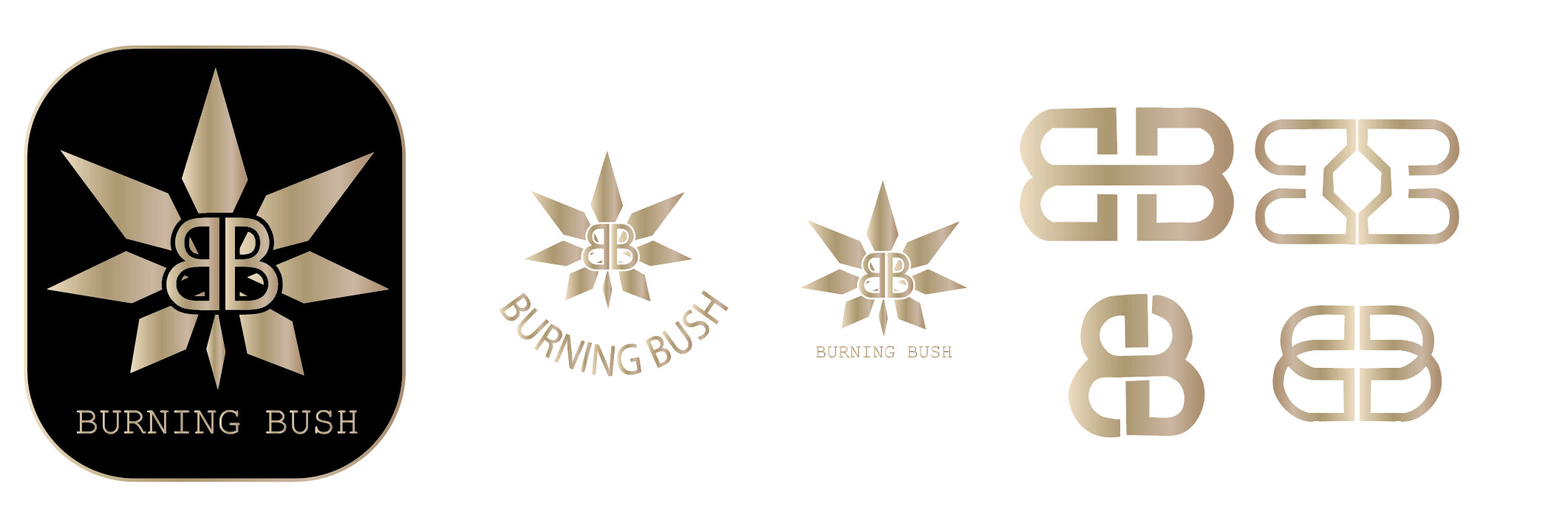
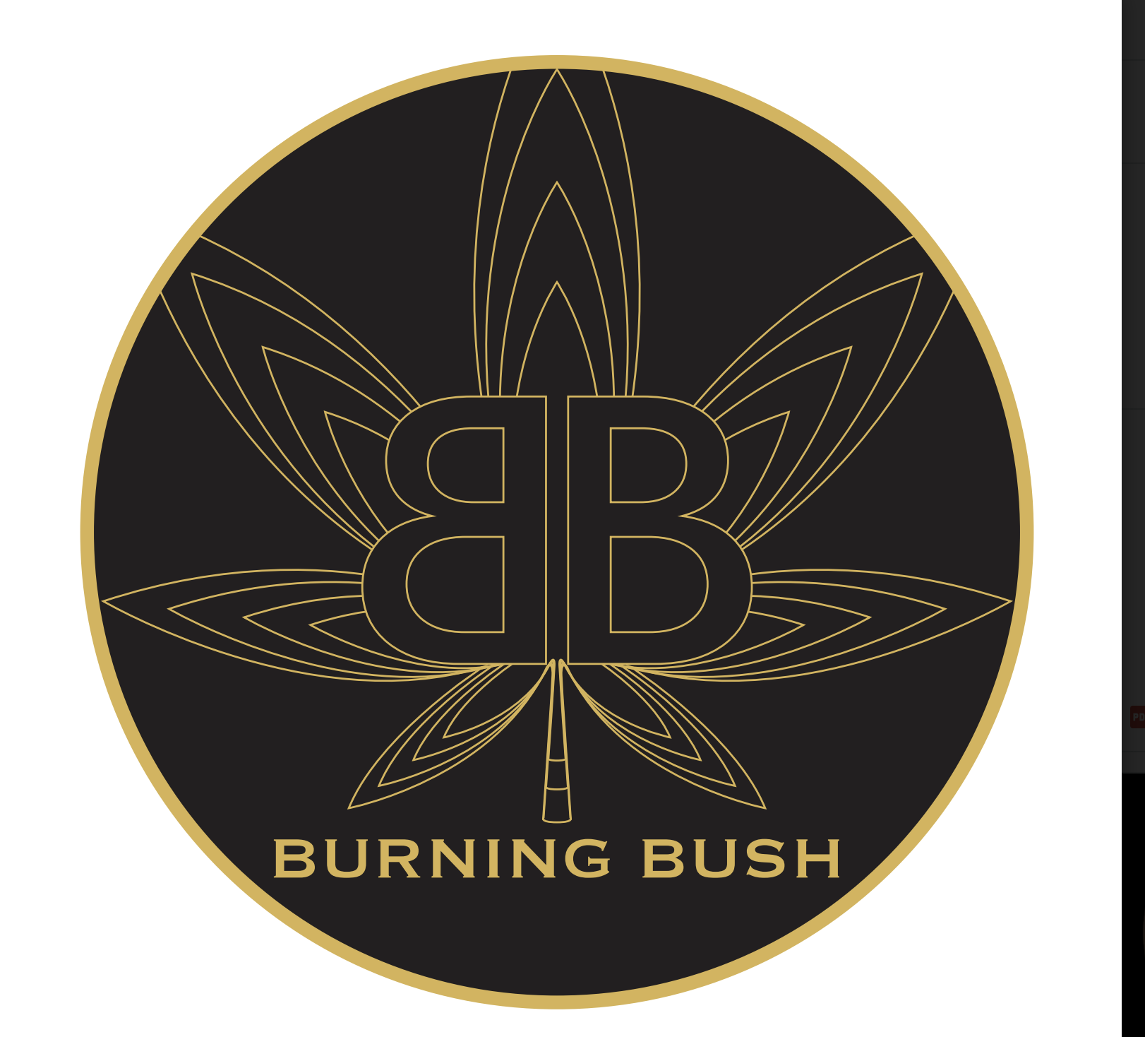
Im rebranding for a company. The company is called Burning Bush, they want two B’s in the logo. so far i came up with these B’s. They want more options. what else can i come up with im stuck.!
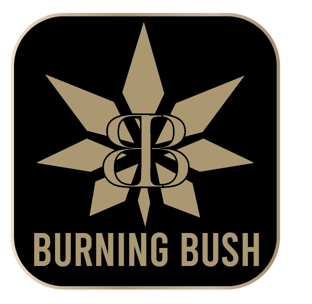
attached is the logo they have.
What about the B’s being drawn as a flame- Kind of how the ( I think its Breslov) “aish Sheli” is written
What type of business is this?
Maybe you could create a flame using the negative space between the two bs
taking @zaksahuva1 's idea - maybe you can do something like this and flip the B to the left also so you have two B’s with a flame in the middle:
He wants the B’s to be in the leaf. Its a Marijuana company. (Hence I do graphics for a company that sells packaging for marijuana  ) He wants the b’s in the marijuana leaf. But maybe ill do a fire with the b’s and hell like that. good idea.
gosh! i thought it was some holy organisation referring to the burning bush and moshe rabeinu but i suppose they could argue that they also help ppl reach levels of holiness!
maybe just focus on getting the leaves and b’s right (somehow!!) and then you can always add some flame/burning effect - hatzlacha!
El oh el, ya holy you got it.
1 Like
haha  I also thought it was some holy thing!
2 Likes
So where getting there. (He keeps on changing his mind…) what font do you think would look good with this logo?
This is what we are working with now. He feels like nothing flows, the fonts are starkly different the leaves are sharp edges, and the leaf feels different from the fonts. However, he is the one that gave me the fonts for his logo.
Can anyone help me out with bringing this together.
maybe ask him if he wants to see the words Burning Bush in other fonts that might flow with the rest better…
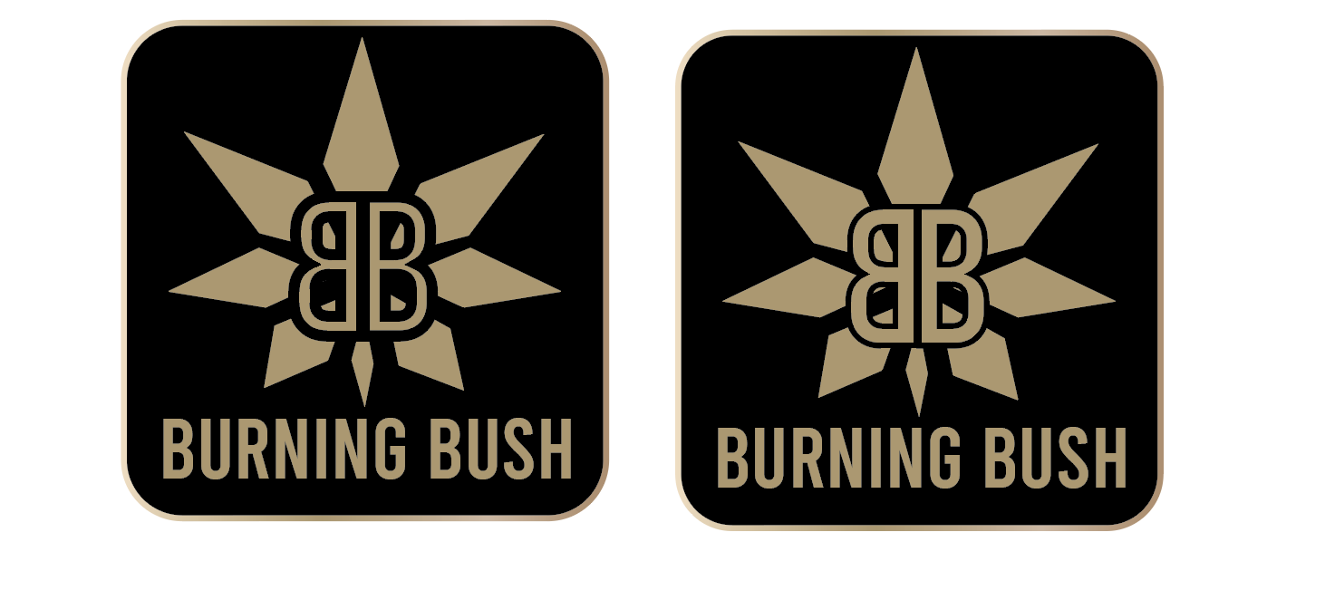
also by the 2 b’s in the center - i think you should get rid of the tiny black line on top and bottom so you shouldnt see where the overlapping b ends.

he was very specific with the font. Thats what he wants, regarding the b’s you mean to do a white stroke so space around it?
no i meant the tiny lines that i covered in red now. the lines are from the b thats flipped

Can you round the corners of the box less?
It gives a very rounded look and is coming close to the text on bottom
how does it look now? I also feel like I like these b’s better. whats your take?! thin or thicker B? Screen Shot 2023-03-21 at 2.10.25 PM|690x312
I like thin B’s better
maybe put black by the holes of the B so it looks neater