Which one do you like, any advice on color, font…
Thanks!
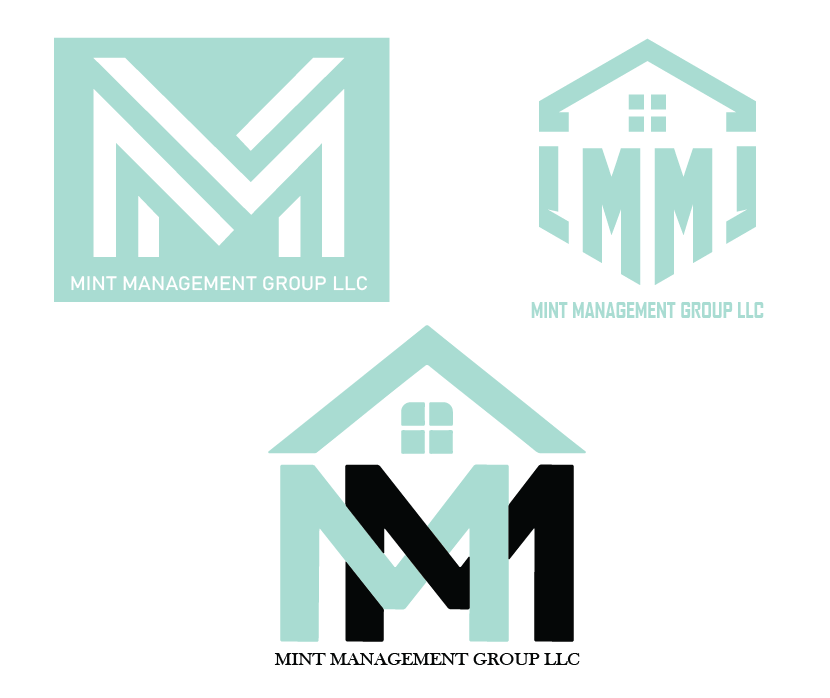
I vote for the first one!
Very nice and clean!
I also love the first one!
The text is a bit small compared to the logomark. Also its not very readable to have small white text on the mint colour, as its not enough contrast.
I would propbably remove the box for the main logo and then have just the logomark inverted like that as an icon.
I like the top 2 best. the right one would be such a cool icon, label sticker…
The top right one looks really nice! I would maybe connect the outer lines to the roof because to me it now looks to me like the letter L and reads LMML.
