Hi, I’m new to this and I would love to hear some critique on the attached ad… thanks so much!!

Nice! I love the pic ![]()
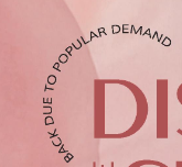
- Make sure no text is too close to the edges.
- I would move all the info to the bottom. Nudge the image up a bit and put the bar underneath. You may need to change the color.
- Center the ‘not anymore’.
- Can the logo go on top? Also, it doesn’t have to be so big.
- An idea- put the ‘one on one’ in a circle. Something like this
- Where does the ‘experienced’ come in?
- Space the bullet points evenly between the contact info.
- Add dashes in the phone number.
I can’t wait to see how it comes out!!

very nice! I would make the text and logo much smaller.
and the background letters should have a lower opacity.

Wow!
I love how you added the letters in the background =)
I would lower the opacity a drop more.
Make sure that the words are not too close to the edges. You can pull all the contact information closer together at the bottom. And higher so it’s not too close to the bottom.
Is the vector of the people reading a part of the logo? The tagline looks so small in comparison. If it’s not attached, I would say to move them to the side of the ‘readt!’. Otherwise, shrink it a drop more and bring it down. But don’t shrink the tagline.