Raffle booklet

I’m designing a sample page so heres what i did so far.
(each page is going to be a different prize with a different CCHF program)
anything i cud change to improve it?
and also does anyone know if theres a way to take images and make them look 3d-generated? (probably using AI, but is there a way without - like a filter?) i want all the prizes to have that look but cant find all the exact pix i need in 3d…

thanks!

Love the little details- such as the tree coming on between the text and overlapping part of the text box on the side. adds so much!
I’d move the luxury villa option over a bit, looke aligned to nothing now.
and should the making change happen be a bit larger?
also I wonder if there’s a way to make the donate… clearer?

thanks adina!
what do you mean by ‘luxury villa option’ - the logo? where would i align it to?
and also would you know how to find or create more 3d style pictures from an image?

Yes the logo, move it centered between the image and edge- like the shalom challenge is centered-- you dont need to move the logo down, just over.
If you work with “out of boundary” it gives a 3D look

ok got it thanks!

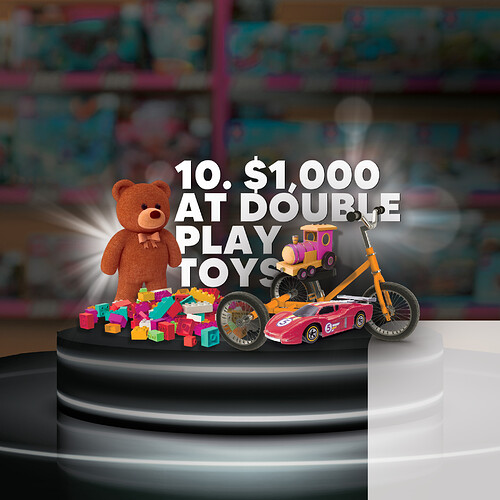
any idea how i can improve this page?
thanks!

Don’t hide the text. Make the background less dark (if possible). What is the square at the bottom right?

I love the idea!

The toys look like they are floating a bit. What about making the background a bit brighter and moving the platform down a drop? Or maybe it’s the angle that needs to be adjusted…?

thanks!
thing is - i should have explained - theres going to be some text on each page - like the first one. so it needs to be a darker background. and the white box is for text also…

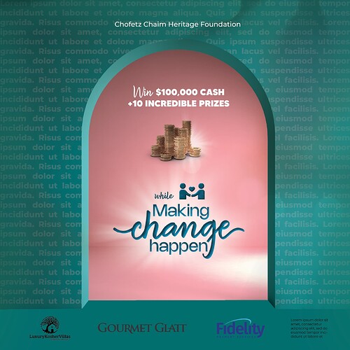
im working on a cover now but im not sure abt it… they want it to be a doorway kind of idea, like opening to make change - but still keep the 3d kind of look, and also to put in the background, text on how cchf is changing the world… (for now its just filler text) what can i do to make it better?
(i cant change the words ‘making change happen’ cuz thats the logo, and also needs to have sponsors logos on bottom)

1 Like

An idea: make the chofetz chaim… a part of the background text. Like it is a part of the paragraph, but those words are white and the rest is faded like you have it

i like that idea! thanks!

Hi again!
Whats the best way to upload the full booklet to my portfolio?
On Issuu, I like that it flips pages as you click but I dont like that it doesnt give off a real mockup look. Does such a thing exist - a mockup that turns pages or is click-able?

and… if you want to see the final booklet you can check it out in this week’s Mishpacha mag :slight_smile:
(i think only in the U.S.)
Otherwise you could check it out here as well :point_down:

6 Likes

Absolutely BEAUTIFUL! You did such a stunning job, well done, we are so proud to have you as a DA Grad :tada: :tada:!!

What a beauty! Really impressive!

wow! love the perfectionism in every detail!

WOW!!! great job Rivka! So professional and striking!!

Very impressive Rivka!!!

Beautiful job!!

You can try a flipbook https://heyzine.com/
There are other ones too, but had this link handy.

Wow! Absolutely beautiful!