Which one do people think is better? They are dressing up as cops and robbers…any idea how I can incorporate the idea of cops into the label while keeping this sharp, clean look?
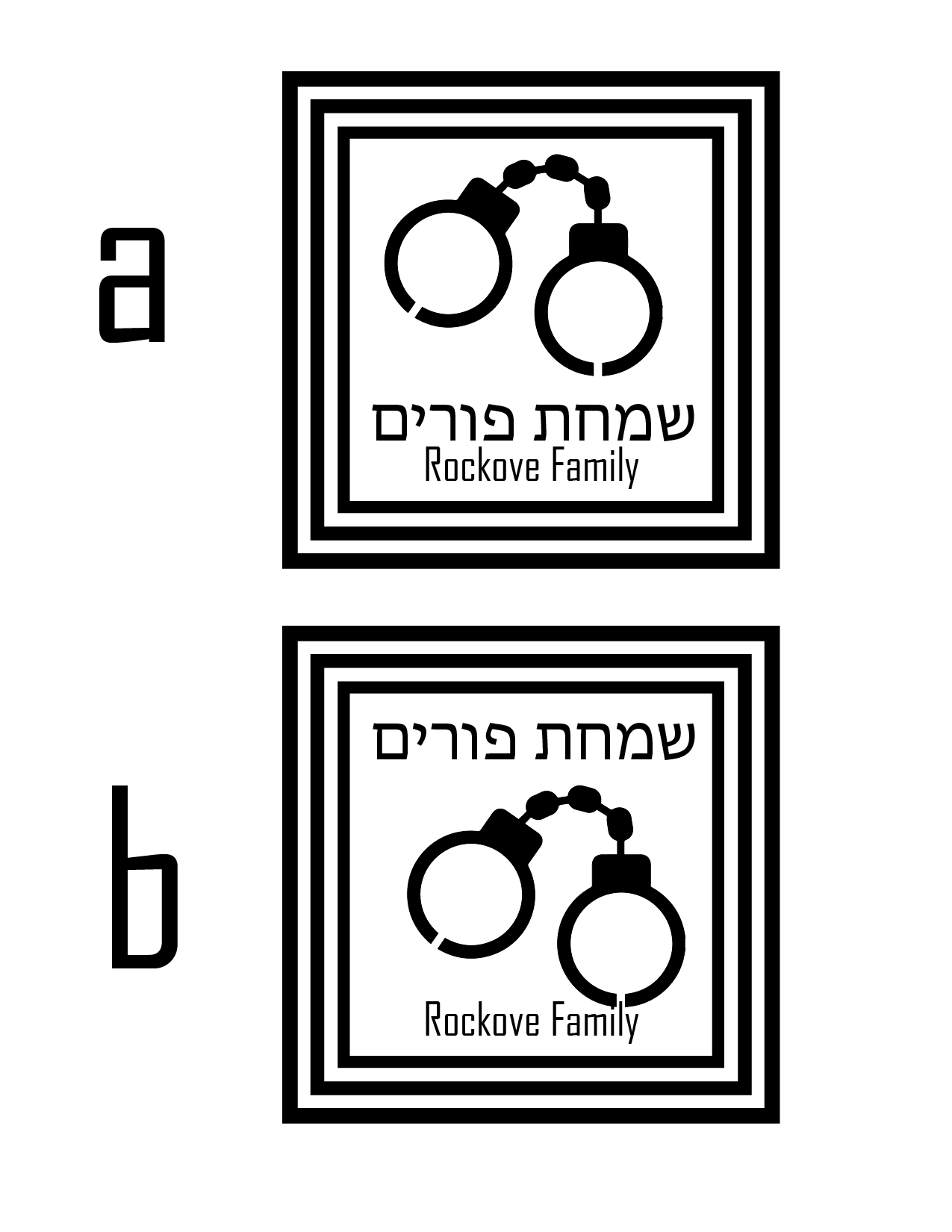
looks rly good! id maybe change to only 2 stroked rather than 3 for the border and i like the layout of a better.
I think the same. do only 2 stroked.
Really nice! I think the strokes are a little heavy. I would make them a bit thinner. I don’t think you want to crowd it up too much by adding anything else.
I think if you want to add the police hat in, you can fit it… I would put it in small on top of the ם of פורים (maybe leaning slightly to the left - like doesn’t have to be straight on top)
and I like best A for the layout.
I like A better. It’s really cute
A hat or badge might be a more cheerful icon  But it’s cops anyways so who cares
Okay, an update- they wanted the logo changed around, more graphic/cutesy than elegant…what do people think of this?
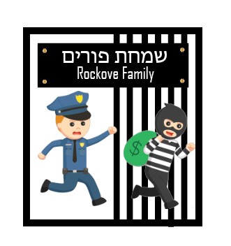
Love it, such character!
Cute!
Im just wondering - does it look like the robber is running into the jail? since they have such looks on their faces, I think you should make it look like the robber is escaping jail - so maybe just move the lines to the left. also, one line is sticking out of the frame (3rd from the right side)
thanks! i see what you’re saying @Breindy-S but then it kinda looks like the policeman is in jail
1 Like
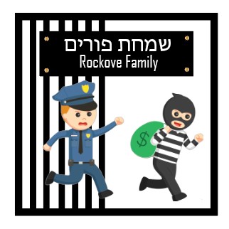
No now it looks super cute!
Love it!
yeah it looks better this way - it looks like venahapoch hu - the robber got the police in the jail or it looks like robber just escaped and police is chasing… wtvr doesnt really matter 
Its really cute!!
It really makes me smile. its so cute!!!
thanks everyone! BH client loves it!
It came out great!